These 13 ideas run from peel-and-stick hexagons you can lift out at move-out to full-height split face stone that needs structural prep and a second pair of hands.
The deciding factor is how much wall you are willing to treat as the whole design statement, because a tile accent wall works best when it gets some breathing room.
1. Patterned Tile Accent Wall
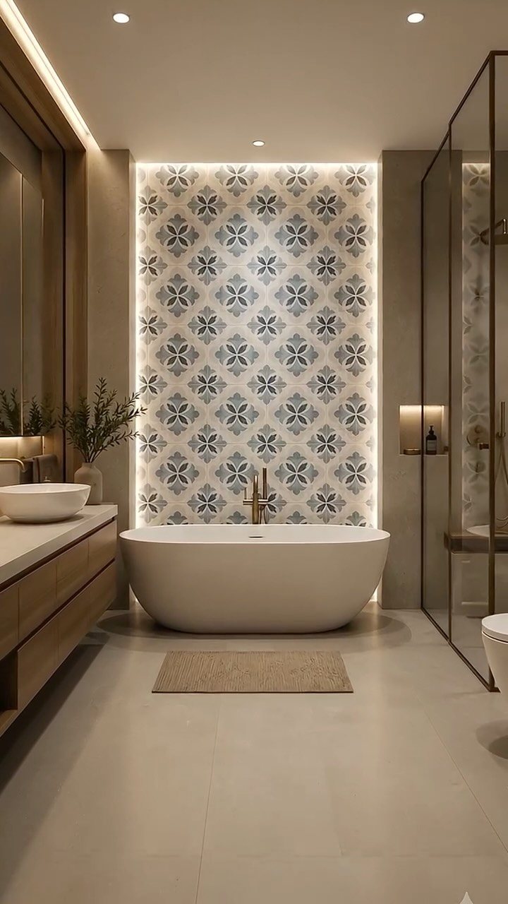
A patterned tile wall carries the whole room, so the pattern itself has to earn its keep.
Scale matters more than color here: a large repeat opens up a small bathroom, while a dense, small pattern can feel busy in tight quarters.
Backlit tile works because the light comes from behind, not from fixtures in front; if you are wiring for that, plan for a dimmer.
I would test a full sheet at eye level before committing, since the same pattern reads differently on a floor than on a wall. This one suits someone who wants one bold move and keeps everything else quiet.

Individually Sealed: 5 sheets tiles in a box. Each black tile full sheet is individually sealed with plastic flim to protect the tile.

Peel and Stick Tile: Say goodbye to boring, outdated kitchen walls and hello to a stunning transformation with our peel and stick backsplash! Each box contains 10 self-adhesive tiles. Each sheet measures 12"x12" and a box covers 10 square feet. Peel and stick wall tiles is designed for DIY enthusiasts

Easy DIY, Just Peel & stick, cut with tin snip , utility knives or hand saws, saving large amount on labor.
2. Mosaic Tile
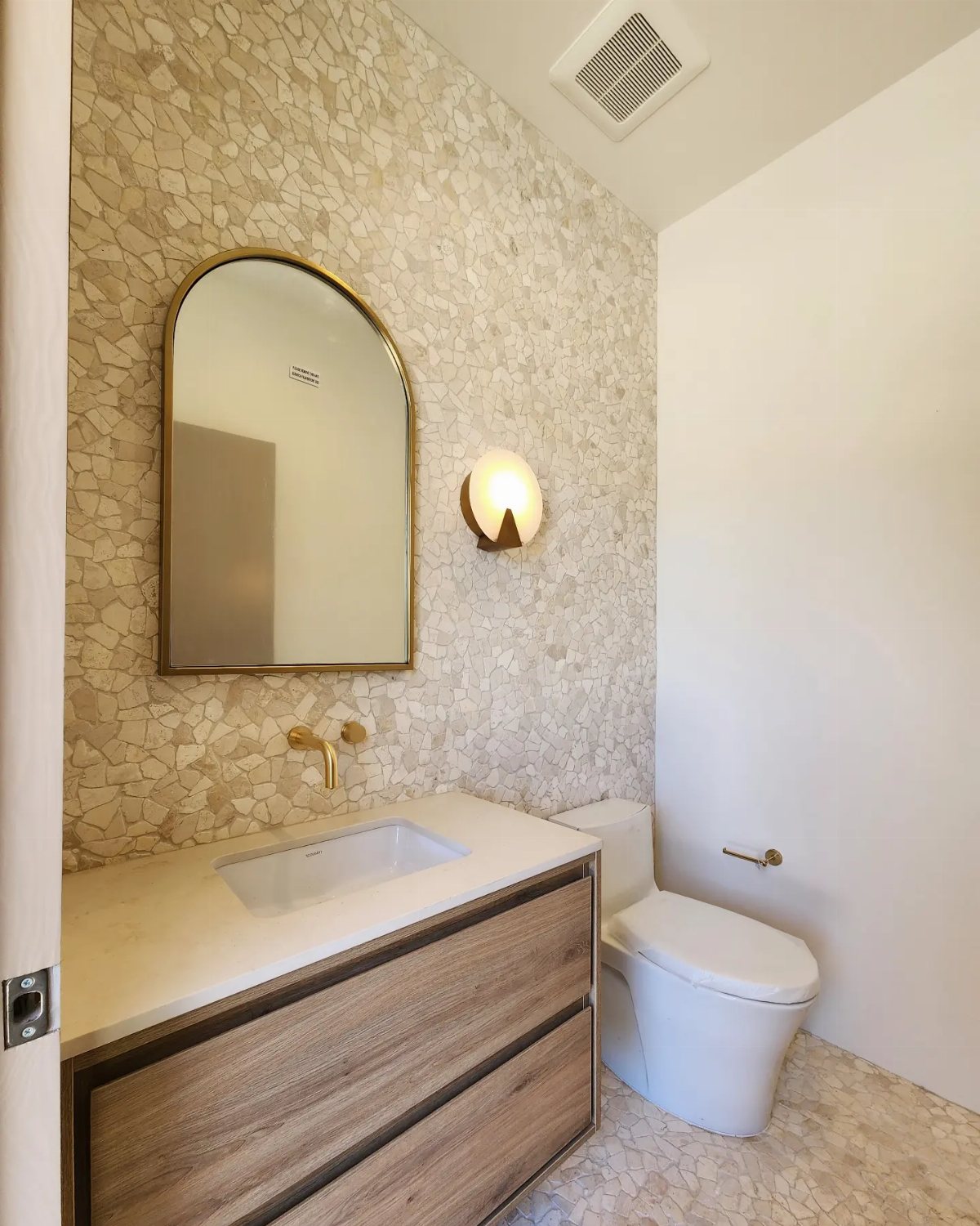
Mosaic tile packs a lot of texture into a small wall because each grout line becomes part of the pattern.
The sheets snap together for installation, which saves hours compared to setting individual tiles, though you still have to check that the sheet edges line up across the whole surface or the grid goes wobbly.
A uniform color reads as texture; mixing colors turns the wall into a pixelated image, which needs more planning and more waste.
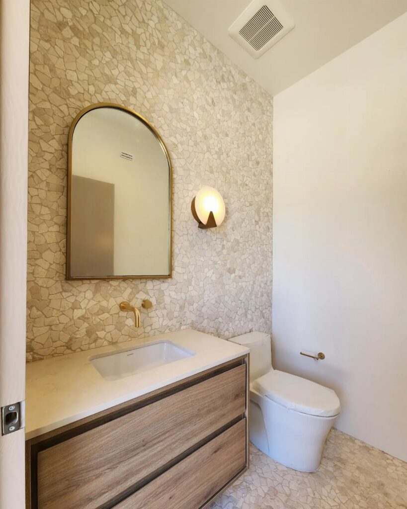
Mosaic shines in a powder room: enough wall to matter, not so much that the labor or material cost gets away from you. I would go uniform for a first project and save the color play for a second.

Realistic Ceramic Tile Look: Glossy and shiny hexagon tile is scratch-resistant, high-impact and fade-resistant, creating a high-end look for you, long hexagon design can be installed vertically or horizontally.
3. Glass Tile Accent Wall
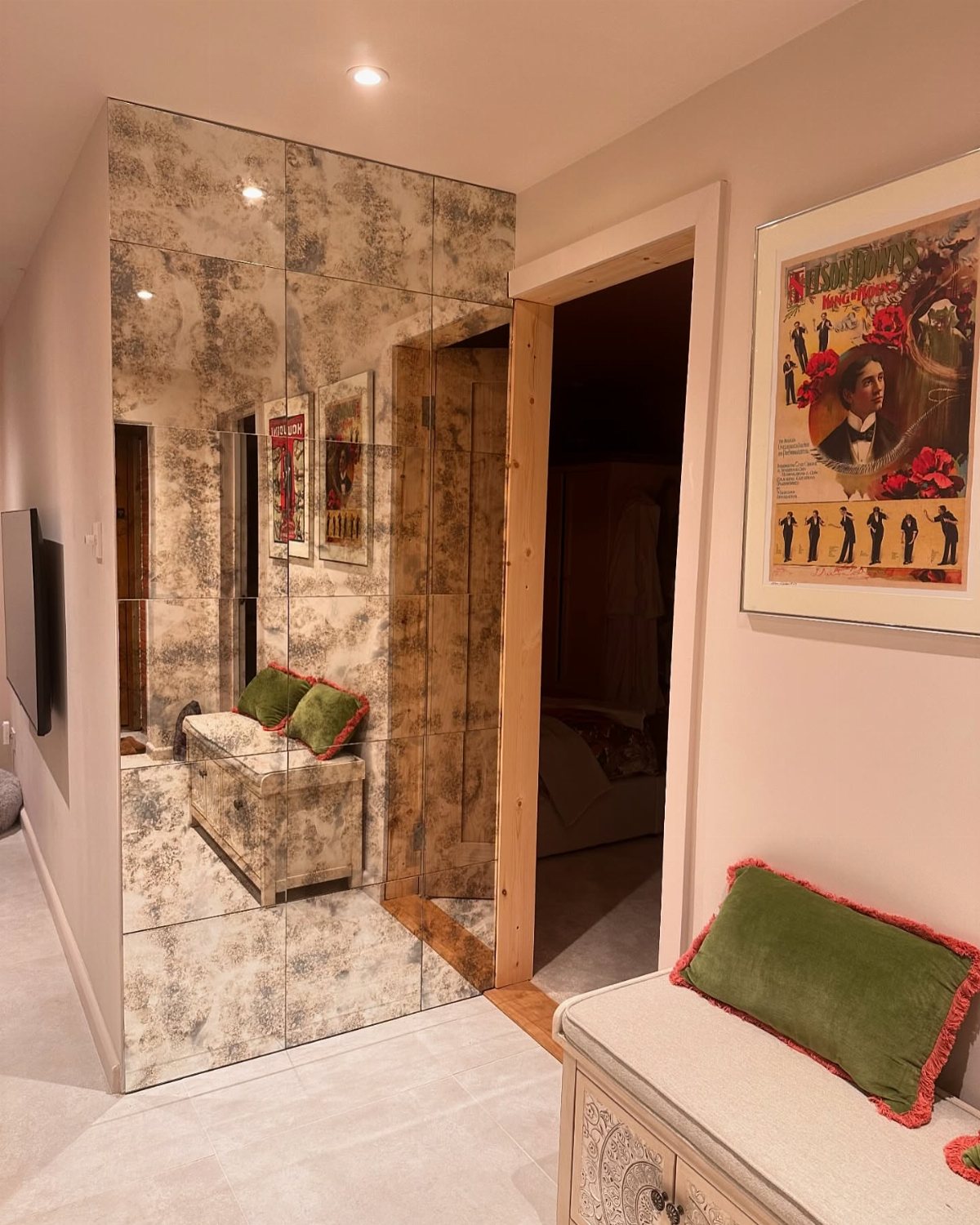
Mirrored glass tile bounces light around a hallway or bath that has little of it, and the antique finish keeps the reflection from feeling like a gym.
A mottled glass surface hides water spots and fingerprints better than a plain mirror would, which matters in a space people pass through.
Installation is trickier than ceramic because the backing shows if a tile sits uneven; a flat wall prep is non-negotiable.
I would use this in a narrow passage or a windowless powder room where the spatial gain justifies the careful work. It trades some privacy for that openness, so skip it across from a toilet or a bedroom door.

Vibrant Penny Round Design – Features a 12x12 inch sheet of 3/4" polished penny glass tiles in a bold azure peacock blue, adding unique style to any space.

Case includes: 5 sheets glass mosaic tiles covering 5 sq.feet. Safe well packed. Mesh mounted glass mosaics tiles with foam pads inside the thickened superhard carton box.

Product size - Each sheet of the ceramic tile is in 12 x 12 inches, 6 mm thickness, weighted around 2 lbs. Whole box 5 pebble tiles cover 5 sq.ft
4. Tile Accent Backsplash
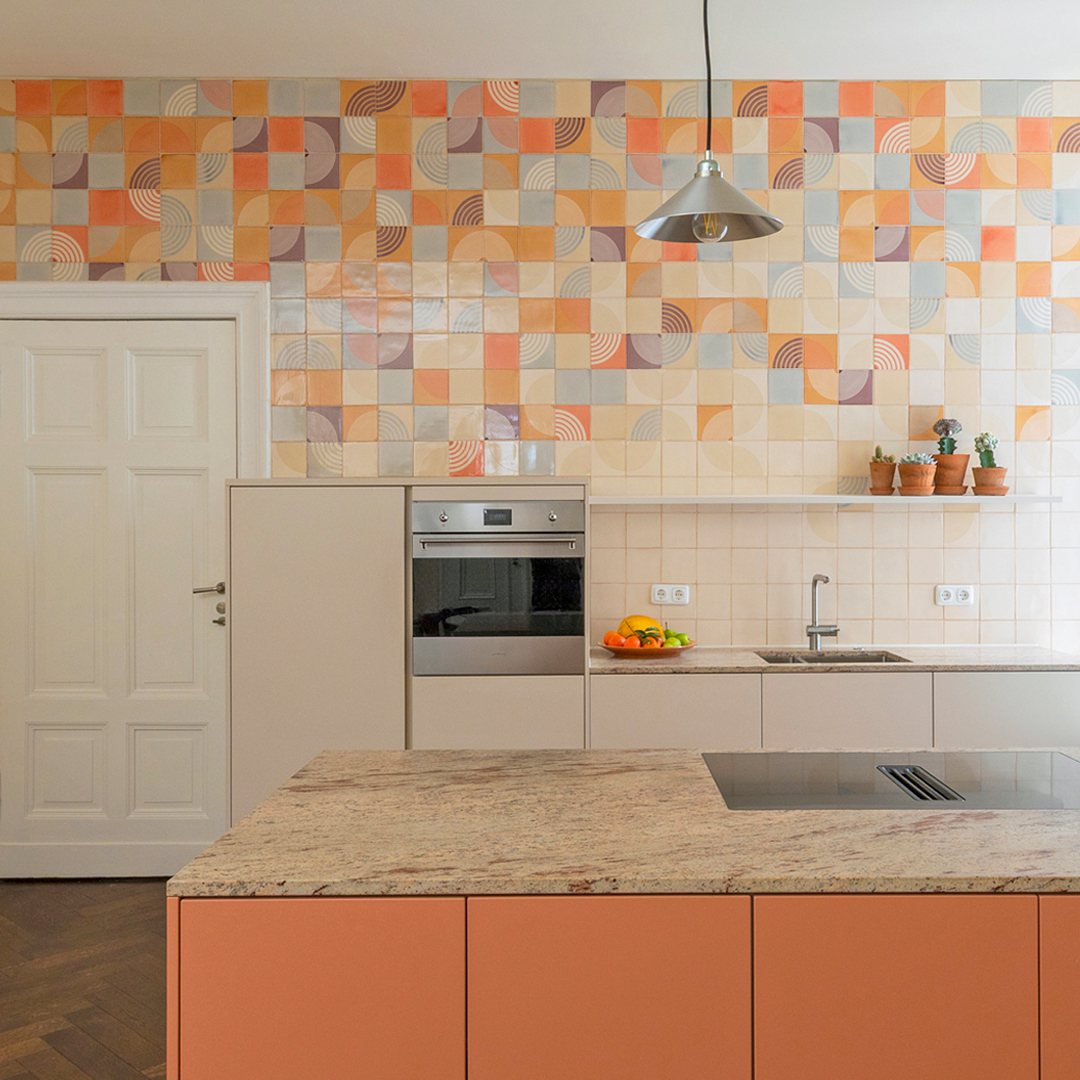
A full-wall backsplash turns the kitchen into the statement room without buying art.
A geometric pattern works when the colors pull from somewhere else in the space; if your cabinets and counters are already busy, a single-color tile behind the range keeps the idea without the competition.
I have seen people tile only the cooking wall and paint the rest, which halves the cost and keeps the impact where you stand.
Decide before you order whether the pattern is the star or the supporting player; mixed signals read as mistake, not eclectic.
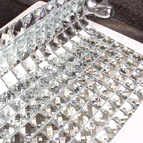
【Just Peel and Stick】Directly stick the mirror mosaic tile on wall or objective surfaces, save your time and money on labor, easy for installation and diy project.

【Peel and Stick】Diflart beveled mirror peel and stick subway tile, strong adhesive, easy to install and do DIY project, no glue, no grout, no mess, save your time and money on labor costs.

Mesh Backing: Beveled gold mirror glass tile mounted on a mesh, easy to install, can be cut to make borders or accents wall.
5. Textured Wall Tiles
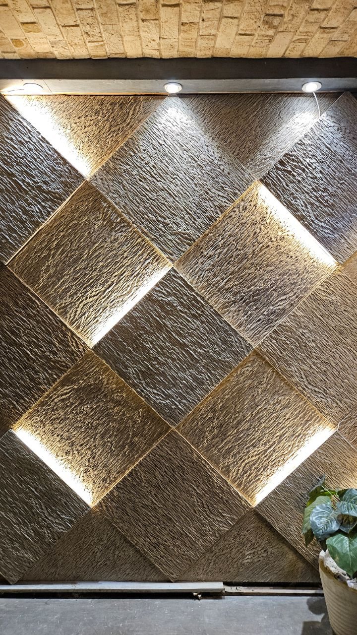
Textured tile catches light at the edges and casts tiny shadows that change through the day, so the wall becomes something you notice more than once.
Recessed lighting is doing half the work here; without it, the texture flattens to almost nothing. I would place the light source at the top or side, never straight on, or you lose the dimension you paid for.
These tiles cost more than flat ones and collect dust in the crevices, which matters if you clean your own walls.
Best for a dining room or entry where people see it from an angle and do not touch it often.


【Materials】Made from clay mineral powder and fiber with a matte texture finish. It can hold up to moisture, sunlight and washing. waterproof and heat resistant in climates ranging from -37 deg C up to 80 deg C.

Premium Travertine Stone – Crafted from authentic Scabos travertine with a splitface finish, combining natural beauty and long-lasting durability.
6. Brick Tile
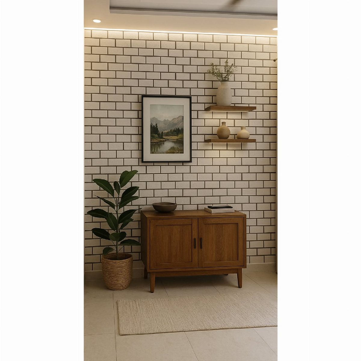
Brick-look tile gives the warmth of masonry without the weight, and that weight difference changes what your wall can handle.
Real glazed brick runs heavy enough to need structural assessment; the tile version lets a standard wall carry it, and the emissions savings are substantial if that matters to your build.
A white glaze reads as clean rather than industrial, which comes down to grout choice: dark grout emphasizes the brick pattern, light grout softens it to near-solid.
I would use this in a room that wants character but not darkness, and I would check that the edges of the tile you choose match up cleanly; some brick tiles have a faux irregular edge that looks manufactured up close.

Pack of 20: A box contains 20 pieces 3x6 inch glass tiles, covering 2.5 sq.ft. Super safe packaging

ARCHITECTURAL 8MM DIMENSION: Elevate your wall from flat to sculptural. At 8mm thick, this tile is double the standard mosaic profile, creating a pronounced 3D relief effect. As light traverses the beveled edges, it casts subtle shadows, adding tangible architectural weight to your kitchen or bathroom.

Come in a box of 3 sheets premium PVC hexagon tiles, 6"x7"x0.12" each.
7. Split Face Feature Walls
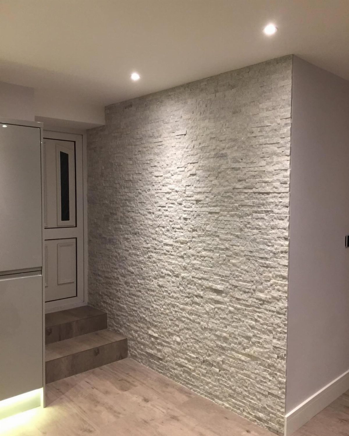
Split face tiles give a wall the kind of shadow and depth that flat paint never will. White is the easiest to find, but the same mosaic sheets come in travertine, grey, and warm sandstone tones.
I have seen them lit from above with recessed spots, the way you would wash a gallery wall, and the ragged surface catches light differently at every hour of the day.
They are thinner than ledger stone and come mounted on mesh, so one person can lift a sheet and press it into place.
A full wall behind a television or open shelving needs no extra art; the texture is the whole statement.
Best for anyone who wants drama without color. Dust settles in the crevices, though a soft brush vacuum attachment handles it fine.

Premium-quality Hexagon Marble Peel and Stick Tile Panel: Blends with matte PVC with stone effect and shiny metal,looks like real stone high-end tiles.The hexagon tile is...
8. Vertical Subway Tile Accent Wall
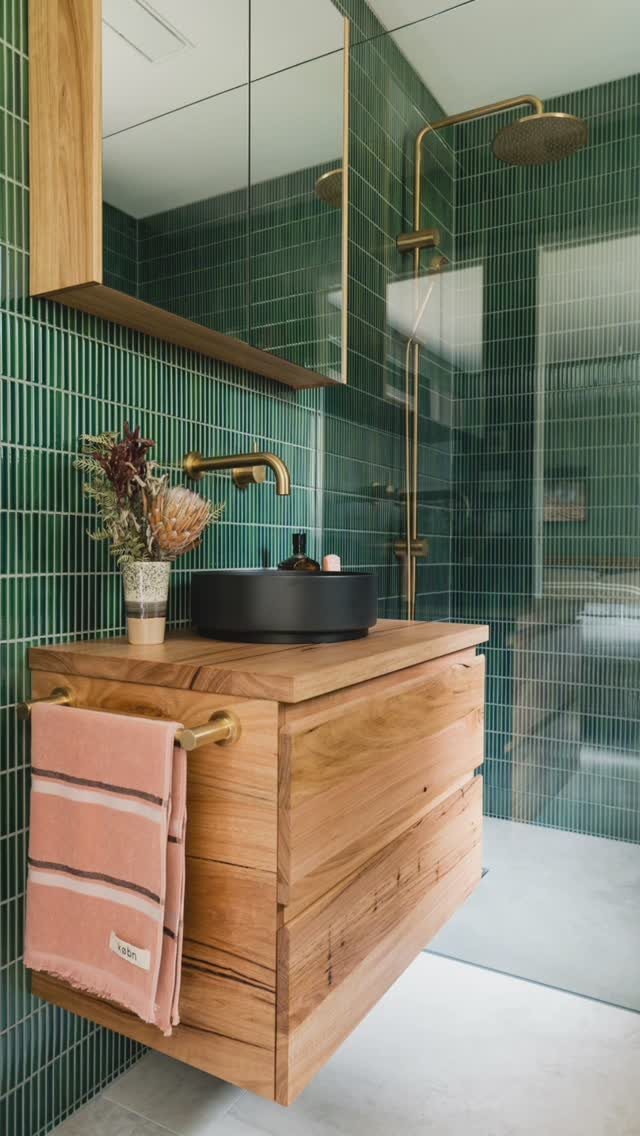
Running subway tile vertically instead of in the usual horizontal stretch changes everything about a narrow room. The eye travels up, the ceiling feels higher, and a small bathroom stops looking like a tube.
Glossy green works because it reflects the vanity light back onto your face, but matte versions in bone or warm grey do the same spatial trick more quietly.
Grout width matters most: tighter joints keep the vertical lines clean and continuous. I would go with a color-matched grout so the rows read as stripes, not a grid.
This layout eats more tile cuts around windows and outlets than horizontal does. Budget extra for waste, and lay out the first two rows dry to check where your verticals land before you mix any thinset.

STUNNING MODERN GLASS DESIGN: Elevate your Vanity or Powder Room with the sleek, dramatic shimmer of black glass mosaic. The polished mirror-finish surface adds sophisticated depth and a premium shine to any contemporary living space or boutique accent

HAND-FINISHED ANTIQUE RELIEF — Elevate your home with the exquisite charm of artisan craftsmanship. Each sheet features meticulously detailed, hand-detailed resin tiles with historic floral carvings, offering a high-end textured look that brings unmatched, timeless sophistication to your walls.
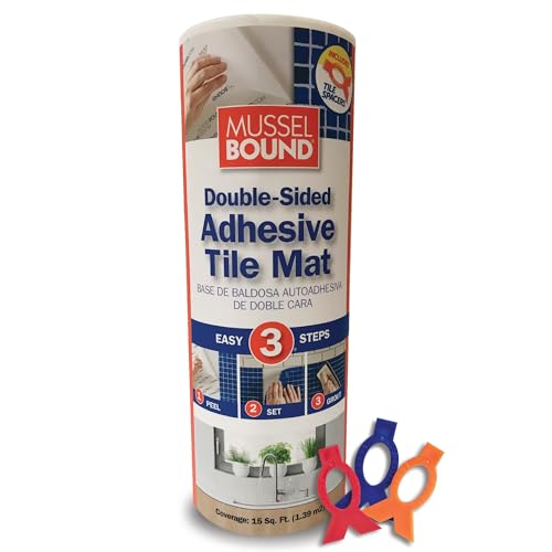
PROVEN - MILLIONS OF SQ FT INSTALLED OVER 15 YEARS !!!
9. Two-Tone Half-Wall Tile Design
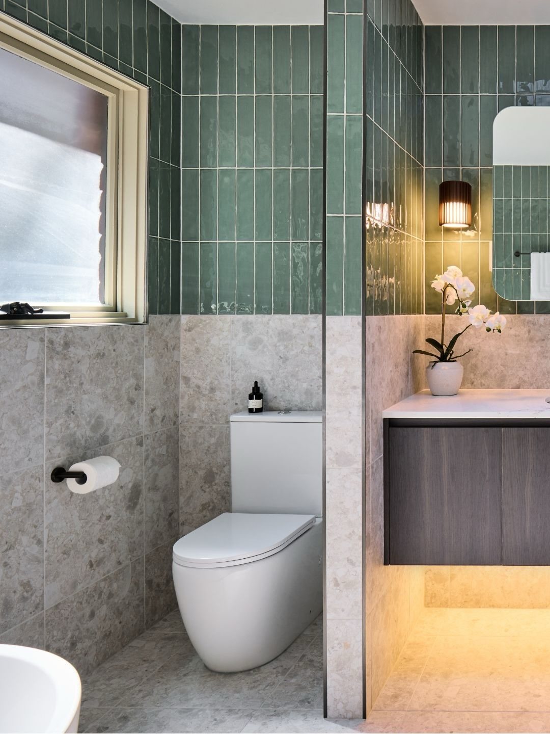
A half-wall split lets you use two materials without either one fighting for attention.
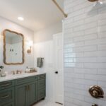
The photo pairs large grey stone below with glossy green subway tile above, and the break happens at about hip height, where a standing adult’s body naturally divides the view.
The lower tile needs to handle more contact: kicks, splashes, cleaning products. A honed or textured stone hides water spots better than polished.
Up top, the smaller glossy tile catches light and stays easy to wipe.
I would run the upper tile well past the shower spray zone if this is a wet room. The seam between the two materials wants a Schluter strip or a very clean caulk line; lippage there telegraphs as a mistake.
Dark grout below, light above, and the wall reads as two deliberate layers rather than a job half finished.

HD REFLECTIONS: This frameless mirror tiles are made of HD float glass, better reflection, more resistant. Wall mirror edge was frosted, which make this mirror more secure

Pack of 2 pieces. Product size: 12.2x12.2 inches. Square frameless design with Exquisite beautiful beveled edge. Wall-Mounted decorative mirrors. Stylish modern fashion wall decor mirror and vintage decoration.

【Peel and Stick 】Diflart peel and stick antique mirror tiles are self-adhesive design, no grout, no mess, easy to install.
10. Pink Scalloped Tile Wall
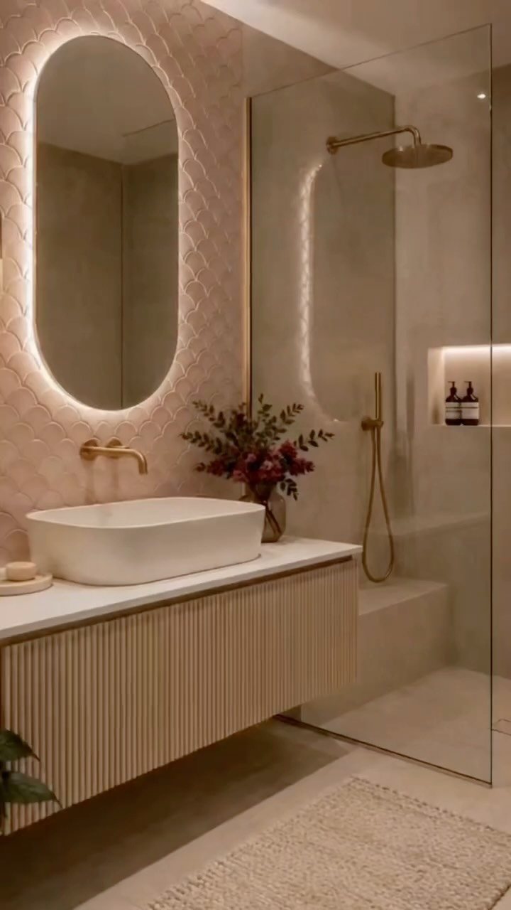
Scalloped tile, or fish scale, reads as something handmade even when it is not. Soft pink keeps it from feeling too coastal or too vintage; it sits right in the middle, feminine without being precious.
These small rounds take longer to set than rectangles because every piece needs individual placement and spacing checks. A full wall behind one vanity, not a whole bathroom, keeps the labor and the visual weight in check.
Backlighting helps, but scalloped tile under ordinary sconces still catches light along its curved edges.
I would order extra for the cuts around outlets and the inevitable cracked piece. The rounded bottom edge means standard tile nippers work better than a wet saw for those last small fits.

Sold by Box of 6 pieces. Thickness is 1/2"

Authentic Travertine Stone – Premium natural stone with greyish tones and unique variation, delivering rustic charm and timeless elegance.

Natural Stone Construction – Made from real stone with a rough tumbled splitface finish, offering a bold and textured look for indoor and outdoor applications.
11. Herringbone Tile Accent Wall
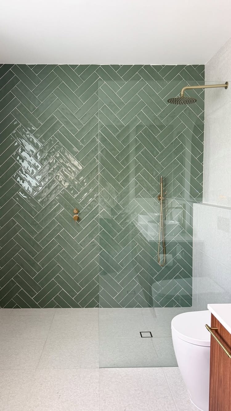
Herringbone looks complicated because the pattern is diagonal, but the tile itself is just a standard subway rectangle turned on its corner.
Start from a center line and work outward in both directions; drift even a little and the whole wall leans.
Glossy green inside a shower enclosure makes sense because the glaze is non-porous and the grout lines, though numerous, are sealed.
In a dry application like a living room fireplace, matte ceramic or even cement tile gives the same geometry without the slip risk on a floor.
I would not attempt this as my first tile job. The cuts where the herringbone meets a corner or a fixture are angled and unforgiving.
A weekend setter should practice on a backsplash or a single panel before committing to a full shower wall.
12. Marble Tile Accent Wall
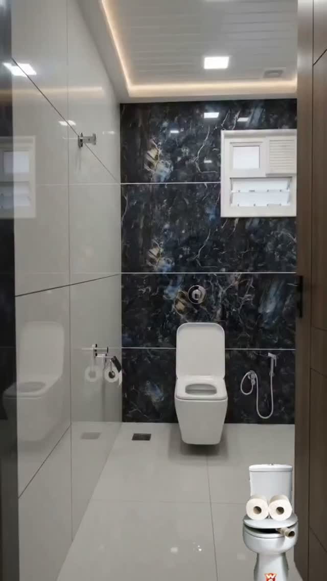
Dark marble-patterned tile on one wall, pale everything else: the contrast does the work so you do not have to. Vertical veining lengthens a narrow room, and the large format means fewer grout lines to break the stone illusion.
Real marble tile at larger sizes costs more and stains; porcelain with inkjet printing gives the same look with none of the sealing schedule.
Pale grey floors and side walls are the right choice, warm enough to keep the dark wall from reading as a cave.
In a daily-use master bath, the dark wall shows every water spot and toothpaste flick; you will be wiping it down more often than the pale tile surrounding it.
13. Hexagon Tile Accent Wall
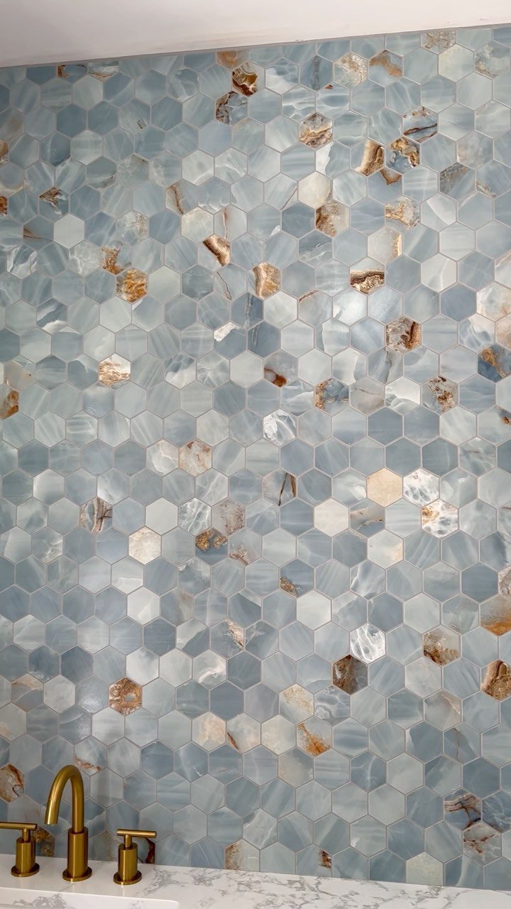
Hexagon tiles give a honeycomb rhythm that reads as texture from across a room and geometry up close, and the translucent veining in these blue tones keeps the pattern from flattening into wallpaper sameness.
The six-sided shape costs more per square foot than subway tile because of the cutting waste, so I reserve it for walls that stay in view: a powder room behind the sink, a shower back wall, or a kitchen backsplash between uppers and a window.
On a full wall the pattern can tire; a small area like a powder room or a single backsplash section gives impact without overwhelm.
Installation needs tighter grout lines than square tile, and the pattern shows every lippage, so a leveling system is worth the small cost. I order extra overage instead of the usual amount; the angles create more unusable cuts at edges.
This suits renters doing a removable backsplash with peel-and-stick versions, or owners who want one memorable surface without redoing a whole room.
Planning Your Accent Wall
Sketch your layout at full scale on the floor before you order anything.
A sheet of cardboard cut to tile size lets you move pieces around and see where the cuts fall, which matters more with large-format tile where one bad edge ruins the row.
Grout color changes a wall as much as the tile does. Width works the same way: a hairline joint keeps lines crisp, a wider one makes each tile stand alone.
Decide which effect you want before you set the first piece.
Light direction changes everything. The same glossy green tile reads flat under a ceiling fixture and dimensional under a side sconce.
Hold a flashlight at different angles against your sample board; what you see there is what you will live with.
Functionality of Accent Walls
A tiled wall can carry weight as well as color. Open shelving set into a tile grid needs backing blocking in the studs before the tile goes up, but the result is storage that looks built-in rather than hung-on.
In a kitchen, a tiled niche behind the range holds oils and tools where you reach for them, and the tile surface wipes clean where painted drywall would stain.
The niche depth is set by your stud bay, usually 3 1/2 inches, enough for a row of spice jars.
Shower niches are the familiar version, but the same idea works in a powder room: a shallow recess for soap beside the sink, tiled in the same material as the wall so it disappears.
Plan the niche location before you run plumbing, not after.
Mixing Materials
Different materials on the same wall need the same thickness or the surface will ridge at the seam. A glass mosaic sheet sits almost flush; a natural stone split face can stick out far enough that you notice the difference.
Build out the thinner material with adhesive or accept a visible transition strip.
Matte stone beside glossy glass gives you contrast in texture without fighting for color attention. The stone absorbs light, the glass throws it back, and the wall changes as you move through the room.
Keep the palette tight, two tones at most, or the materials compete instead of talking to each other.
Metal accent strips set into ceramic field tile are the easiest mixed-material project: one row of linear mosaic as a horizontal band, installed at the same time as the surrounding tile.
No thickness issue, no special order, just a break in the pattern that reads as deliberate.
Choosing Colors and Patterns
A solid color tile wall is the safer choice in a room that already has pattern in rugs, upholstery, or window treatments.
It gives the eye a place to rest, and the texture of the tile surface still registers as interest even in a single tone.
Patterned tile needs breathing room. In a room with ornate molding, busy upholstery, or strong wood grain, the pattern and the architecture fight for attention.
I would use patterned tile only where the surrounding surfaces are quiet: flat cabinets, simple trim, plain floors.
Small tile, more grout, more energy; large tile, fewer lines, more calm. Match the scale to the stillness you need from the room.
Frequently Asked Questions
Can you tile an accent wall?
Yes. Any wall that can handle the weight of tile and the moisture from thinset can carry an accent wall, though you will want to check that the studs and substrate are solid before you start.
Patterned tile, mosaic sheets, glass, and even brick-look porcelain all work on vertical surfaces, and the installation is the same as a backsplash or shower wall just with less water exposure to plan around.
Tiled accent walls work anywhere paint would have been the default choice: hallways, bedrooms, behind open shelving.
Are accent walls outdated in 2026?
Not in any room where they solve a real problem. A single tiled wall still gives a small bathroom or powder room a focal point without the cost of tiling every surface, and that function does not expire.
Accent walls still show up in every search for fresh tile ideas, which suggests demand is steady.
A bold pattern behind a vanity earns its attention; a random red wall in a living room because you saw it years ago does not.