These hall wall ideas run from a roll of painter’s tape to a slatted marble feature wired to a dimmer, and the right one depends on whether you own the wall or just the lease.
Renters will live with peel-and-stick murals and freestanding storage benches; owners can cut into drywall for recessed lighting or real wainscoting.
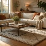
The 3D geometric relief that catches morning light in Kelsey Leigh McGregor’s Oklahoma living room proves the texture itself can carry the space, no frame required.
1. Textured Wall Design
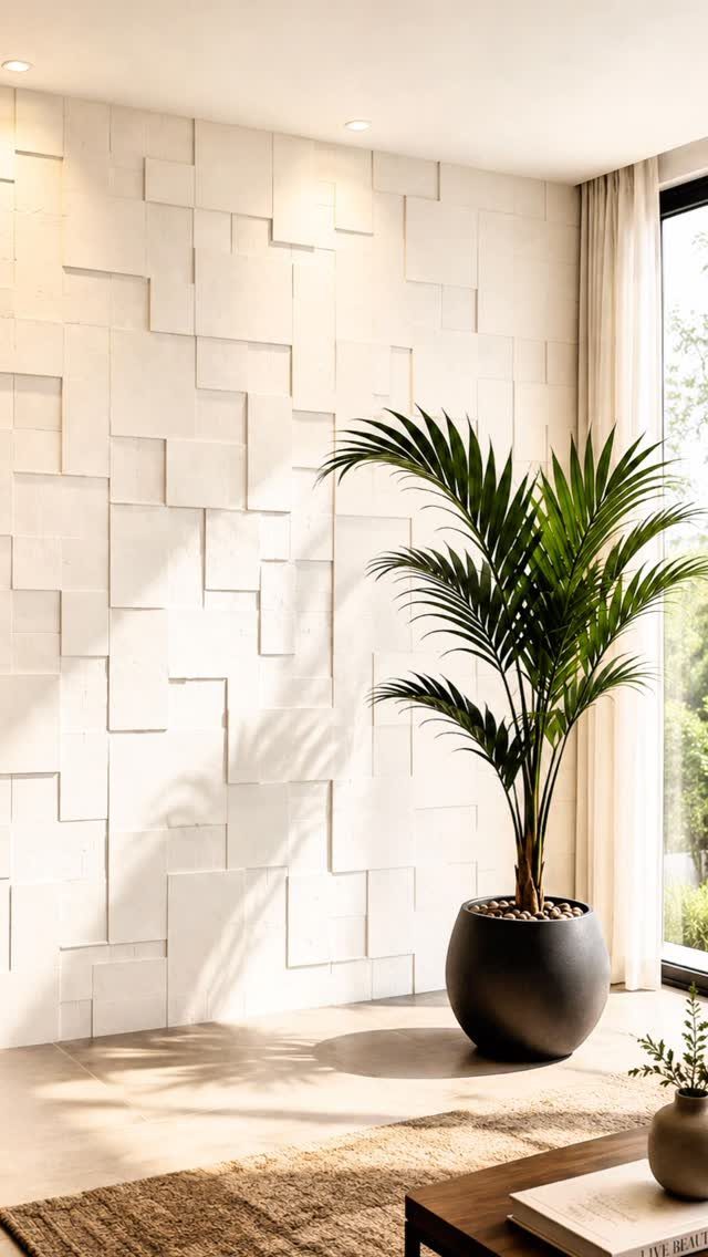
A 3D geometric relief wall catches light across the day so the texture itself becomes the art.
Stone veneer or faux panels warm the space and give a newer home some age, the way Kelsey Leigh McGregor used it in an Oklahoma living room to bridge rustic and modern.
I like this best when one wall carries the weight and the rest stay quiet; a single palm or a few succulents nearby keeps it from feeling too built-in.
Lightweight faux panels keep the budget manageable; real stone and professional install push it much higher and are harder to undo. What you gain in looks you lose in flexibility: this is not a weekend swap.

Size & Modular Design: Includes 12 individual panels: 6 pieces of 13.39 x 6.69 in (34 x 17cm) and 6 pieces of 10.63 x 5.31 in (27 x 13.5 cm), covering 7.74 sq. ft. The two sizes work together as a modular system, allowing you to align the center lines and combine individual pieces into continuous Half Circle patterns or personalized layouts.

Size & Modular Design: Includes 8 individual panels: 4 pieces of 11.02 x 11.02 in (28 x 28 cm) and 4 pieces of 9.45 x 9.45 in (24 x 24 cm), covering 5.86 sq. ft. The two sizes work together as a modular system, allowing you to align the center lines and combine individual pieces into continuous Star Lattice patterns or personalized layouts.

Size & Modular Design: Includes 8 individual panels: 4 pieces of 11.02 x 11.02 in (28 x 28 cm) and 4 pieces of 10.24 x 10.24 in (26 x 26 cm), covering 8.74 sq. ft. The two sizes work together as a modular system, allowing you to align the center lines and combine individual pieces into continuous Cross Grid patterns or personalized layouts.
2. Bold Accent Walls
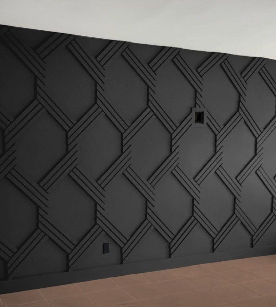
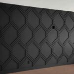
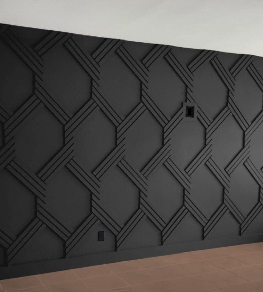
Matte black with raised geometric moulding turns a wall into architecture without building any.
The wall you choose matters more than the color; it should be the one your eye lands on naturally, usually the far end of the hall or the surface behind a console.
Sherwin-Williams Tricorn Black in a saturated coat does the heavy lifting, and the wood pattern adds height and symmetry that flat paint cannot.
I would check whether your hall gets enough natural light to balance the darkness; a narrow passage with no windows will feel like a tunnel. Pair it with lighter floors and ceiling, and the boldness reads as intentional, not heavy.
Whether you’re a minimalist who gravitates toward neutral paint colors, a maximalist who loves making a bold statement, or fall somewhere in between, there are plenty of accent wall ideas for everyone.

What You Will Receive: includes 3 sets of white pre cut geometric wall molding kits; Each set includes pre cut trim pieces that assemble into one upper frame, one center diamond accent and one lower frame panel, with an overall assembled size of approximately 30 x 67 inches; Ideal for creating an elegant decorative accent wall

Geometric Art: Bring your minimalist vision to life with clean lines, cool tones, and bold style. Embrace the art of abstraction—a timeless trend where classic geometry meets modern expression. Design your contemporary space with ease, one panel at a time.

Transformative - Art3d pre-cut molding trim adds depth and character to walls, gives traditional elegance with a hint of contemporary refinement
3. Wallpaper Mural
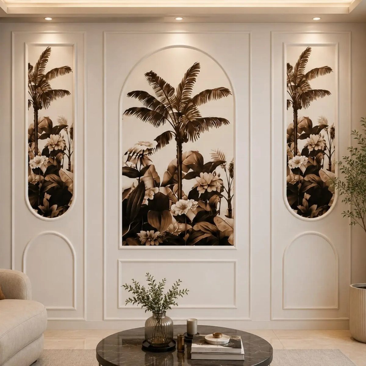
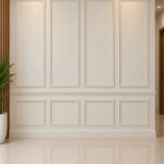
Peel-and-stick wallpaper in a mural print gives you the hand-painted look without the lifetime commitment or the artist’s fee. Wainscoting frames a mural pattern and keeps it from overwhelming the room; white trim around the panels acts as breathing room.
I have swapped these out in a rental on a single afternoon, which is the real advantage. If you want the actual hand-painted route, hire locally and budget for a wide range depending on wall size and complexity.
For most renters, the removable version wins; it leaves no damage and follows you to the next place.

MURAL SIZE - Approx.137"x 96"(Wx H), This peel and stick mural wallpaper cut into 8 strips. All is marked with number under each strip. You can put it in sequential order before you install it

【SIZE&MATERIAL】17.3In X118.In=14.16sq.ft.Floral wallpaper,upgrading and thickening. Adopt vinyl and the latest removable glue,wallpaper sticks to any smooth, flat ,clean surface,No residue after removal.

Peel and Stick - Unlike traditional wallpaper, Flortlias wall mural is self-adhesive—just peel and stick! Each panel is numbered to help align the pattern. Slight overlaps ensure a seamless look without the need to trim. No stress, no mess.
4. Mirrors with Colorful Frames
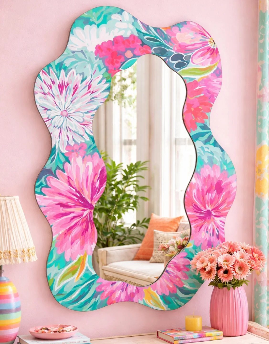
A wavy mirror with a hand-painted floral frame does two jobs: it bounces light around a tight hall and it replaces the art you might not have wall space for.
The Anthropologie Primrose moment proved mirrors can carry a room, but the colorful frame here goes further, adding the vibrancy that a plain silver frame would not.
I would prop a smaller antique mirror against the glass for the layered effect Meg Lonergan uses, or keep it single if the frame itself is busy.
Best for halls with at least one window or a good sconce; in a dark corridor the color gets lost.

TRANSFORM YOUR SPACE: Add charm to your home with 3D wall panels featuring a textured, natural-looking faux stone design that is ideal for accent walls and TV walls

【Realistic 3D Faux Stone Texture】Embossed, touchable 3D surface creates a natural stone-look effect and can be painted to match your décor.
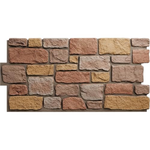
FAST DIY INSTALLATION: Our lightweight polyurethane panels are designed for quick and easy installation, saving you time and professional labor costs. Unlike heavy real stone, these panels are easy to handle and can be installed by a single person using basic tools—perfect for a weekend DIY project.
5. Storage Benches
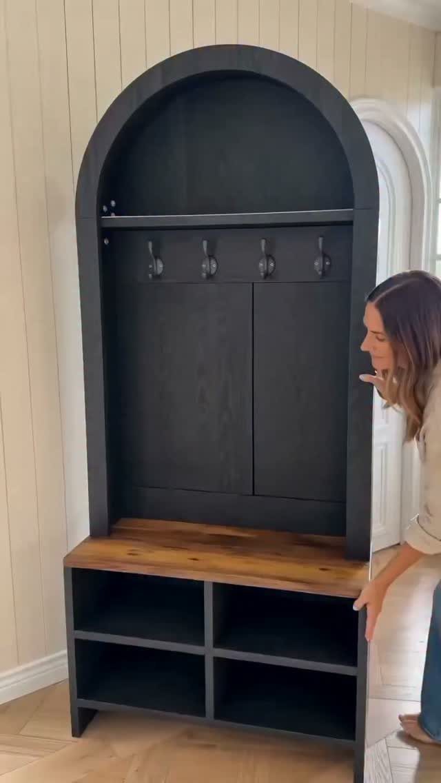
An arched hall tree with shoe cubbies and a bench seat solves the mess that accumulates where people enter.
A dark finish hides scuffs better than raw wood, and open storage means you actually use it because you can see what is there.
I would measure your hall width before ordering; these units need generous clearance to avoid a bottleneck. For renters, a freestanding piece like this beats built-ins for cost and portability.
The footprint matters: it suits wider halls or entry nooks, not a tight passage.

Includes 3 pre-cut 20"x27" wall molding frames and 2 chair rail trim pieces, Covers 78.7"W x 39.9"H wall area (6.5 ft wide). All pieces feature a peel-and-stick design for easy installation

Elevate Your Walls Instantly – These fluted PS wainscoting panels add a clean, modern architectural look to any space, perfect for accent walls, half walls, and decorative wall upgrades in living rooms, dining rooms, and hallways

Wainscot Kit: This kit includes 8 pieces of 35.8 x 9.8 inch wainscoting panels and 2 pieces of 1.8 x 38.7 inch slats, it covers 21.5 sq, ft and matches most interior color schemes
6. Gallery Wall
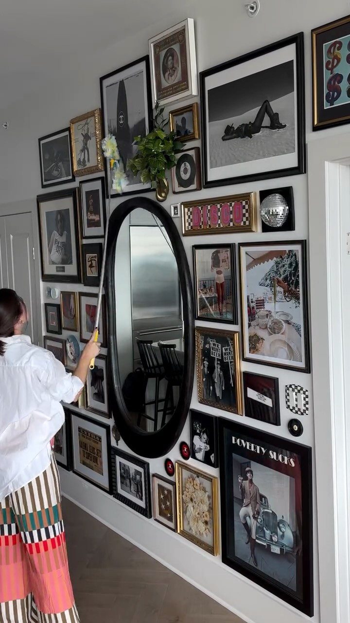
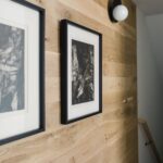
A gallery wall turns a long hall into something you walk through rather than past. The mix here, black-and-white photos with a mirror and a few words, works because the frames vary but the palette stays tight.
Nicole Arruda’s trick of leaning some pieces on a ledge and hanging others keeps it from feeling too arranged; picture lights finish it if your hall lacks natural light.
I would start with a small group of pieces and live with the layout on the floor before putting holes in the wall.
Best for collectors or anyone with a stack of art and no single piece large enough to carry a wall alone.

SPECIFICATION: Each package includes 33 decorative wall panels, each measuring 11.8" x 11.8" (300mm*300mm), covering approximately 32 square feet (𝗡𝗼𝘁 𝗽𝗲𝗲𝗹 𝗮𝗻𝗱 𝘀𝘁𝗶𝗰𝗸,𝗮𝗱𝗵𝗲𝘀𝗶𝘃𝗲 𝗻𝗼𝘁 𝗶𝗻𝗰𝗹𝘂𝗱𝗲𝗱)

Real 3D Design: Diamond pattern with 1 inch raise design makes our wall panels more eye-catching. A box comes in 33 tiles, which covers 32.Sq.Ft.

Real 3D Design: Diamond pattern with 1 inch raise design makes our wall panels more eye-catching. A box comes in 33 tiles, which covers 32.Sq.Ft.
7. Hanging Planters
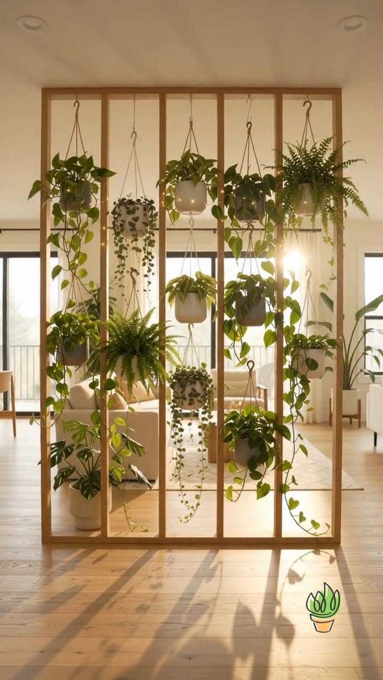
A room divider hung with trailing ferns and pothos turns dead space into a living screen. I like this for renters because the plants hang, not the hardware; a tension rod or leaning frame leaves walls untouched.
Choose pots in 2 or 3 tones, white to warm grey, so the cluster reads as intentional rather than accumulated.
Ferns want humidity, succulents want neglect; match the plant to the light your hall actually gets, not the light you wish it had.
A living wall suits the reader who will water weekly. For the rest of us, 1 or 2 hardy hangers by the door still brings in that fresh, filtered feeling without the commitment.

You Will Receive: 1 set of precut wall molding kit with French corners, consisting of 20 lines and 4 corner flowers, mix and match to design your dream wall or door decor; You can also DIY to create your favorite style according to your needs to add elegance to your space; They are easy to connect and bring finished appearance to doors or walls

Transformative - Art3d pre-cut molding trim adds depth and character to walls, gives traditional elegance with a hint of contemporary refinement

DIY Wall Panel Set: Wall molding kit includes 3 sets of pre-cut flexible wall decorations, each set has 8 pcs, total 24 pcs, can mix and match our different sizes to beautify your walls. Additionally, easily paint the trims in your favorite color(black,gold,blue,pink,green) to match any interior style-modern, farmhouse, vintage
8. Dark Paint Background
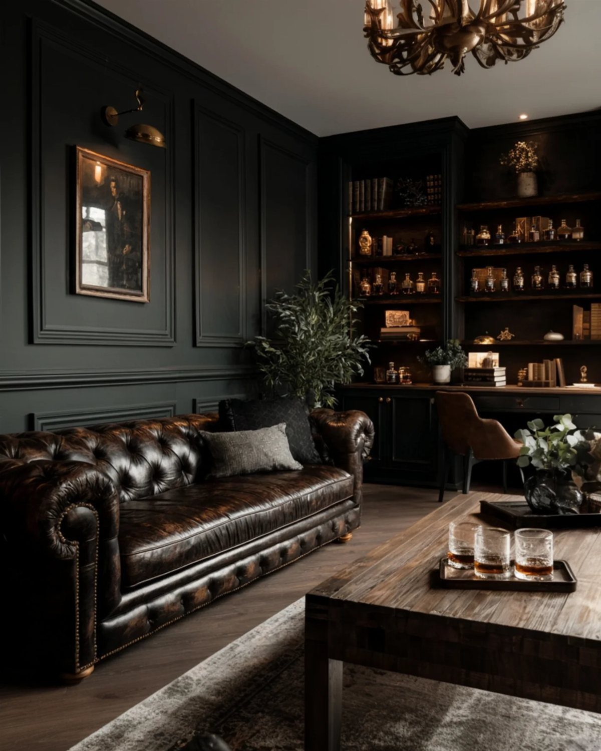
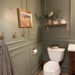
Charcoal walls make burgundy leather and warm wood furniture feel settled in, not staged. A light source keeps dark paint from going flat: a window with white blinds, a sconce, anything that adds contrast.
Test your sample in the late afternoon, not under noon sun.
This look trades the airy openness of pale walls for intimacy. If your hall is narrow and windowless, keep the ceiling white and let the dark stop at the picture rail.

【Immersive Forest Statement】 Transform your room into a mystical sanctuary. Featuring majestic intertwined ancient trees and a sun-drenched mossy path, this deep green "Statement Art" mural creates a breathtaking 3D optical illusion that visually expands your space while inducing a sense of peace.

【SIZE&MATERIAL】 16.9In X 118.1In ≈ 13.8sq.ft. Floral wallpaper,upgrading and thickening. The thickened polymer material protective film makes this wallpaper less prone to tearing. Adopt the latest removable glue, strong adhesion and can be easily applied to any smooth and dry surface. No residue after removal.
9. Coastal Style Look
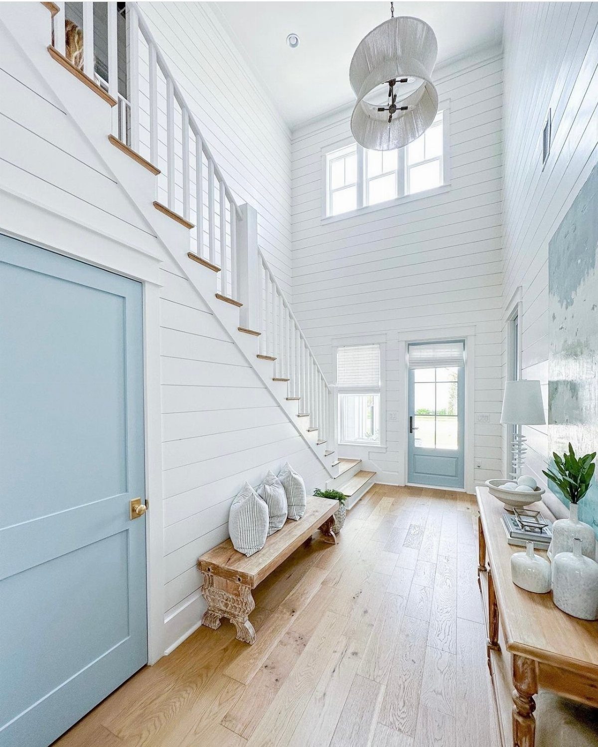
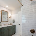
Shiplap and soft blue read coastal without the seashell kitsch. The brass here is polished, not antiqued; that small shift keeps it from feeling like a vacation rental.
I look for this palette when a hall connects to rooms that already run warm. The cool white and dusty blue act as a palate cleanser between spaces heavy with wood or red tones.
A bench and console give you a place to set down bags and mail, which matters more than the styling.
Natural light carries this look. A dark apartment hall will flatten the blue to grey, and the cheerful, airy feeling vanishes with it.
South-facing or skip it.

3D Faux Brick Panels, retro brick pattern, show personality, bid farewell to the monotonous wall.Peel and stick, convenient cutting, easy to finish wall renovation. It is suitable for special wall, TV background wall, sofa wall, living room wall, bedroom wall, stairs, corridor, dirty wall and so on.

TRUE-TO-NATURE 3D REALISM: Crafted from premium high-density polyurethane (PU), our faux stone wall panels perfectly replicate the rugged texture, deep crevices, and color variations of natural stone. Unlike cheap foam or flat wallpapers, these 1.18-inch thick 3D artificial rock veneers fool the eye and touch, instantly upgrading your space with a high-end, realistic masonry aesthetic.

Real Stacked Stone Look: Hand-painted faux stone and rock texture with deep 1.38 in relief for natural shadows; lightweight PU stone veneer gives a true stone look without the weight
10. Wall-Mounted Shelving
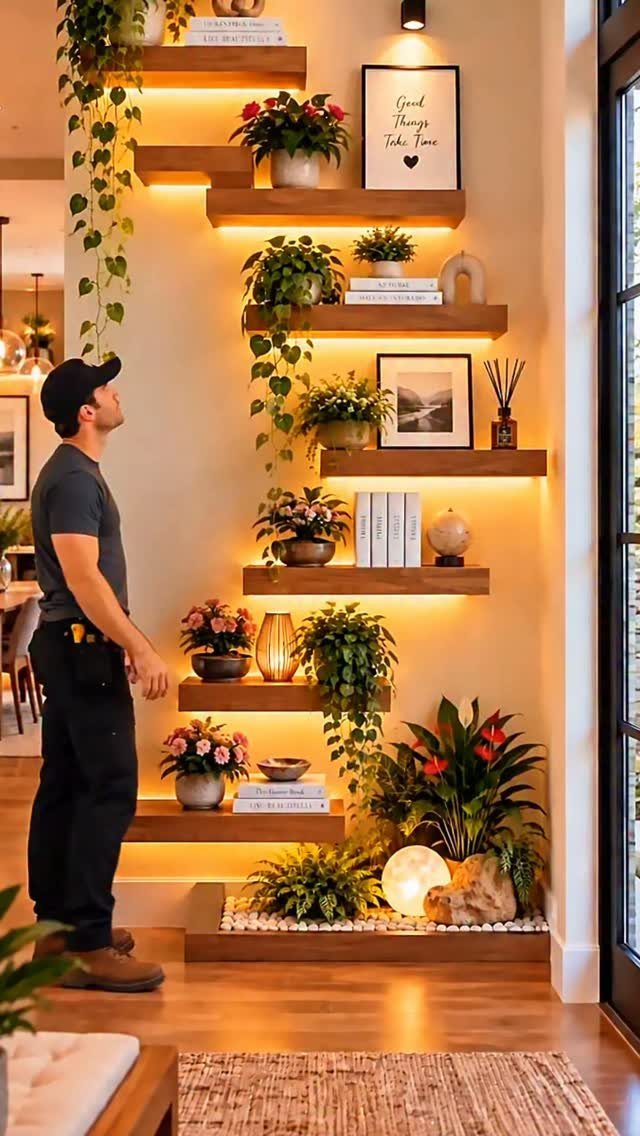
Staggered shelves with hidden LED strips turn a blank wall into something that works after sunset.
Warm backlighting is what separates this from dorm-room floating shelves; integrated strips cost more than stick-on puck lights but the glow is even, not spotty.
I arrange objects in threes: a plant, a book, a small frame, then repeat the rhythm at different heights. The staggered placement lets each piece breathe; a straight row reads as a display case, which feels colder.
This suits the reader with small collections, not large ones. These shelves show a small edit beautifully and tempt you to pile on too much.

Quick DIY Installation: This Wall Molding Kit includes pre-cut peel and stick wainscoting panels, lightweight and ready to install. No special tools required, making it simple for anyone to use

【Complete 4-Panel Set】 Includes 4 sets pre-cut panels (16"x24" each), and 2 pcs 41" length Shelf Edge. Cover up to 82 inches of wall length

Quick DIY Installation: This Wall Molding Kit includes pre-cut peel and stick wainscoting panels, lightweight and ready to install. No special tools required, making it simple for anyone to use
11. Geometric Patterns
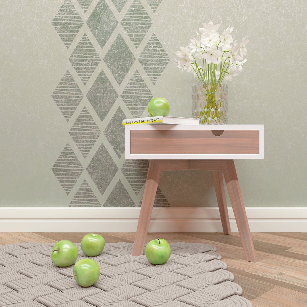
Painter’s tape and two colors turn a wall into geometry for the cost of a weekend. A diamond pattern that sits large and calm lasts longer; smaller repeats feel busier and harder to live with.
I measure the wall height and divide by an odd number to set the scale. Odd counts center a full diamond; even counts leave halves at the edges, which looks like a mistake.
Remove the tape when the paint is tacky, not dry; clean lines depend on that timing.
This works best on a wall with nothing in front of it. A console table or bench that interrupts the pattern breaks the effect entirely.
12. Lighted Wood Slat Wall
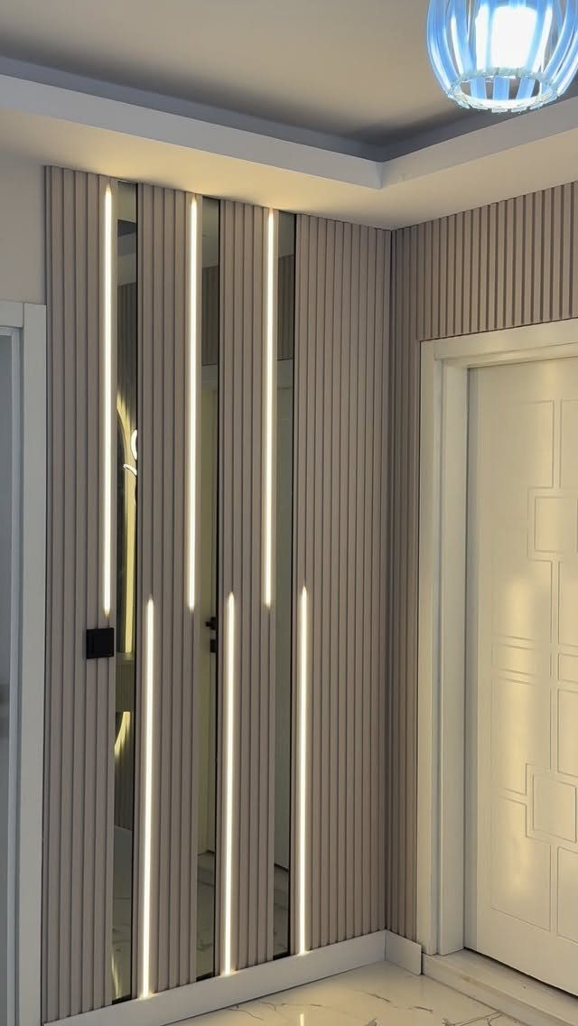
Vertical slats with recessed LED strips give a hall the rhythm of paneling without the formality. The light reads as architectural, not decorative; it grazes the wood grain and makes the texture visible after dark.
I have seen this done with real wood and with wood-look tile; tile wins for durability near an exterior door, wood wins for warmth in an interior passage.
The mirrored strips between slats in some versions double the light, but they also reflect every fingerprint and vacuum scuff.
This idea asks for a flat wall and some electrical skill. If you are not comfortable cutting into drywall for the wiring, battery channel lights exist, though they need charging every few weeks.
13. Black Paneled Grid Mirrors
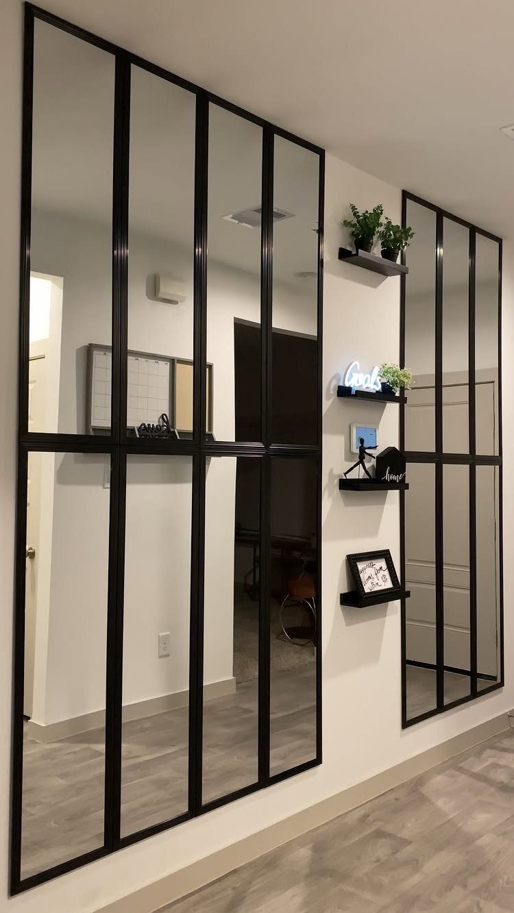
A grid mirror turns a hallway into something that reads like architecture rather than decoration. I like these best in pairs or runs because the repetition gives you that built-in feeling without the built-in price.
The frame weight matters more than you’d think. A hollow plastic frame looks cheap up close and worse from farther down the hall.
Check the hanging hardware before you buy; these need two points, not one wire, or they’ll tilt.
Small floating shelves between the mirrors give you a place for a plant or a sign without cluttering the reflective surface itself. Black keeps it sharp; gunmetal works better in hallways with cooler tones.
14. Mirrored Wall Panels
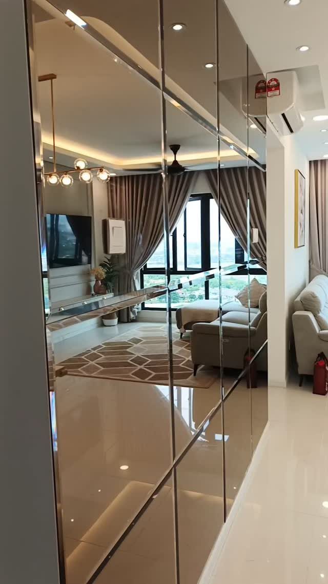
Bronze-tinted mirror panels do something ordinary silver cannot: they warm the light they throw back instead of cooling it. A full wall of them reads as intentional where a single large mirror might read as leftover.
The grid breaks the reflection into manageable pieces. Without it, you get that gym-mirror effect, your own face repeated to infinity.
The grid gives you windows instead.
Installation needs a flat wall and a patient installer. Any bump in the drywall telegraphs through.
If you’re renting, this is a landlord conversation, not a weekend project.
I’d run LED strip along the top edge, hidden in a shallow crown. Spotlights will highlight every cleaning streak on a mirrored surface; grazing light across it is the better choice.
From above, the reflection does the work.
15. Decorative Plate Wall Display
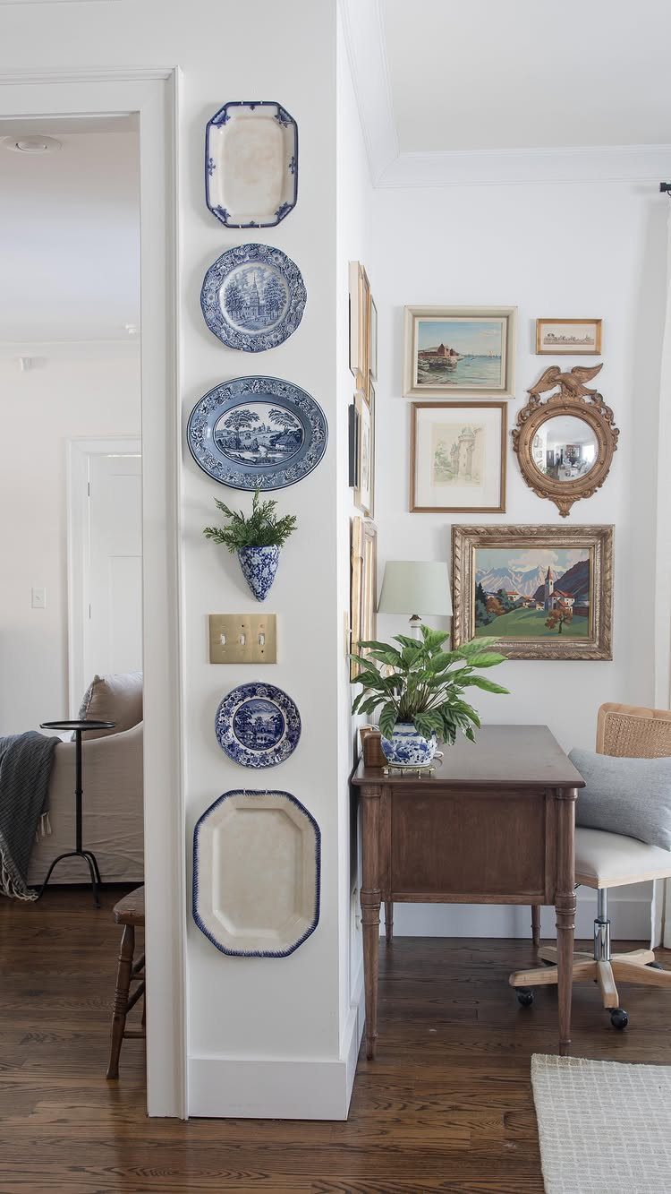
Vertical arrangements read taller than horizontal ones; in a narrow hallway, that upward draw matters. Blue and white plates against white plaster give you pattern without color competition.
The mix of sizes keeps it from looking like you bought a set. A platter, two dinner plates, a salad plate, a wall pocket with something trailing: that’s enough variety to feel collected, not assembled.
Thrift stores and estate sales are your friends here; matching reads as new, and new reads as thin.
Hangers need to match the plate weight. A wire plate hanger that fails in the middle of the night leaves you with ceramic shards and drywall holes.
For anything larger than a salad plate, I use two hangers, not one.
The wall pocket is the move I’d steal: it breaks the flat pattern and gives you something living.
16. Dark Wainscoting and Paneling
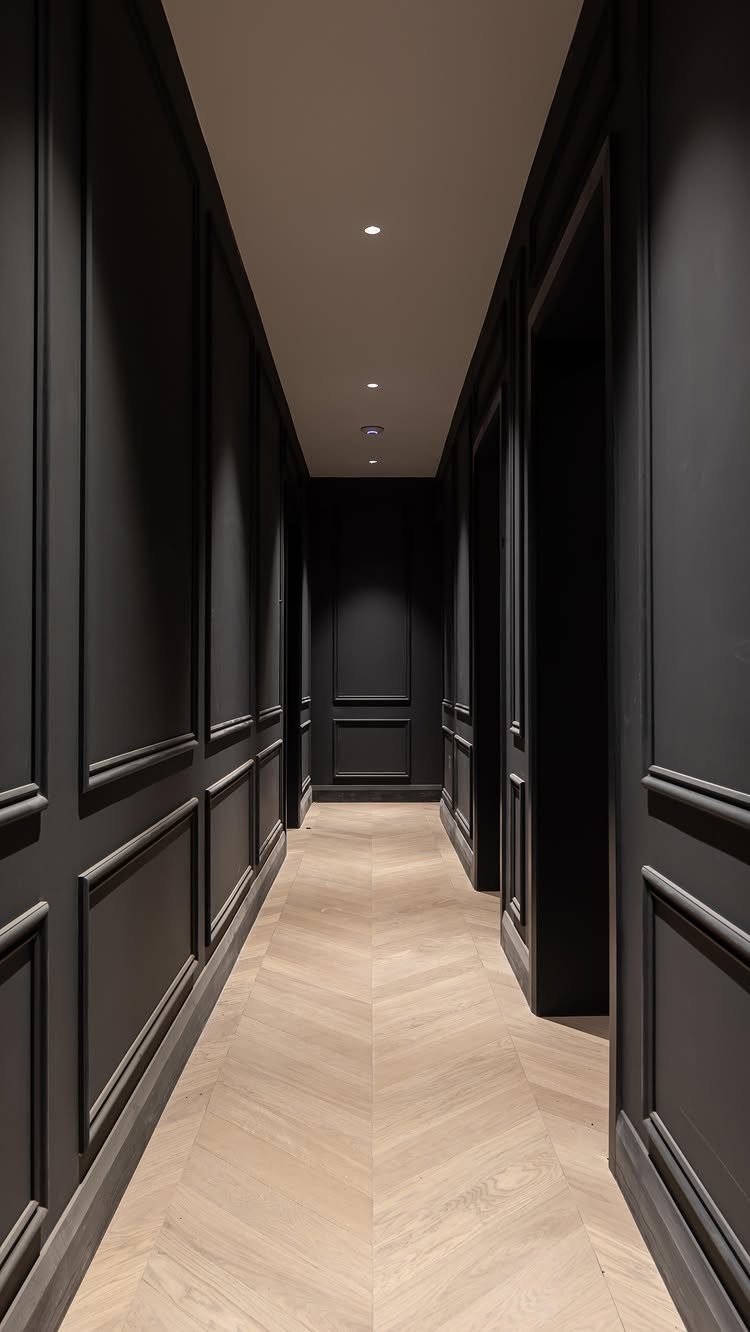
Dark wainscoting in a narrow hall sounds wrong until you see it. The darkness recedes; the molding catches what light there is.
Herrbone floors help, their geometry pulling the eye forward so the walls don’t close in.
Recessed spots in the ceiling, not the wall. Wall washing would flatten the panel detail; downlight grazes the molding and builds shadow.
The contrast is the point.
Charcoal reads softer than black, especially under warm bulbs. Two coats minimum, and a satin finish, not matte.
Matte chalks on molding.
If your hall has no window and you hate switching lights on, stay lighter. For evening arrivals, though, this feels like entering a room, not passing through a tube.
17. Framed Branch Shadow Boxes
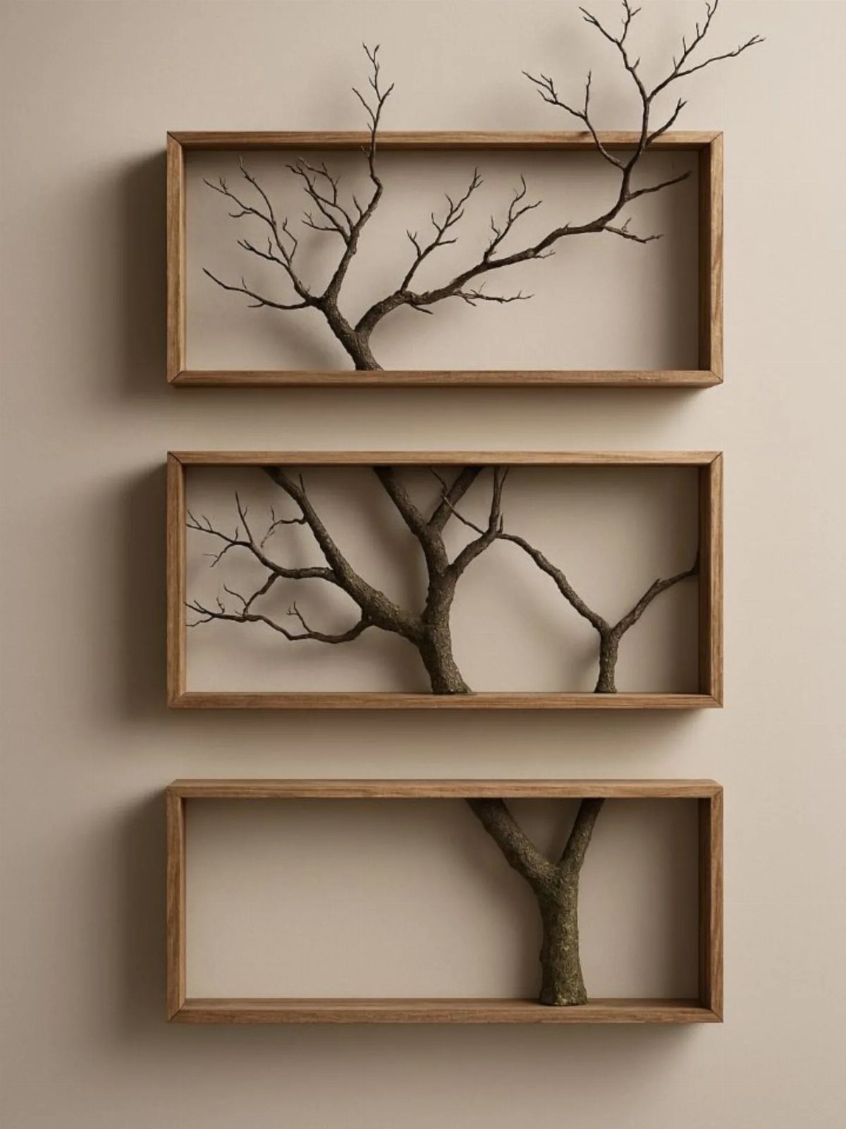
One branch, three frames, the segments aligning across the gaps: it’s a puzzle that solves itself if you lay it out on the floor first. The beige wall here is doing work; anything busier would compete with the branch’s silhouette.
Shadow box depth matters. Too little depth crushes the twigs against glass; more lets them float.
I build mine from 1×2 pine and half-inch plywood backs, nothing fancy. The branch should be fully dry or it’ll drop bark inside the frame for years.
The vertical stack draws the eye up in a low-ceilinged hall. Horizontal would feel like a fence.
Stain the wood to match your floors or go deliberately lighter; mid-tone against mid-tone muddies both.
This suits renters who can patch small nail holes. The frames are light, the statement is quiet, and the materials cost less than a single framed print of similar size.
18. Slatted Wood and Marble Feature Wall
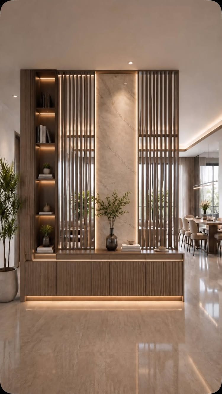
Wood slats with marble between them sounds like a hotel lobby, but at residential scale it reads as craft. The slats give you grain and rhythm; the marble panel gives you something cool and still to rest your eye.
The integrated lighting is what makes it practical, not just pretty. Strip lights set behind the slats turn them into a lantern at night; the marble reflects without glaring.
I’d wire this to a dimmer, not a switch.
Freestanding works if your hall is wide enough; otherwise, treat one wall.
Marble-look porcelain costs less and holds up better in a high-traffic corridor. Only you and your contractor will know the difference, and only if you tell them.
Choosing Colors for Walls
Jewel tones work best when you commit to 2 or 3, not a scattered handful. Emerald, sapphire, or ruby against white or grey walls gives you a focused accent that reads intentional rather than accidental.
I would pick one tone for the larger pieces, a second for smaller frames or shelf edges, and stop there.
Metallic frames in copper, silver, or champagne gold add another layer without introducing new color. They catch light differently than paint and give you movement as you walk past.
For fabric hangings or macramé, go brighter and more contrasting than you would with solid furniture. These pieces can swap out seasonally; a yellow wall hanging in January lifts a room differently than the same yellow in July.
Match artwork to your rug or upholstery, not your wall, so the connection reads as depth rather than matching.
Lighting for Wall Decor
Layer your light sources instead of relying on one overhead fixture. Ceiling lights, floor lamps, and wall sconces together let you adjust the room through the day.
Picture lights serve artwork directly; sconces graze molding or wash a texture. Dimmers on everything let a hall shift from morning passage to evening arrival.
Warm light suits halls better than cool white, especially where wood furniture or pastel walls need flattering. The glow that bounces off a console or bench at 2700K reads as invitation; the same wall at 4000K reads as institution.
I would place a sconce where it lights a face, not just a wall. A hall is where you check your reflection, hand someone a bag, read a label.
Light that skims past you misses the point. Battery-operated sconces with remote dimmers exist now for renters; they cost more upfront but leave no landlord conversation behind.
Creating Visual Interest
Texture and color together do more than either alone. A single textured surface in one tone reads as material; the same texture against a contrasting ground reads as pattern.
I would start with the wall itself: paint, paper, or paneling sets the base, then build forward.
An accent wall in a hall works differently than in a living room. You pass it, you do not settle in front of it.
The color or texture needs to reward brief attention, not sustain long study. Bold reads better here than subtle; a muted texture at 3 feet per second flattens to beige.
For depth, stack your elements in real space, not just on the surface. A shelf projects, a frame recesses, a sconce casts shadow.
The eye reads these separations as richness without clutter. A tight palette saves a narrow space when the forms start to vary; busy color plus busy shape exhausts the eye before you reach the living room.
Functional Decor
Every piece in a hall should earn its floor space twice. A bench with shoe cubbies, a console with drawers, an ottoman that opens: these keep the surface clear for the daily performance of entering and leaving.
I would rather one piece that stores than two that only display.
Hidden storage beats open for anything you use less than weekly. Seasonal items, extra bags, the shoes you keep meaning to donate: out of sight keeps the hall from feeling like a closet with ambitions.
Open storage is for daily shoes, the mail you will sort tomorrow, the keys.
In a narrow hall, every piece that does more than one job earns its floor space twice over. A nesting table that expands for sorting mail, then tucks back, preserves the width you need to pass.
A TV unit with hidden drawers in a hall sounds odd until you use it for gloves, dog leashes, the rechargeable vacuum. The best hall pieces look like they belong there because they actually do the work.
Frequently Asked Questions
What are some creative wall design ideas for a hall?
A textured 3D geometric relief wall, a bold matte black accent wall with raised moulding, or a peel-and-stick wallpaper mural each turn a blank hall into something intentional.
A gallery wall mixes frames and a mirror to break up a long passage, while vertical wood slats with recessed LED strips add rhythm without formality.
Stone veneer and professional installs push the cost and timeline much higher than paint, peel-and-stick paper, or a gallery wall you hang yourself.
How to style a hallway wall?
Start with what your hall actually gives you: light, width, and where your eye lands first. A console with a leaning mirror or a small gallery ledge keeps the floor layout flexible, which matters in a rental.
I measure width before buying anything with depth; a hall tree or bench can turn a passage into a bottleneck if you are not careful.
What are the trends for decorating hallways in 2026?
Warmth and sustainability are steering choices: solid wood, rattan, and bamboo show up in hall trees and slat walls, while modular pieces suit renters who move.
Pastel tones and hidden lighting replace the brighter, busier looks of a few years back.
Bold color is still in, but it is showing up as one dark wall with intentional molding rather than all-over saturation, and mixed materials like wood slats with marble-look porcelain give residential halls the feel of craft, not hotel lobbies.