Bathroom beadboard can climb to the ceiling, stop halfway, or frame a single door, and the height you choose changes the whole room more than the color does.
What separates one idea from another is whether you want the boards overhead, at waist height, or wrapping one wall, and whether you need them to handle moisture or just add texture.
A brad nailer rented for a weekend and a sample panel held against the wall at different heights will keep you from the common mistake of boards that stop short of existing trim.
1. Beadboard Ceiling
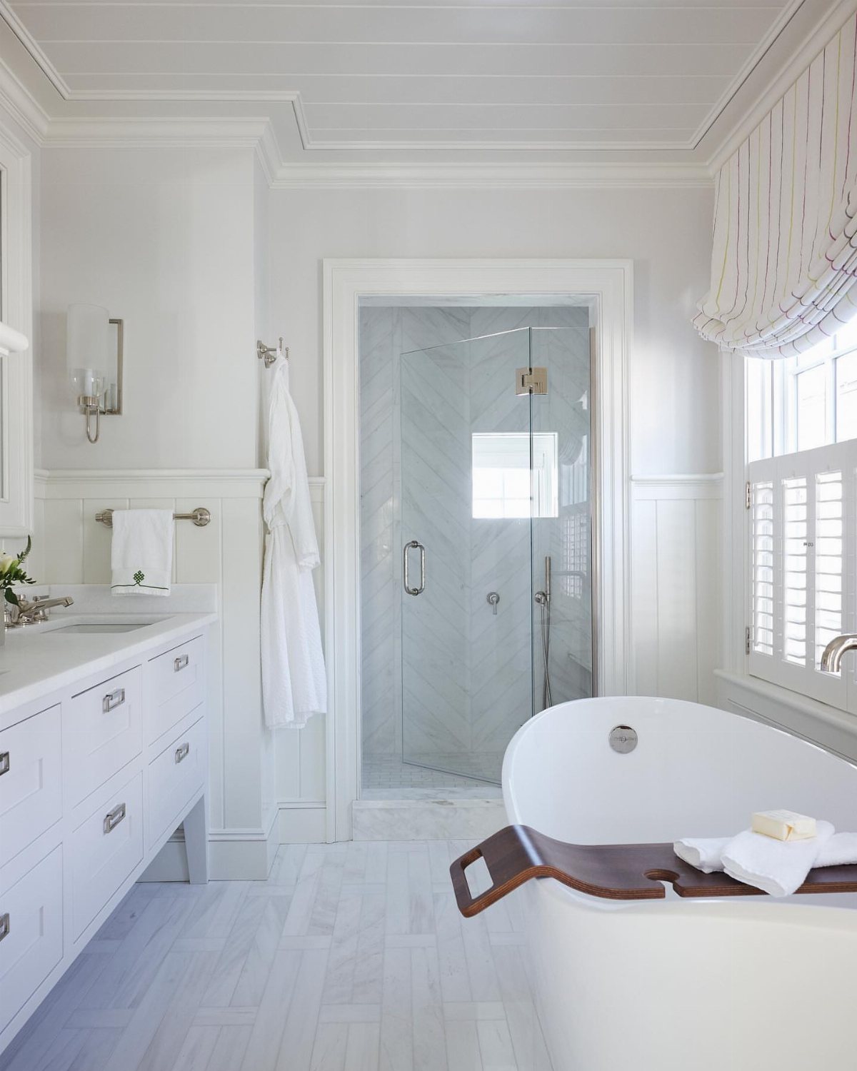
Running beadboard overhead turns a flat ceiling into something with shadow and rhythm, and in a bathroom where every wall already has a job, it gives you texture without sacrificing towel hooks or art.
White keeps it airy and reflects light back down into the room, though I have seen a soft sage or pale blue up there that pulls the eye upward without crowding the walls.
The boards need solid backing since moisture collects at the top of any bathroom; rent a brad nailer for a weekend if you do not own one.
This suits renters in older homes with cracked plaster ceilings they cannot fix, and anyone who wants cottage character without cluttering the space they actually use.
2. Half-Height Beadboard
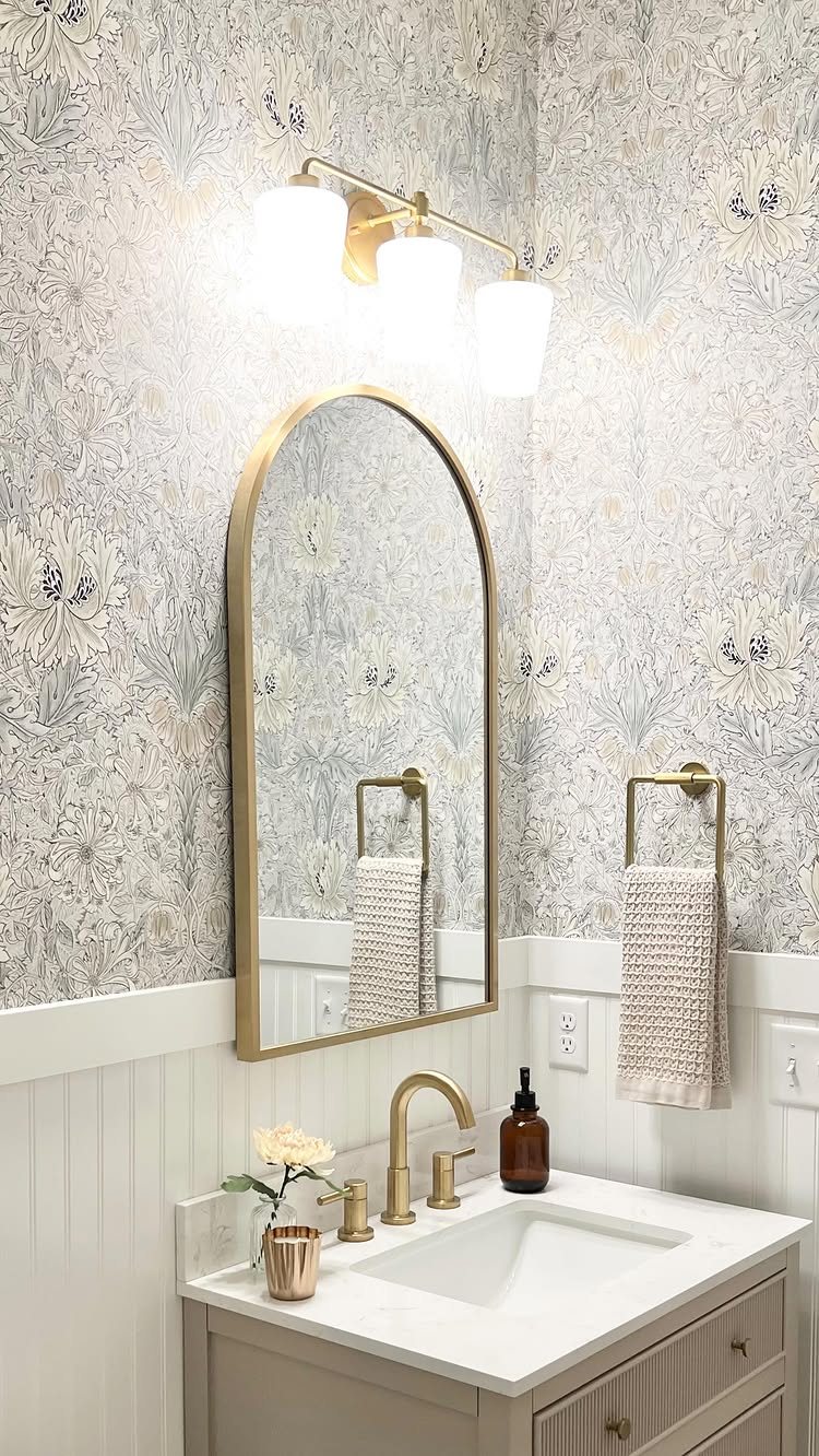
A chair rail splits the wall into two territories, and that line does more than protect plaster from splashes. Floral wallpaper floats above crisp white boards; the beadboard grounds the pattern so it never reads as too much.
Paint or paper above needs enough contrast to matter: if both halves whisper, the eye misses the architecture.
This works for anyone who wants pattern but not a full commitment, and for bathrooms where towels and fixtures already compete for attention.
3. Striking Dark Beadboard
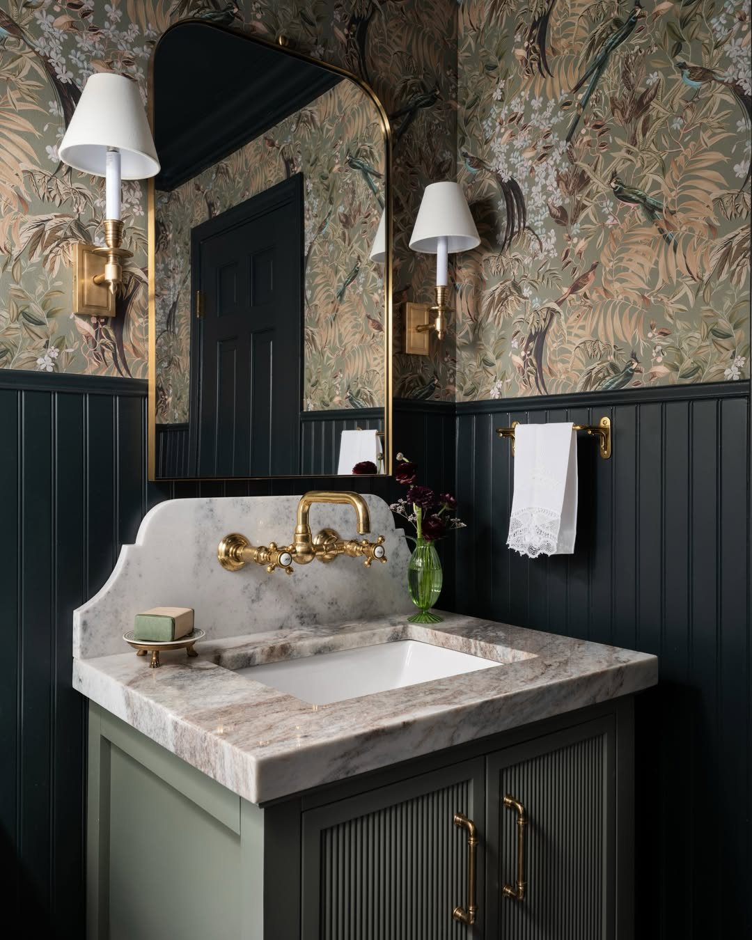
Charcoal or navy beadboard risks closing a small room in, but paired with brass and a light wallpaper above, it reads as deliberate rather than heavy.
The finish shows lint and water spots more readily than white, so a satin or semi-gloss sheen helps; matte on dark boards looks rich for exactly 2 days.
I would reserve this for powder rooms that guests see but do not live in, or for baths with good natural light and a vent fan that actually moves air.
The maintenance is real, yet you get a space that photographs like a magazine spread on what you spent a Saturday installing.

Transform your space effortlessly without searching for separate parts. Each package comes complete with 8 premium main wall panels and 2 perfectly matching finishing trims. This curated set provides everything you need to create a cohesive, designer-level accent wall or elegant half-wall paneling right out of the box.
4. Low Bathroom Beadboard
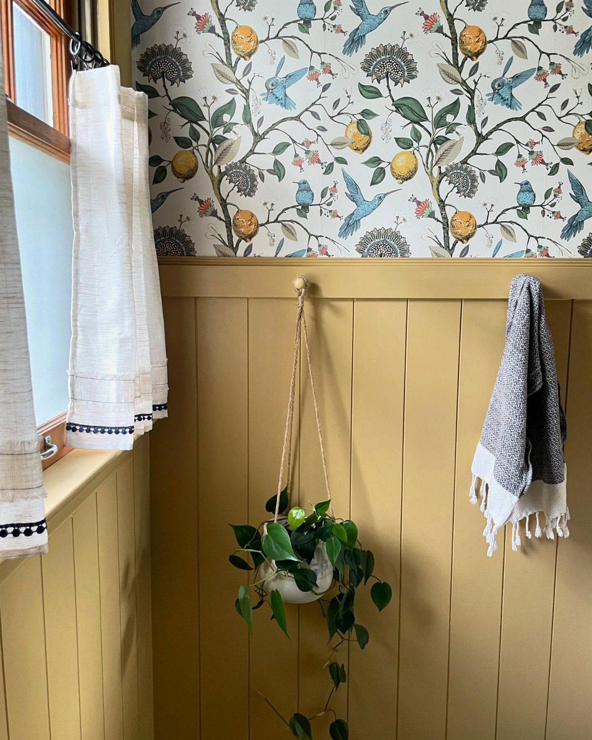
Yellow beadboard sitting well below the traditional chair rail height changes the proportion of the whole room; it reads as furniture or wainscoting from another era rather than standard trim.
Contrast matters: a color that pops against whatever lives above it, whether that is wallpaper, paint, or bare plaster. Check your baseboard height before you start; boards that stop awkwardly short of existing trim look like a mistake.
I would measure twice and buy one sample panel to hold against the wall at different heights. This suits bathrooms with high ceilings that need bringing down to human scale, and anyone bored by the expected chair-rail height.

Size: 2" W x 6" L Handcrafted by Mexico's Finest Artisans Each item is hand-painted individually, small differences in color from the picture shown are expected. Color...
5. Beadboard Bathroom Wallpaper
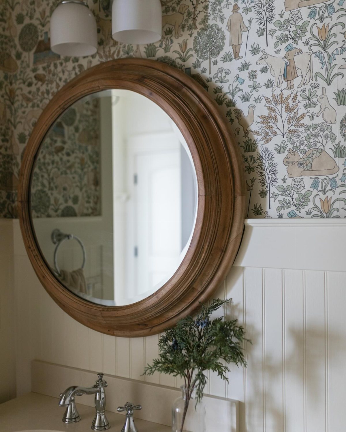
Beadboard below and wallpaper above is not a new combination, but the coordination of color is what keeps it from looking like two ideas colliding.
Pull one tone from the paper and match it to the board paint exactly, not approximately; the eye catches near-misses faster than outright contrast.
Check your paper’s repeat pattern before cutting: a large motif needs more height above the rail to breathe.
This works for renters who can paper a small bath in an afternoon and repaint the boards back to white when the lease ends.

PRIMED & READY TO PAINT: Factory-primed solid pine planks are ready for your chosen paint color, helping you create beautiful beadboard wall panel designs for wainscoting, bathrooms, hallways, and interior wall panels. Each box includes 12 individual wainscoting planks that install one by one to create a wainscot look. One box covers up to 3.5 linear feet of wall when installed vertically. As a natural wood product, allow 48–72 hours for acclimation before installation.
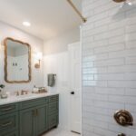
6. Beadboard Door
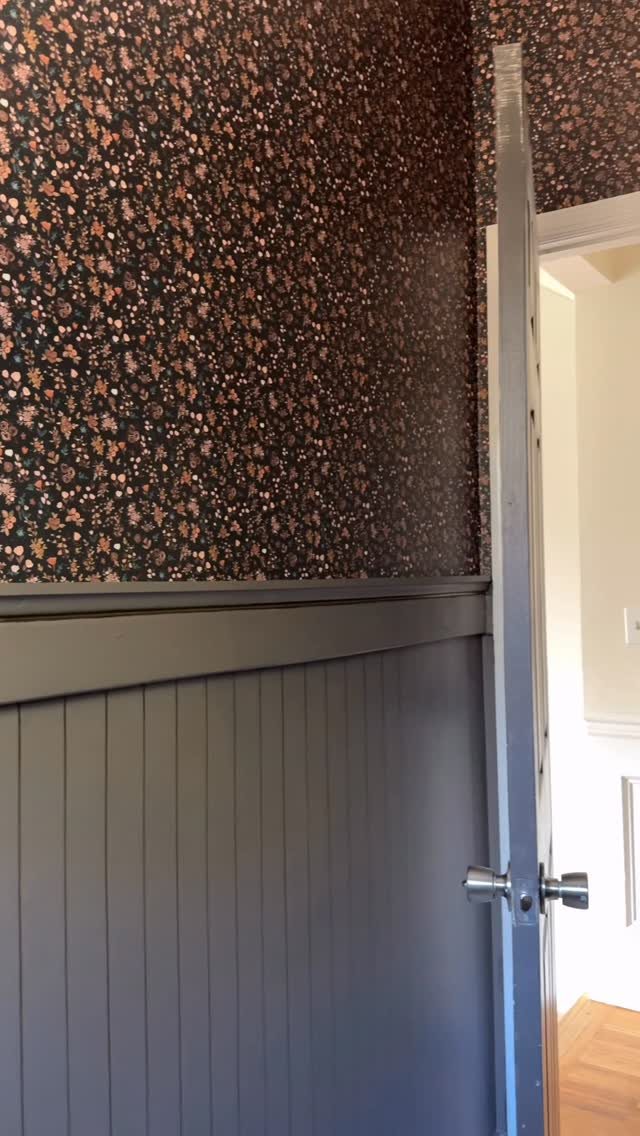
A linen closet door is wall space you already own, and beadboard there gives texture without requiring a full room commitment.
Grey boards with a silver handle let the color match the chair rail line so the door reads as architecture, not afterthought.
Any flat-panel interior door can take applied beadboard, though hollow-core doors need shorter brad nails to avoid punching through.
I would do this on a closet that faces the toilet or tub, since that is where the eye lands when the room is in use.
It trades away the sleek modern door, obviously, but for bathrooms where every wall is already spoken for, it is a way to sneak the detail in without rethinking the whole plan.
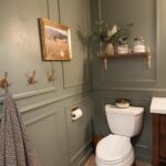
7. Sage Green Beadboard
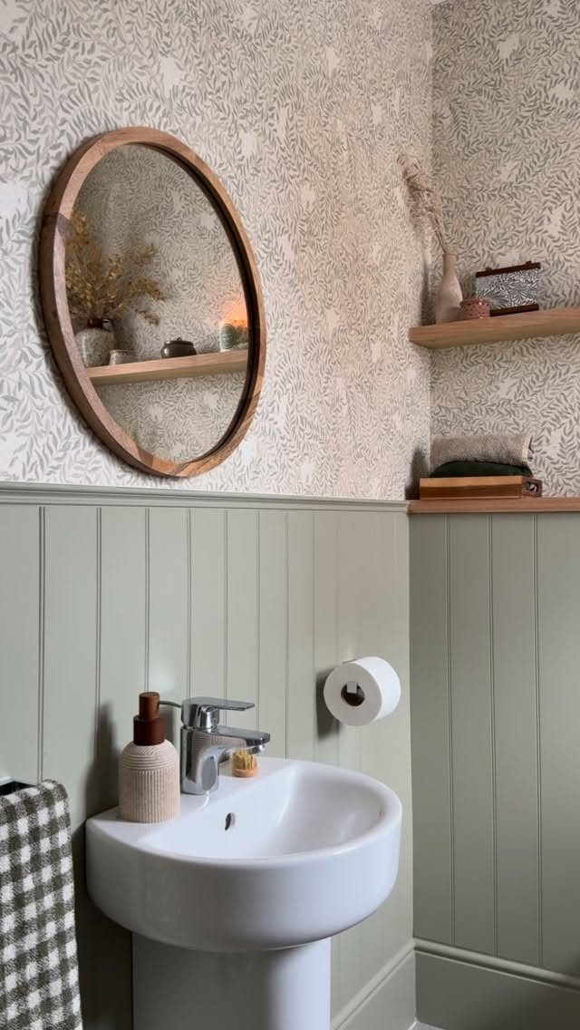
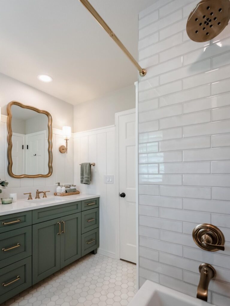
Sage green beadboard reads as a color choice and acts as a neutral.
It carries enough pigment to feel intentional against white fixtures without demanding the room’s full attention, which makes it a safe middle ground for renters who want personality they can paint over later.
Botanical wallpaper above sage green beadboard works because both share a muted saturation.
I’d test this by holding your wallpaper swatch against the green at the store; if one looks electric next to the other, shift the beadboard lighter or the paper quieter.
Vertical boards draw the eye up in small baths where horizontal lines would widen an already tight floor plan.
This suits someone who likes collected, slightly English interiors and already owns wood tones to echo. Skip it if your bathroom gets no natural light; sage turns muddy in yellow bulbs.

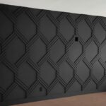
PREMIUM MATERIAL: Made from high-quality polyurethane with advanced molds and surface treatment technology, highly restoring the delicate texture and natural color of rocks....
8. Light Blue Beadboard
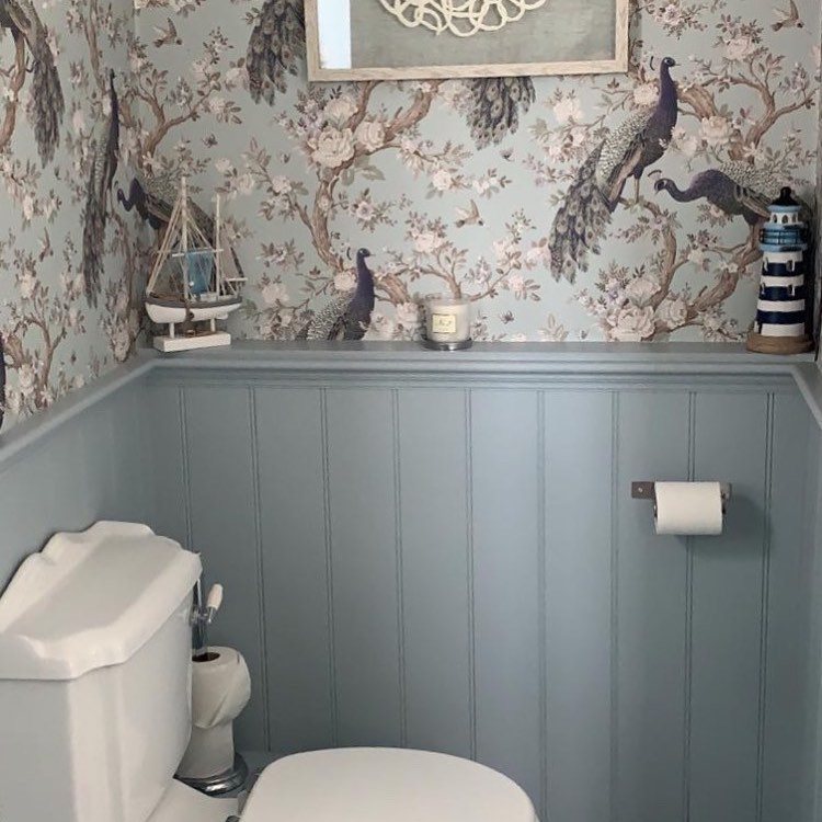
Soft light blue carries the same spatial trick as white but registers as a decision. Peacock wallpaper beneath light blue beadboard gives you coastal without going thematic; that is the reason to choose this shade over safer options.
I’d split the difference for most readers: this lighter blue keeps a small bathroom from feeling like a cave, while navy demands the white-tile contrast and stronger light that few weekend budgets include.
PVC or moisture-resistant MDF matters here, same as any beadboard bath; seal every edge where humidity collects, especially behind the toilet.
I’d pick this for a half bath guests see but do not linger in, where the color makes an impression and the scale keeps it from overwhelming.
9. Light Grey Beadboard
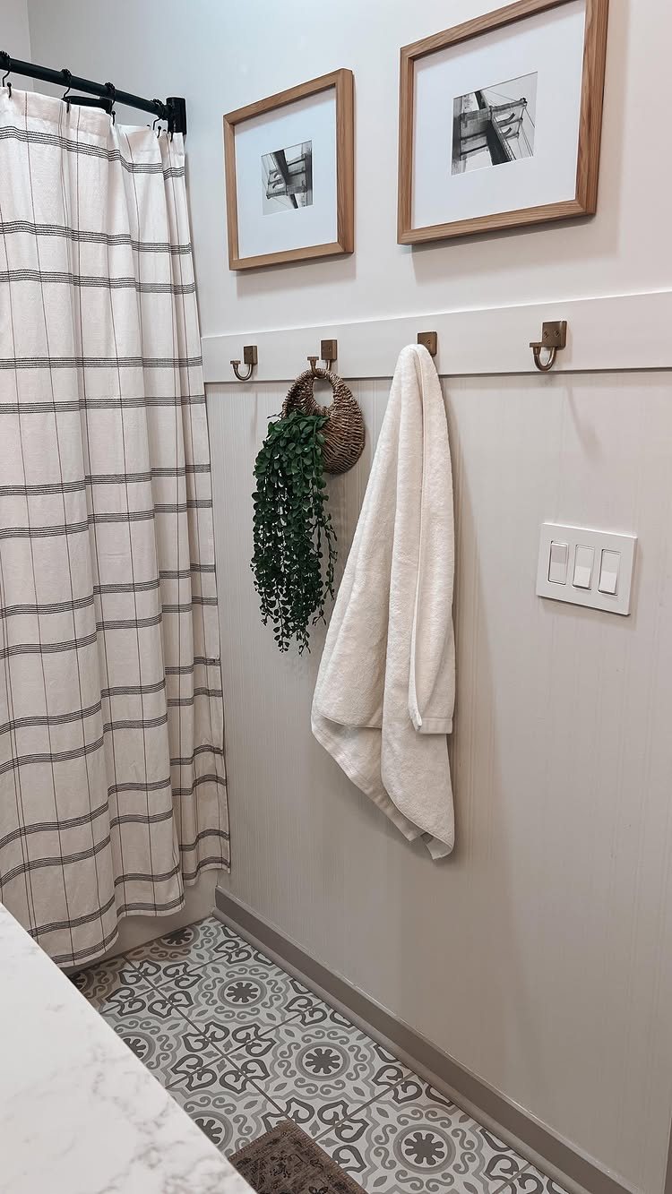
Light grey beadboard with peg hooks turns the wainscoting into storage, not just finish.
Towels and a hanging plant against light grey beadboard mean the paneling earns its wall space twice; in a bath where every inch counts, that efficiency matters more than the color itself.
Grey at this value sits between white’s cleanliness and blue’s mood, so it pairs with either direction above it. Patterned floor tiles, like the ones visible, work because the grey picks up their quieter tone without competing.
I’d keep the pegs natural wood; painted ones would fracture the calm. Moisture-resistant MDF or PVC, sealed edges, the same rules apply, though grey hides water marks better than white if your seal ages.
This is the entry for readers who collect art or rotate textiles and need a neutral stage.
Grey reads as contemporary, and in a house full of honey oak trim from the era of oak everything, the contrast might feel like a mistake rather than a choice.
10. Warm Beige Beadboard
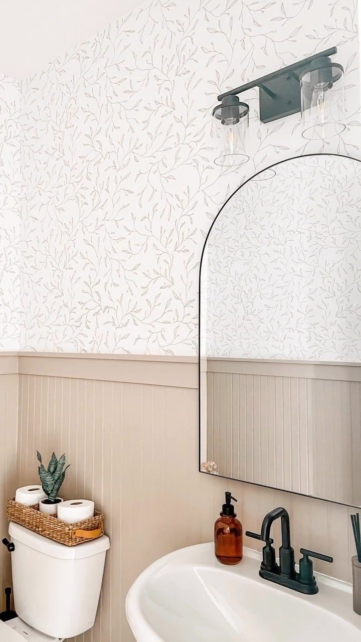
Warm beige beadboard does what white does for resale value with more texture and less glare.
Vine-patterned wallpaper above warm beige beadboard gives you neutral on quiet pattern; that is how you build a bathroom that photographs well without looking like you tried.
Two paint names worth testing on your own wall are Sherwin-Williams Accessible Beige and Benjamin Moore Pale Oak; beige shifts dramatically under fluorescent versus LED versus morning window light, and the chip in the store is a fiction.
Black accents, the faucet and mirror frame here, keep beige from reading as builder-grade default. I’d add those last, after the paneling and paper are up, because beige with chrome reads entirely different, more rental, less considered.
This is the choice for someone who wants the bathroom to feel finished in 2 years when the rest of the house is still mid-project.

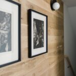
𝐀𝐭𝐭𝐞𝐧𝐭𝐢𝐨𝐧: This is Non-Textured wood slat wallpaper, not real 3D wall panel, smooth finish with wood slat look 𝐏𝐫𝐨𝐝𝐮𝐜𝐭...
Moisture Resistance
Humidity collects at the ceiling line and behind the toilet; unsealed edges swell in weeks, not years.
Renting a brad nailer and a paint sprayer the same weekend pays off fast; brushing polyurethane into every groove by hand turns a short job into one that drags across half a week.
Reclaimed beadboard gets mentioned for its patina, but the sealing matters more than the story behind the wood. Two coats of exterior-grade polyurethane on all six sides of each board, including the ends you cut to fit.
Check the fan rating while you are at it; 50 CFM minimum for a half bath, 80 for anything with a tub.
Easy to Care for
Satin or semi-gloss sheen is what makes beadboard wipeable, not the material itself.
Matte paint in a bathroom traps soap scum in the grain; I have seen it happen in a rental where the previous owner went cheap on the finish. A damp microfiber cloth with plain dish soap handles most marks.
The vertical grooves collect dust if the sheen is too flat, which means darker colors need more frequent attention whether you chose charcoal for drama or just inherited it.
PVC beadboard exists for a reason, and that reason is a bathroom with teenage boys or a vent fan that wheezes.
Texture and Depth
White or soft grey performs better in dim light because the grooves themselves become the texture; color competes with shadow when the bulb is your only window.
Wrapping all four walls works in a powder room under 40 square feet where the door is usually closed and the occupant stands still.
The bead detail, that thin ridge between boards, catches light differently than flat paneling; it is the difference between texture and just lines.
Color Choices
Test a sample patch at home, not the chip in the store; the store bulb is a lie. Gray, mint, periwinkle, and navy are the other choices that keep appearing, each with its own demands.
Navy needs brass and good light or it becomes a cave; mint wants white fixtures and reads as dental office with chrome.