Wainscoting in an entry runs from a weekend of board-and-batten and a few hundred in lumber up to custom picture-frame molding that eats a whole room’s budget.
The deciding factor is what your entry already gives you: light, width, and whether you need to take it with you when you leave. White Down OC-131 goes greige; Iron Mountain 2134-30 reads charcoal without tipping dark.
1. Wallpaper and Wainscoting
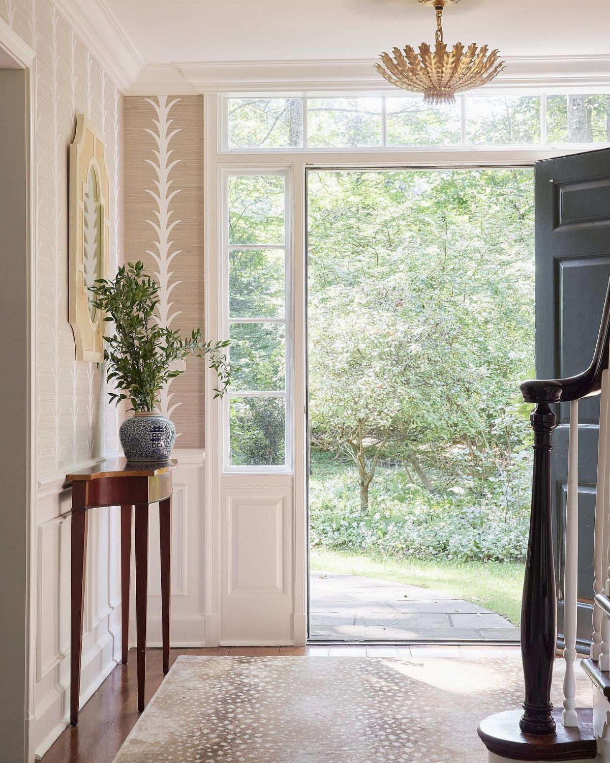
Pairing wainscoting with wallpaper hands you pattern without letting it take over the whole room. White boards below and a lively paper above keep the entry feeling grounded, not busy.
I’d wallpaper the upper half first, then paint the wainscoting in a tone pulled from the paper itself so the two talk to each other instead of competing.
Coastal colors work well here, something with a little warmth that won’t fight whatever light your entry gets. This one suits renters, too, if you stick peel-and-stick paper above prefab panels you can remove later.

Unique Design: This boho wallpaper features a soft beige and light brown leaf pattern on a white background, accented with geometric lines, adding natural elegance and vibrant energy to your space

【COTTAGE FLORAL DESIGN】This seamless floral wallpaper features light blue and soft sage green, adorned with a pattern of continuous single-stem hand-drawn flowers. Printed on a background with a fine linen texture, it captures the gentle, warm feel of natural fabric. All colors are softly muted to low saturation for a gentle, non-harsh tone, adding depth and a cozy, natural ambiance to living rooms, bedrooms, entryways, and various spaces
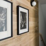
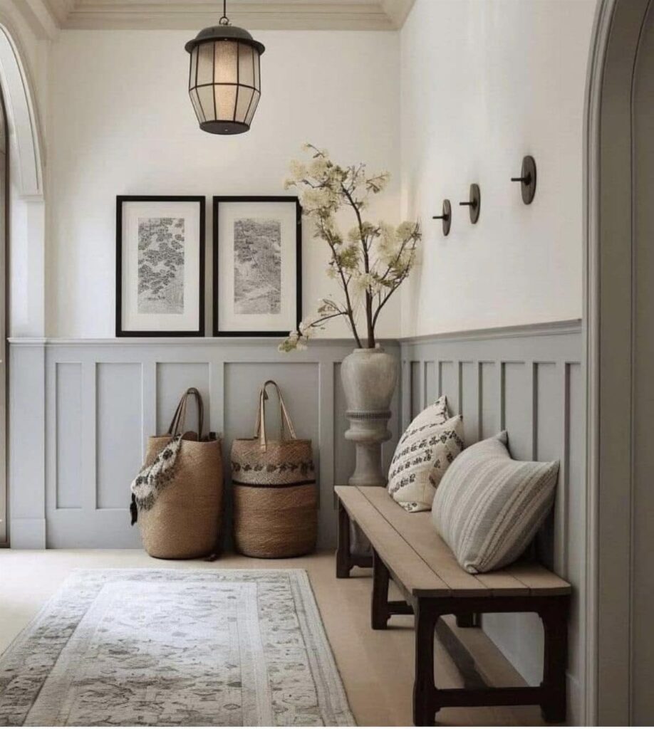
2. Modern Beadboard
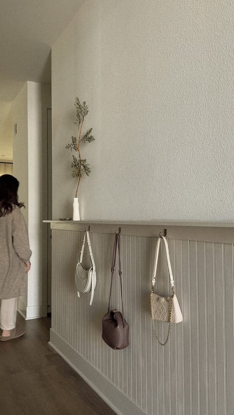
Vertical beadboard reads cleaner than the horizontal kind your grandmother had. Run the boards floor-to-ceiling or stop at chair height and cap them with a narrow shelf, deep enough for a small vase or your keys.
Greige reads warmer than rental beige, and the beadboard gives you solid backing for screws if you want hooks. Gold hardware lifts the whole thing toward modern rather than farmhouse.
If your entry is narrow, the vertical lines draw the eye up and make the space feel less like a corridor you just pass through.

🏠DETAILS: Size 15.8 X78.8 Inch , total 8.65 sq.ft(40cmX2m),Wide of wood slat: 1.42 inch. Self adhesive (no extra glue needed). Made of durable pvc vinyl, faux beadboard wallpaper Peel and stick, Waterproof, Removable.
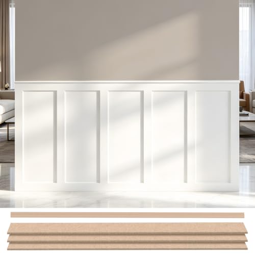
[Complete Board & Batten Wall Makeover] Refresh plain walls with a timeless board and batten design using one convenient kit. The premade panels and matching molding trim help create a clean, custom-built accent wall while reducing measuring, cutting, and assembly for a faster DIY installation.

Stylish Wall Upgrade: This wainscotting wall panel kit adds texture and charm to any space. The 37.8” tall beadboard panels create a beautiful decorative accent for living rooms, bedrooms, kitchens, studies, and more
3. Classic White Wainscoting
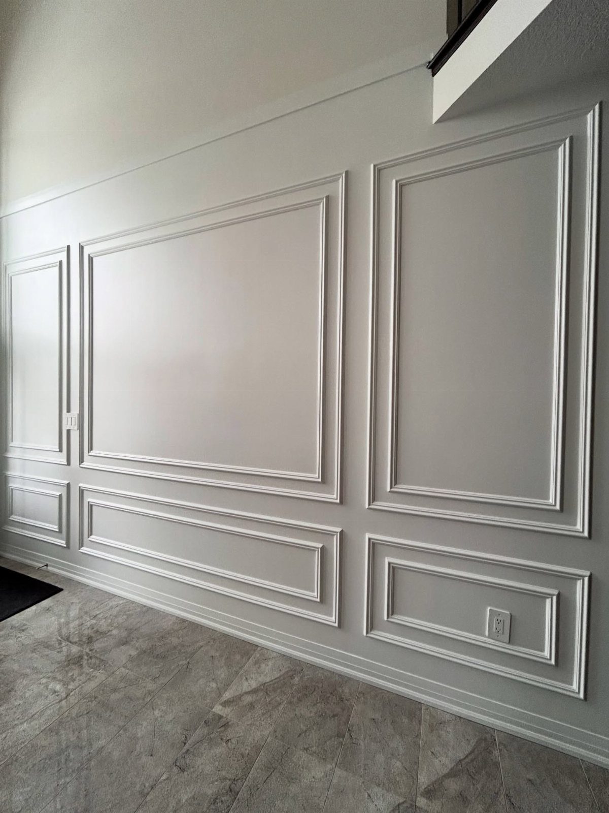
White wainscoting against a soft gray wall is the combination I keep coming back to when I want something that will still look right years from now.
Picture-frame molding, like what sits above these panels, adds the formality of old houses without their dust-collecting grooves.
Portland Stone and similar warm neutrals play well with oak floors if you have them, and the lack of color contrast means your console table or mirror becomes the focal point instead of the architecture.
This is the safe choice that does not read as boring, the one I’d point someone toward if they are selling in a few years.

Wall Molding Kit: The package includes 24 pcs wall molding (24in-14 pcs, 54in-6 pcs, 48in-4 pcs), which can be combined into 6 frames, allowing you to easily create a stylish accent wall. The 6-frame layout shown is designed for a wall measuring approximately 10 feet high by 11 feet wide. Please measure your wall and plan the layout before installation.

Wall Molding Kit: you will receive 3 sets of pre-cut peel and stick molding for walls, which can be easily matched and connected to give a sophisticated look to a door or wall, meeting your various decoration needs
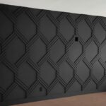
4. Dramatic Dark Wainscoting
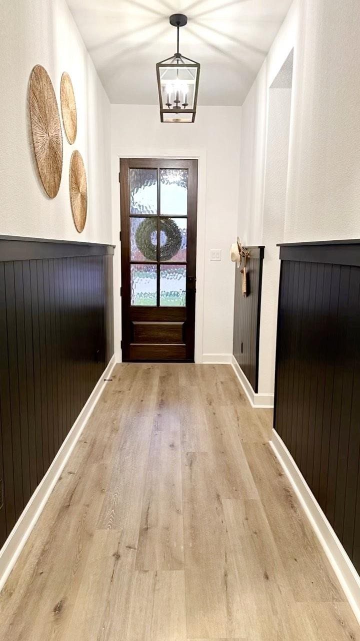
Black wainscoting in an entry sounds like a risk until you see it against white walls and pale wood floors.
The dark boards ground the space the way a dark sofa grounds a living room, and they hide scuffs from bags and shoes better than white ever will.
Iron Mountain 2134-30 sits right in that charcoal range, deep enough to read as intentional without tipping into goth.
Keep the upper walls light, add a brass or black lantern, and the entry becomes a room you pause in rather than pass through. This one trades away some natural light; use it where your entry already gets plenty.
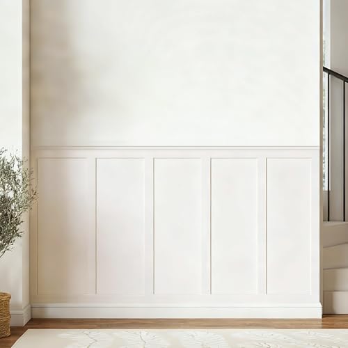
【Coverage】Includes 10 pre-cut wall molding slats and 2 shelf edge strips to create a clean board & batten look. (No peel-and-stick adhesive or nails included)

All-in-one Molding Kit: This premade board and batten wainscoting kit includes 20 molding slats and 3 decorative edge strips for quick accent wall assembly. It is supplied to build classic board and batten wall designs
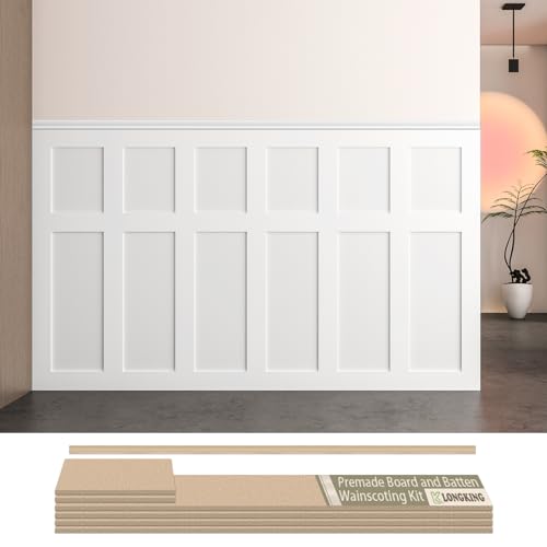
Board and Batten Wainscoting Kit – LONGKING pre-cut MDF wall panel kit is designed for easy DIY installation. Create a stylish accent wall with classic board and batten molding trim, perfect for modern and traditional home décor.
5. Color Drenching Wainscoting Entryway
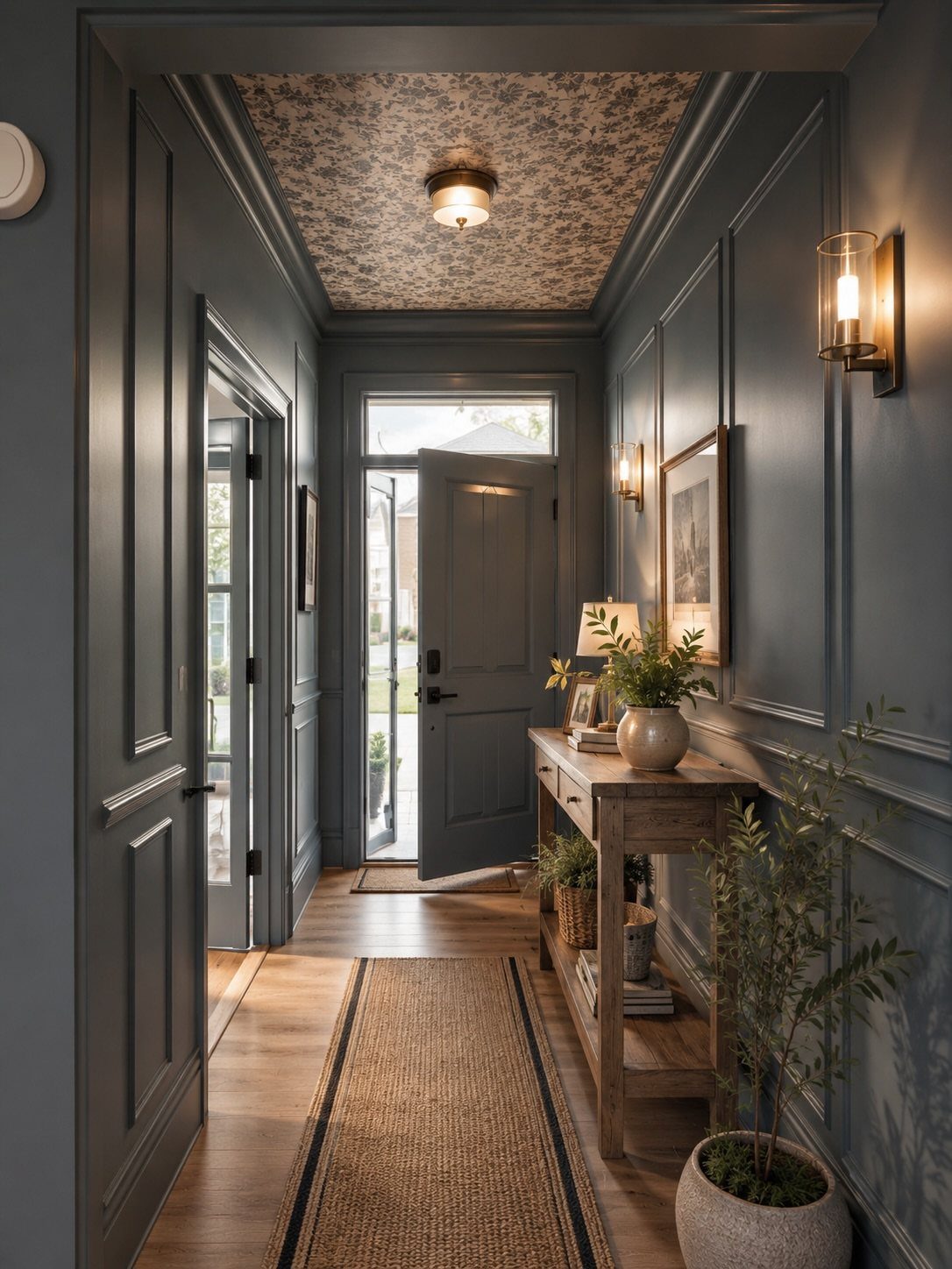
Color drenching means painting the wainscoting, the walls, the trim, even the ceiling in one saturated hue so the architecture becomes texture instead of contrast.
Without color variation, light and shadow from the paneling itself do the visual work, so the molding matters more here than in a two-tone room.
I’d add texture through a runner with some pattern or a ceiling paper, something to break up the flatness. This suits the decisive, the person who knows what they like and does not need a safe resale choice.

Immersive 3D Depth & Realistic Texture: Instantly elevate your interiors with our flowing stone design wall panels. The high-definition, cement-like texture creates dramatic dimensional relief, transforming living rooms, bedrooms, or offices into captivating spaces with profound modern character and artistic flair.

【All‑In‑One Wainscoting Set】Kit includes 8 vertical 3D fluted wall panels plus 2 matching top trim mouldings, forming one 60.2"W × 40"H decorative wall section.
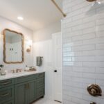
6. Light Grey Wainscoting
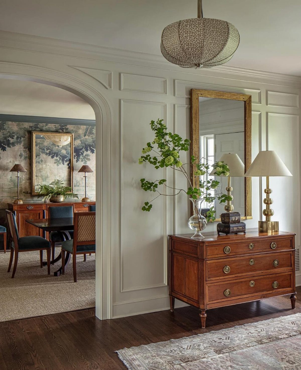
Pale grey wainscoting adds the texture of paneling without the formality of white against white. French Grey graduated across adjacent walls, lightening as you move deeper into the house, gives you subtle depth that reads as sophisticated rather than decorated.
Boards, a wooden dresser, and a mirror in a gold frame keep the entry simple without feeling bare. The grey lets the furniture speak.
For a minimalist scheme, this is how you add interest without adding objects; the paneling becomes the decor. I’d use this in a small entry where every piece of furniture needs to earn its floor space.

Warm Tips: Colors may vary slightly due to different lighting conditions and screen settings. We recommend purchasing enough rolls at once to ensure they come from the same batch for a consistent color match. Apply to a clean, dry, and smooth surface for the best adhesion

【SIZE&MATERIAL】17.3in X118.1in=14.16 sq.ft. Floral wallpaper,upgrading and thickening. Adopt vinyl and the latest removable glue,wallpaper sticks to any smooth, flat ,clean surface,No residue after removal.
7. Cream Wainscoting
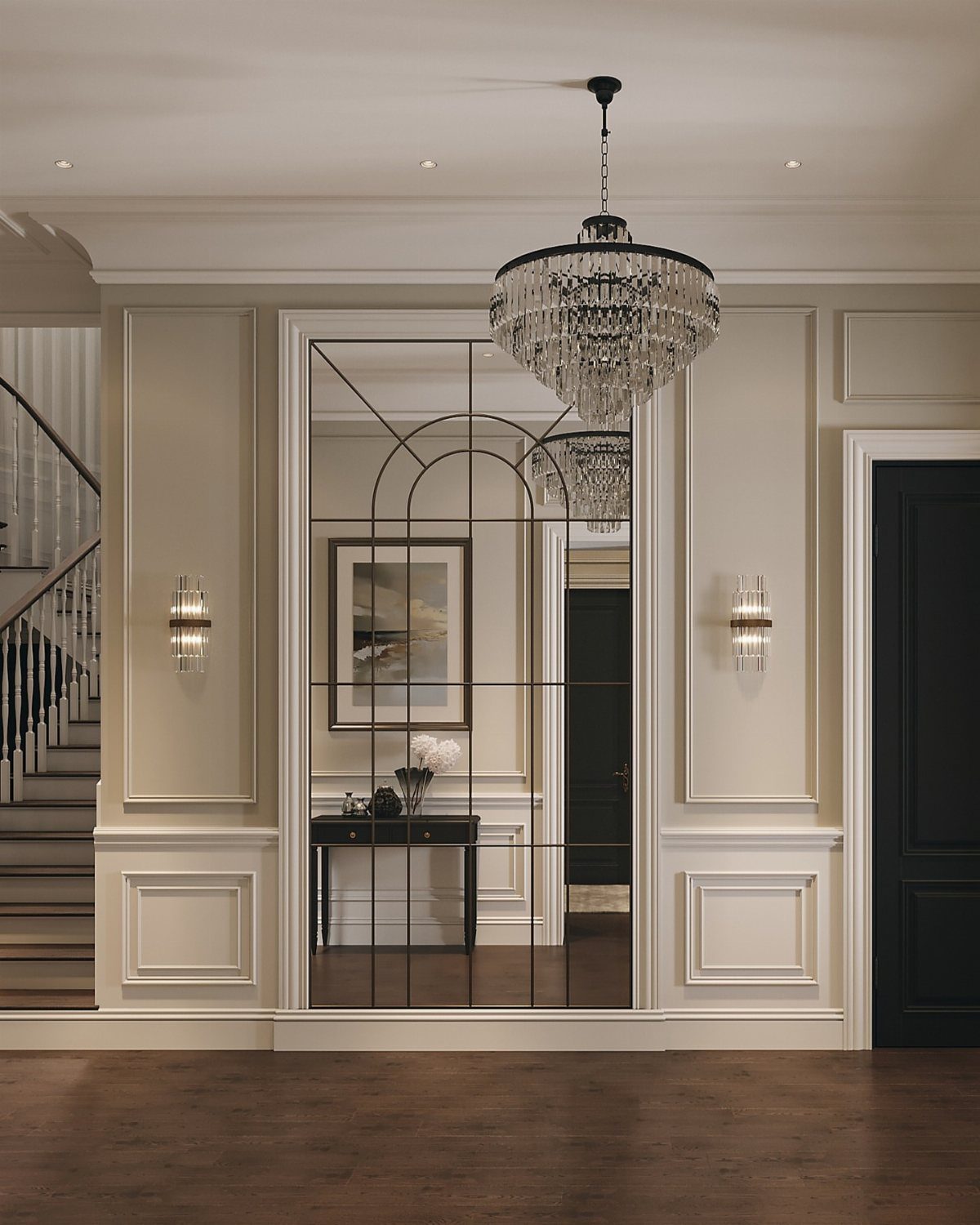
Cream wainscoting reads as warmth without the commitment of a real color. It pairs well with dark floors and brass fixtures, and it forgives the scuffs that white would show by Tuesday.
Cream wainscoting in a picture frame molding adds formality, but the same color in plain beadboard would calm a busier space.
I would check my light bulbs before choosing the shade: cream under warm LED can turn orange, and under daylight it goes flat gray. The sample needs to live on the wall for a full day.
This one suits renters preparing to sell, or anyone whose furniture already carries enough color.
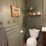
8. Olive Green Wainscoting
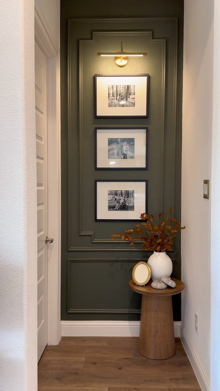
Dark olive green wainscoting narrows a hallway visually, which sounds like a flaw until you want the space to feel like a room instead of a passage.
Olive green wainscoting absorbs shadow and lets black-and-white photography and a small wooden table read as intentional rather than leftover.
Benjamin Moore pairs Dark Olive 2140-30 with Icicle OC-60 above the rail, a combination that keeps the green from going muddy. I would test that pairing in afternoon light, when olive can turn brown without warning.
Picture lights help, not for glamour, but because olive eats ambient light and the art needs its own.
Best for entryways with a window or a fixture you can upgrade; avoid it in a tunnel with a single overhead bulb.

High Quality Material - These molding panels are made of polystyrene material, which is hard and durable, lightweight, odorless, non-warping, and non-cracking. The quality is absolutely superior to that of foam molding panels.
9. White Board and Batten
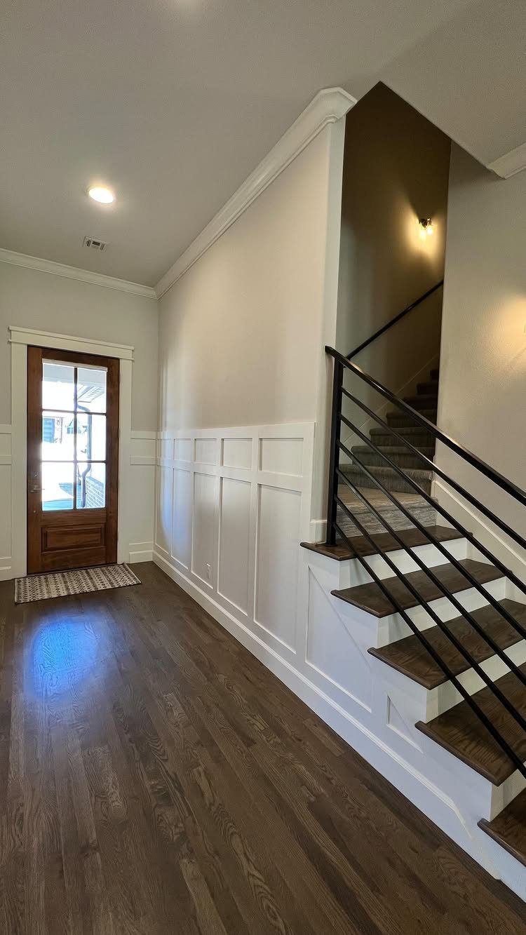
Board and batten carries more shadow lines than flat beadboard, which gives it presence even painted out in white. The vertical strips break up wall length, so a long entry hall feels less like a corridor.
White Down OC-131 goes greige, which I would choose only if the trim elsewhere already lives in that world.
The work is straightforward: boards cut to size, a top rail, a cap, and a saw that can handle repeated cuts square.
This is the entry for someone who wants the look of craft without the cost of custom millwork. A weekend and a few hundred in lumber usually finishes it.

【Complete Wainscoting Kit】Board and batten wainscoting kit includes 23 premade MDF molding trim slat and 5 decorative trim strips, covering 220in x 51in to create sophisticated board and batten wall decor
Choosing Wainscoting Colors
Cheerful color pairings turn an entry into a greeting. Atrium White OC-145 with Chestertown Buff HC-9 gives you warmth without weight, while Horizon OC-53 against Aegean Teal 2136-40 reads coastal and calm.
Kitten Whiskers 1003 with White Dove OC-17 reads the calmest of the three, soft enough that a narrow hall won’t feel busy.
For something livelier, two contrasting shades on upper and lower walls do the work of artwork; Acorn and Hopper is one pairing that pulls this off without looking like a color exercise.
I’d test any combination at the hour your entry sees the most traffic, morning or evening, since the light there rarely matches the room you mixed paint in.
Wainscoting Styles
Wainscoting styles fall into three practical camps. Beadboard is the fastest install and the most forgiving of uneven walls.
Shiplap reads horizontal and coastal; in an entry it can feel like a fence unless you break it with vertical elements.
The style you pick should eat up at least a third of the wall, though chair height at 36 inches is where tradition stops.
For paint, Advance Interior in a satin or semi-gloss holds up to the brushing an entry wall takes.
Durability of Wainscoting
An entry wall collects scuffs the way a kitchen floor collects crumbs. Wainscoting exists because British builders in the 1700s noticed the bottom half of a room took the damage; the paneling took it instead.
That function still matters. A scrubbable satin finish, something like Intelligent Satin, lets you wash off the marks from bags and boots without lifting the color.
I’d rather repaint a panel than patch drywall every spring.
Wainscot paneling—a paneled lining of an interior wall—was pioneered by British builders in 18th-century England who began adding Danish wainscot oak wood paneling to the bottom half of a room as a way to protect walls and provide additional insulation.
Combining Wainscoting with Other Elements
Wainscoting does not have to carry the whole design. Pairing a stronger color below with a quieter wall above, or the reverse, splits the visual load.
Carolina Gull 2138-40 against Paper White OC-55 is one combination that works this way; the wainscoting becomes the statement and the wall becomes the rest.
Colorado Gray 2136-50 with Snow White 2122-70 reads cooler, better for a south-facing entry that already gets warm light.
What the list does not say: the rail between the two materials needs to be deep enough to handle both edges cleanly, usually 3/4 inch or more.
Frequently Asked Questions
What is wainscoting?
Wainscoting is a paneled lining applied to interior walls, usually covering the lower third or so. It started as practical protection against scuffs and chair backs, and beadboard or board-and-batten are the most common forms now.
Paint turns it into decoration, and color contrast between the paneling and the wall above it does most of the visual work.
How high should wainscoting be in a hallway?
Wainscoting typically sits about one-third of the wall height, though it can run higher if the look calls for it.
Chair height is the traditional stop, but floor-to-ceiling beadboard or tall picture-frame molding works in entries where you want presence rather than protection.
The proportion matters more than the measurement; in a narrow hallway, taller paneling draws the eye up and keeps the space from feeling like a tunnel.
What are some modern wainscoting ideas?
Vertical beadboard reads cleaner than horizontal, and running it floor-to-ceiling or capping it with a narrow shelf updates the look. Gold hardware and greige paint steer it toward modern instead of farmhouse.
Deep plum above white wainscoting, or charcoal boards against pale walls, also read as contemporary rather than colonial.
How to make your entryway look expensive?
Pair wainscoting with wallpaper above it; the boards ground the space and the pattern stays manageable because it only covers half the wall.
Brass hooks, a 6-inch ledge that holds a vase and your keys, and a sconce with a warm bulb finish the look without touching custom millwork money.
What are some good ideas for decorating an entryway in 2026?
Wainscoting still centers the look, but the current direction pairs it with bolder choices above.
Wallpaper the upper walls and even the ceiling in something like a bright block print, then balance it with wainscoting in a deep, grounding color such as obsidian green.
The combination reads as confident rather than safe, and it works in entries of any size.