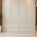
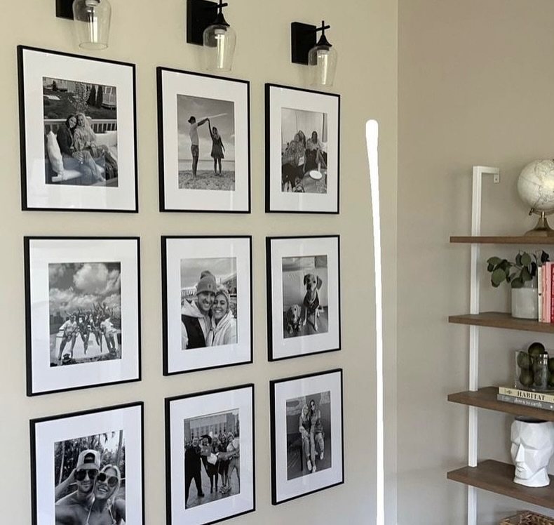
Gallery wall layouts can be a weekend of mismatched frames or a single afternoon with matching prints and a measuring tape.
The deciding factor is how much of your existing art you plan to keep, since reprinting a clashing collection costs less than starting fresh, but some walls demand that you do.
A thumb’s width of breathing room between frames appears in nearly every option here, whether the arrangement is rigid as a grid or loose as a staircase climb.
1. Cohesive Color Palette Gallery Wall Layout
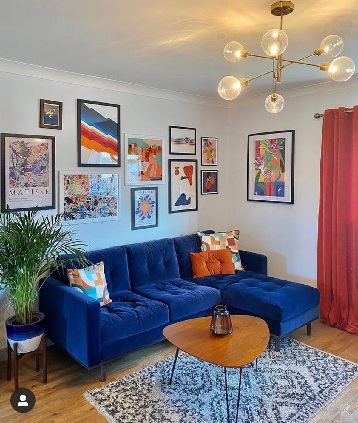
A color-locked gallery wall pulls a room together the way a throw pillow never could. Three tones carry the whole wall: orange, blue, and white hold every piece together.
I like this for renters who already own a few prints that clash, since reprinting costs less than reupholstering. Lay your frames on the floor first, snap a phone picture, then transfer up.
Keep the intensity similar, not just the hue; a pastel and a neon in the same orange family will still fight. Best for living rooms where you want calm without blank walls.

MULTIPLE FRAMES COLLAGE: Bulk of 5 pieces picture frames set in the same sizes. Perfect for pictures 8x10 with mat or 11x14 without mat. The frame opening display size will be 0.5 in smaller than the photo to hold the photo in place

Versatile Sizes for Display: Vittanly 15-Pack Multi-Size Picture Frame Set includes 3x 8x10", 6x 5x7", and 6x 4x6" frames. Ideal for showcasing family photos, artwork in living rooms, bedrooms, and offices

CLEAR ACRYLIC & SOLID BUILD: Crafted from engineered wood that is lightweight yet sturdy for effortless handling. It features a clear acrylic cover instead of traditional glass, offering a safe, crystal-clear view of your cherished memories. Each frame measures 12.86 x 12.86 x 0.47 inches and weighs just 13.1 oz, while the 9-piece set has a net weight of 7.4 lbs. This thoughtful design significantly reduces weight pressure on your wall, allowing for easy and secure hanging
2. Mix Frame Styles
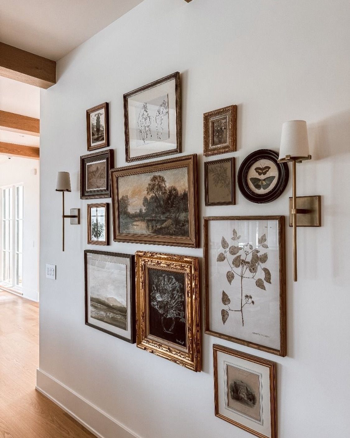
Brass sconces flanking a hallway of mismatched frames, that’s the whole appeal.
Thin black metal beside chunky walnut, a gold ornate frame catching light from a sketch in plain white; the variety reads as collected over years, not bought in one afternoon.
I mix modern and vintage frames when the art inside is mostly monochrome or muted, so the frames become the pattern.
Start with one anchor piece, the largest or the oldest, and build outward with a thumb’s width of breathing room. This suits long corridors and anyone whose taste spans decades, not seasons.
The tradeoff: it takes longer to assemble than a matched set.

✔Multiple Picture Frames: 10 packs picture frame sets include 2PCS 8x10 inch picture frame , 4 PCS 5x7 in picture frames , 4 PCS 4x6 in picture frames. Hang these on a wall, or on a deskto. this rustic picture frame set meets your wall gallery design at one time.

HD Glass Cover: Picture frames collage wall decor set made of MDF and glass protectors cover, provide a clearer view of photos without dazzle, scratches or fingerprints than pvc protective cover

Your Gallery, Your Story: This 15pcs picture frame set - featuring 3 (8x10in), 6 (5x7in), and 6 (4x6in) frames - provides everything you need to create a captivating gallery wall. Display a single treasured image or a curated collection, and fill your space with love and personal moments.
3. Eclectic Gallery Wall
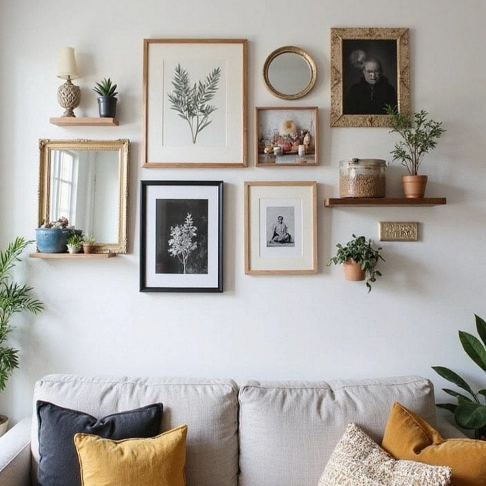
Mirrors, small shelves, a fern in a pot, and prints in mismatched frames; the eclectic wall is for people who can’t choose one thing to be. The unifying thread is spacing, not content.
Keep a thumb’s width between every edge, and the eye reads it as intentional. I add one metallic element, brass or black iron, repeated at least twice so the chaos has rhythm.
This works in rooms already full of books and throws, where a rigid grid would feel like a lecture. The risk is clutter; one shelf or ledge is plenty for most walls.

【CHERISH YOUR MEMORIES】Some of the best moments are worth remembering forever. Create your personal memo board with the wall grid photo display panels. a Great way to decorate any room!
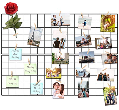
Painted Wire Grid Board: The clip photo frame. It is an ideal showcase for photos, cards, artworks, memos, 4x4, 4x6 and 5x7 photos, as well as greeting cards, Instax and Polaroid photos along its twine cords using the included clothespins which satisfied multi pictures display and can be decorative your living room, bedroom. Record more funny Memories to your life.

Compact and versatile – This product includes 2 standalone metal mesh wall grids (no accessories included), each measuring 11.8 "x 15.7 "
4. Grid Layout
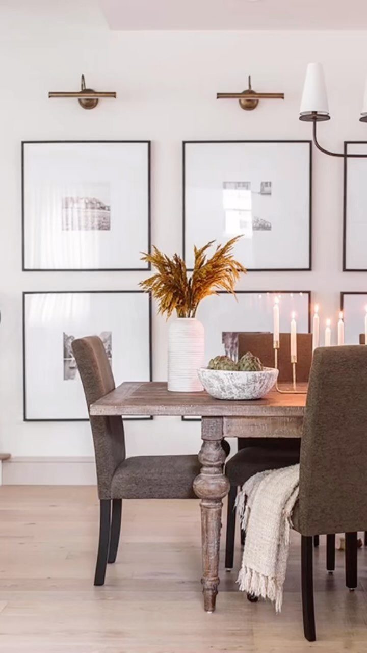
Four matching frames, two by two, dead even spacing: the grid is the gallery wall for people who measure twice. I hang grids at eye level to the center of the arrangement, with a thumb’s width between frames.
Fast to install, fast to read, no arguments. Best for photographs from one trip or prints from a single artist.
What you lose is flexibility; adding one piece breaks the whole.

Durable Material: YESKAY 11x14 picture frames made of MDF wood, stable structure, premium texture, and well-made quality. The HD plexiglass front also protects your treasured photos from damage and keeps them in good shape for years.

Multiple Sizes – This 20-piece set includes 4x 8x10", 8x 4x6", and 8x 5x7" oak frames with white mats, plus damage-free nails for easy hanging. Perfect for versatile wall arrangements!

Multi-size: 10pcs picture frames set come with ONE black frame 11x14in with mat for 8x10 photo, TWO wood grain brown frames 8x10in with mat for 5x7 photo, FOUR gray frames 5x7in, THERE black frames 4x6in. Come with HD plexiglass to protect your picture(Please tear off the protective film before use, there is a protective film on both sides of the plexiglass).
5. Asymmetrical Layout
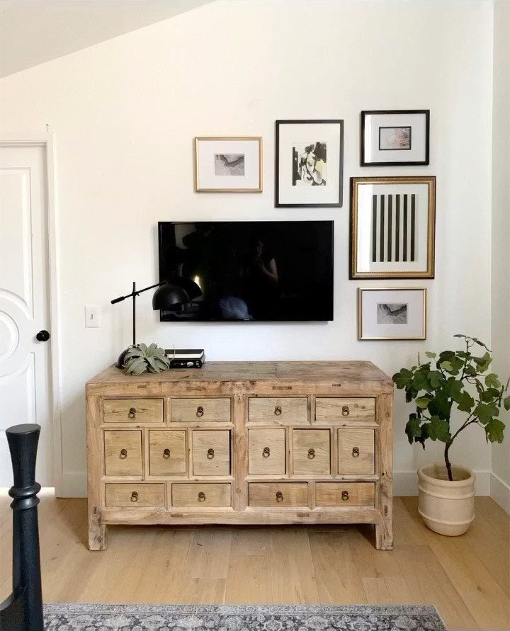
A TV mounted dead center, art clustered unevenly around it, no two pieces the same size; the asymmetrical layout turns the television into just another rectangle.
I place the largest piece off-center, then fill gaps with smaller verticals and horizontals, like Tetris with better colors. Keep the outer edges soft, not ragged; imagine a loose oval bounding the whole group.
Black and white photography simplifies this, since value replaces hue as the organizer. Good for walls that must hold a screen or a door you can’t block.
Takes more patience than a grid, less money than a single large statement piece.

Gallery Wall Set: vintage frame set with one arched frame, one classic frame, one decorative mirror, one shield mirror, and two wall shelves brings assorted picture frames and display accents together for a layered antique inspired gallery wall with a coordinated look

Unique rainbow arch silhouette — vintage charm with gothic drama Dark black finish with natural wood grain showing through for added texture Pre-drilled mounting holes — no drilling into the shelf board needed, prevents cracks or damage Hassle-free installation — simply insert base board into back panel, then hang with included nails Space-saving wall display — turns empty walls into art

Vintage Rainbow Arched Design: Crafted with a unique rainbow arch silhouette, these Bohemian shelves designed with a soft minimalist and retro look, adding a warm and rustic vibe to home kitchen, hallway, entryway, office, apartment, dorm, near a window, or cozy plant corner
6. Family Photos or Travel Souvenirs Gallery Wall
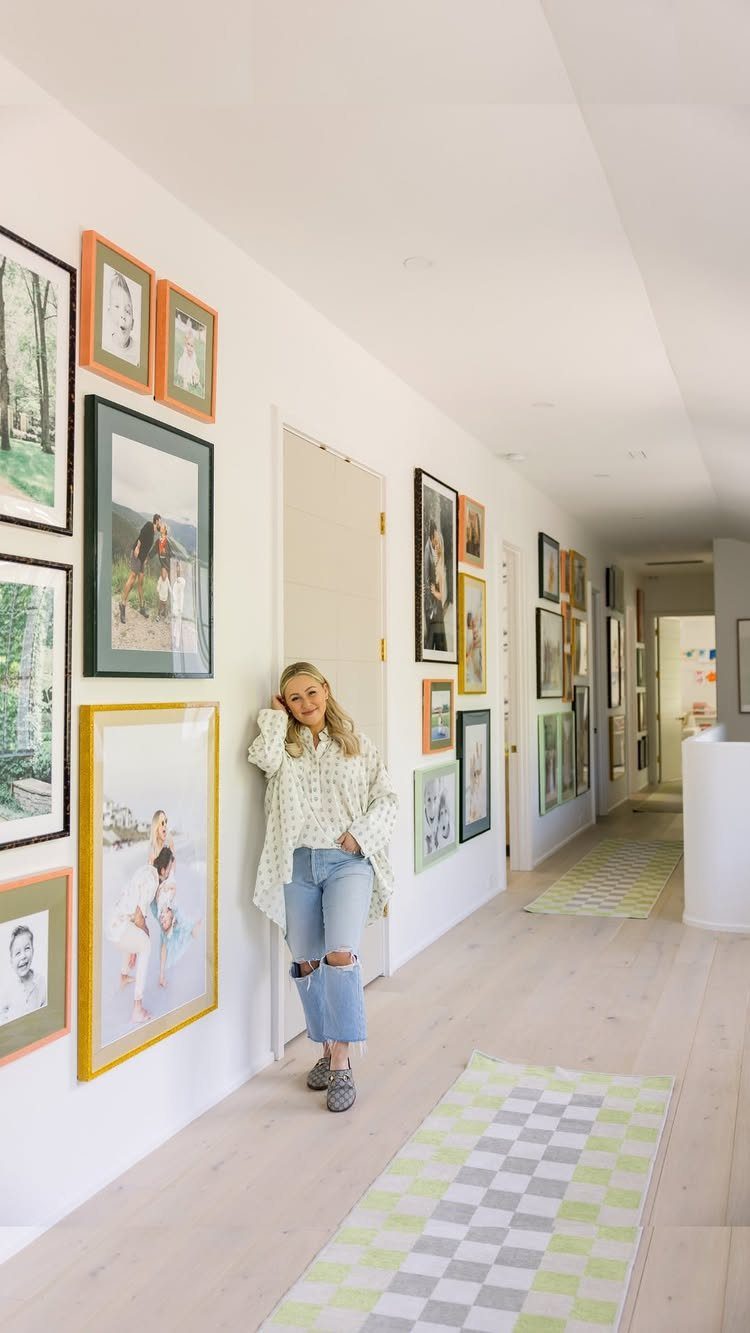
A hallway of family photos in mismatched colorful frames, the woman leaning against her own wall; this is memory made visible.
I rotate travel souvenirs in and out, a textile from Oaxaca, a small mirror from Lisbon, so the wall grows with the years. Mix mediums, photography beside painting beside something woven, for depth that flat prints alone can’t give.
Start with the largest portrait at center height, then spiral outward with smaller moments. Costs nearly nothing if you print at home and buy frames on sale.
Best for households that already tell stories at dinner; the wall becomes the opening chapter.

Versatile Sizes for Display: Vittanly 20-Pack multi-size picture frame set includes 4x 8x10", 8x 5x7", and 8x 4x6" frames. Ideal for showcasing family photos, artwork in living rooms, bedrooms, and offices

Modern Minimalist Style: Our Picture frames are carefully packaged with minimalist art in mind, featuring natural colors such as black, white, and brown. Whether used as wall hangings or desk decorations,the gallery wall frame set is suitable for all seasons. We prioritize the perfect balance of aesthetics and functionality, ensuring a comfortable and natural experience for our customers.

Curated Vintage Mix for Gallery Walls: Features ornate arched & round pieces plus classic rectangular styles in antique gold, brass, and bronze finishes. Instantly creates a cohesive, high-end vintage picture frame set look rather than a messy mix
7. Console Table Gallery Wall Layout
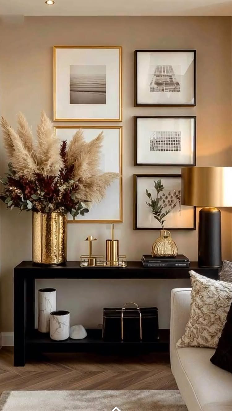
A console table is already a natural stopping point in a hallway or behind a sofa, so the wall above it reads as one contained scene. Two columns of frames fill the space without crowding the objects below.
The table itself sets the width: the arrangement should not spill past its edges, or the whole thing starts to wander.
This setup suits renters especially because it covers a small, defined area. A single Command strip failure does not send the whole arrangement tumbling.
A tall console limits how large the prints can read, so I would stick to 8×10 or 11×14 pieces and let the lamp and a tall stem or two carry the vertical interest.

Value Set: This exquisite French vintage photo frame set includes 10 vintage frames in various sizes and styles, ranging from 12 x 10 inches to 5 x 4 inches. You can easily display 10 photos of different sizes (photos not included in the package). The set also includes 10 traceless nails for easy hanging of the vintage frames on the wall

16-Piece Mixed Color Frame Set: This all-in-one 16-pack includes 1 black & 1 white 11x14 frames, plus 1 black & 1 white 8x10 frames. Each of the 6 tones (black, white, natural brown, gray, dark walnut, distressed white) comes with one 5x7 and one 4x6 frame. Perfect for building a stylish gallery wall.

A GALLERY WALL TO IMPRESS: Create a feature wall that your guests will want to copy. The Kate and Laurel Bordeaux Frame collection allows you to design a display that not only will add style to a blank wall but will also give you the warm glow of your treasured memories and enhance any room
8. Patterned Wallpaper Gallery Wall
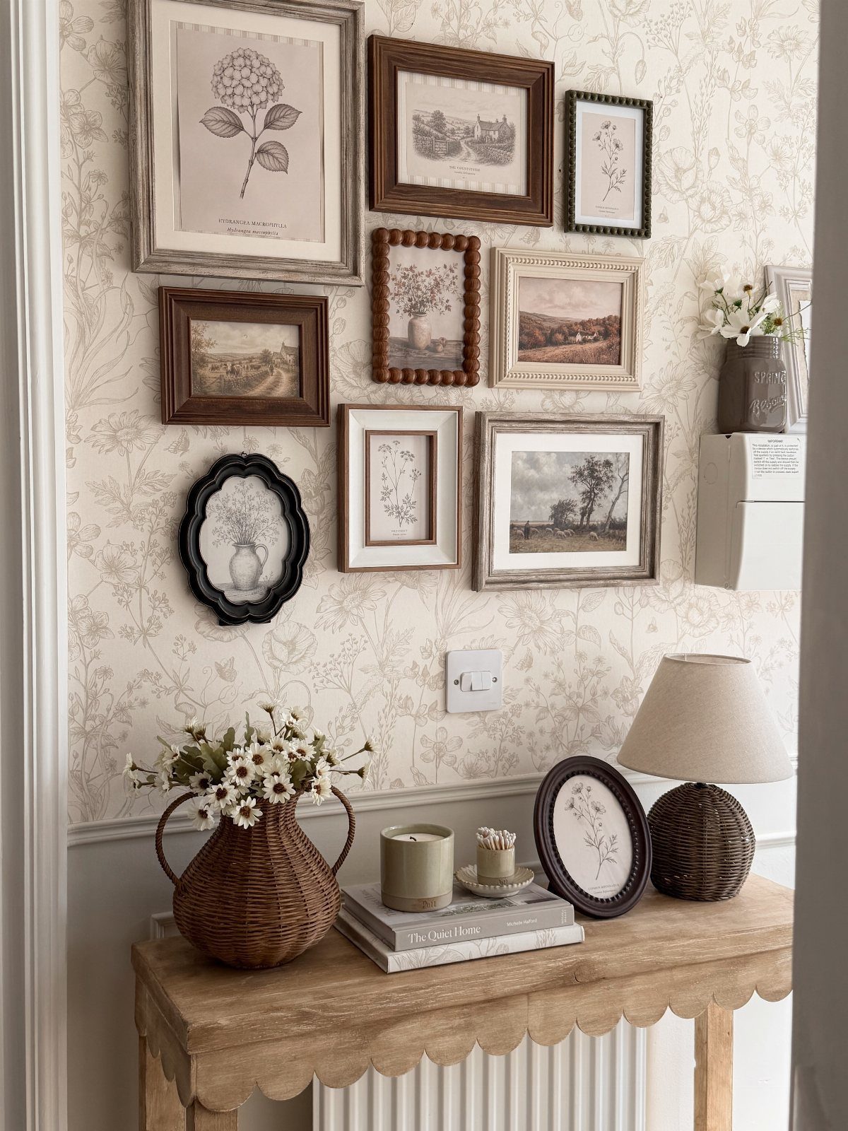
Bold wallpaper turns the wall itself into a participant, not just background, which means the art has to hold its own without shouting.
The floral and landscape pieces stay in the same tonal family as the paper behind them; nothing pops in a competing hue. That is the judgment call here, and it is worth getting right.
A black frame against busy pattern fights; wood or gilt, like these, settles in.
The console below matters too. The scalloped edge repeats the organic shapes in the botanical prints, so the whole thing feels grown together rather than staged.
If your wallpaper is geometric, I would look for a cleaner table line and frames with less ornament. The wallpaper is doing the heavy lifting; let it.

Modern Design: Black color, includes a mat for 8x8 (display area: 7.5x7.5) picture or without mat for 12x12 picture (display area: 11.5x11.5)

【CHERISH YOUR MEMORIES】Some of the best moments are worth remembering forever. Create your personal memo board with the wall grid photo display panels. a Great way to decorate any room!

Material: The wire grid boards are made of metal with black coating
9. Vertical Stack Layout
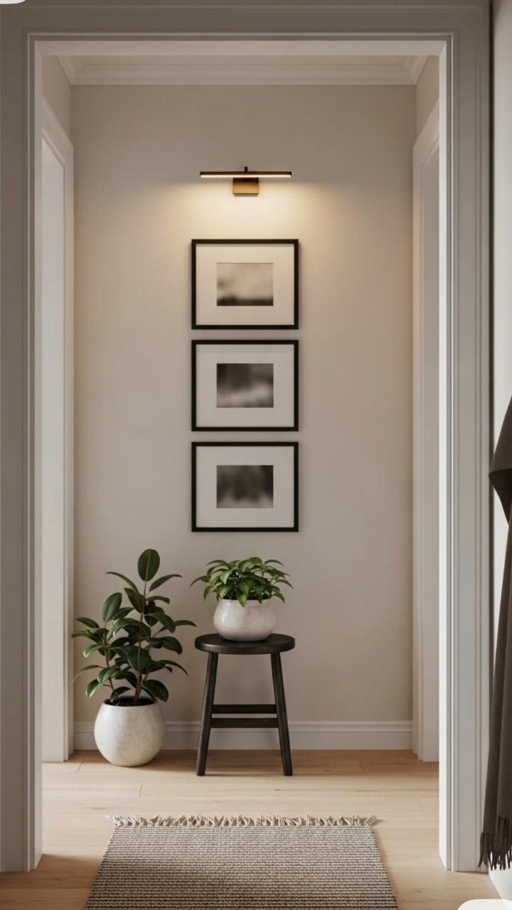
Three frames in a straight column suit a spot where width is scarce and height is not: the end of a hallway, beside a door swing, between two windows.
The picture light is a clue to how narrow the space reads; without it, the stack could disappear into shadow. I would keep a vertical stack narrow or it starts to look like a ladder missing its rungs.
The order of the images matters more than in a grid because the eye travels one way.
I put the piece with the most open space or the lightest value at the top; it draws the gaze upward and keeps the column from feeling bottom-heavy.
Two vertical stacks flanking a sofa or bed can frame the furniture like sentries, but one alone is usually enough.

Variety of Frame Sizes: This gallery wall frame set includes 15 French vintage photo frames in assorted sizes, ranging from 12 x 10 inches to 5 x 4 inches (inner frame sizes from 10 x 8 to 3 x 2 inches). Inspired by classic French countryside design, each ornate French country frame features ornate decorative details, perfect for showcasing photos or artwork of various sizes.

15-Piece Picture Frames: this set includes 3 pcs of rose-red 8x10in picture frames, 3 pcs of light pink 5x7in picture frames, 3 pcs of rose-red 5x7in picture frames, 3 pcs of light pink 4x6in picture frames, and 3 pcs of purple 4x6in picture frames; The picture frames are suitable for both wall-mounted displays and can be easily placed on a tabletop, with sturdy brackets and hanging clasps designed on the back for vertical or horizontal hanging
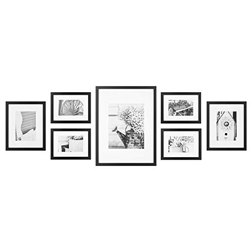
SEVEN BLACK DECORATIVE FRAMES: Each equipped with removable classic white mats. These frames provide a timeless elegance to your gallery wall, allowing you to showcase your favorite photos, artwork, or memories in style. With their versatile design, you can easily switch out the mats to suit different artwork sizes or preferences, ensuring your display remains fresh and personalized, whether you're looking to create a cohesive gallery wall or add a touch of sophistication to any room
10. Staircase Gallery Wall Layout
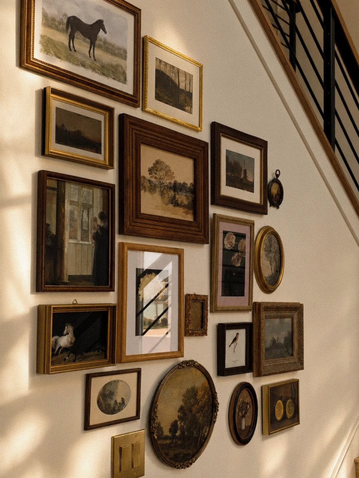
A staircase wall is one of the few places where asymmetry feels inevitable rather than chosen, because the steps themselves break any horizontal line you try to draw.
The frames climb with the railing, not against it, which is the move: follow the architecture.
I start from the bottom step and work upward, keeping the spacing tight and even between each frame and the stair tread beside it, measured diagonally.
The mix of orientations here is what keeps a long climb interesting. A horizontal landscape every few pieces gives the eye a place to rest; all verticals would feel like reading a scrolling feed.
I would pick one frame finish or one dominant color inside the frames, though, or the wall turns into a yard sale by step 12.
Family photos work well because the story unfolds as you rise; a single large statement piece would be passed in one glance and forgotten.

Effortless Matching: you will receive a vintage-style carved wall mirror and a wall-mounted shelf, combining aesthetics and practicality; No separate purchases required, eliminating the hassle of matching; Both the mirror frame and shelf are adorned with exquisite European carvings, exuding a luxurious vintage gilded sheen and creating an elegant atmosphere

[SOPHISTICATED DESIGN]- Set of 3 elegant geometric wall mounted floating decorative mirrors with black wooden frame is perfect for wall, hallways, office and any place that needs aesthetics and functionality.

Contemporary mirrored glass floating ledge shelf
11. Dark Accent Wall Layout
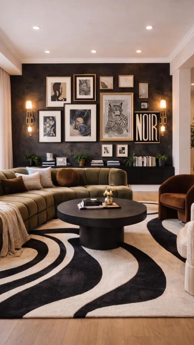
Dark walls swallow light, so the art needs contrast in value, not just color. The black-and-white sketches and typography read clearly because they are high-contrast by nature; a mid-tone landscape would sink into charcoal paint and disappear.
I would not hang pale pastels here unless the frames are very wide and light, and even then I would hesitate.
The mood is the appeal, but the wall takes more planning.
Every frame on a dark wall casts a faint shadow that reads as murk; I hang them slightly closer together than I would on white, so the group reads as one luminous shape.
The green sofa below anchors the scene and keeps the wall from feeling like a void. This one suits someone who already chose the dark paint and now needs the wall to earn its keep.
12. Textured Object Gallery Wall
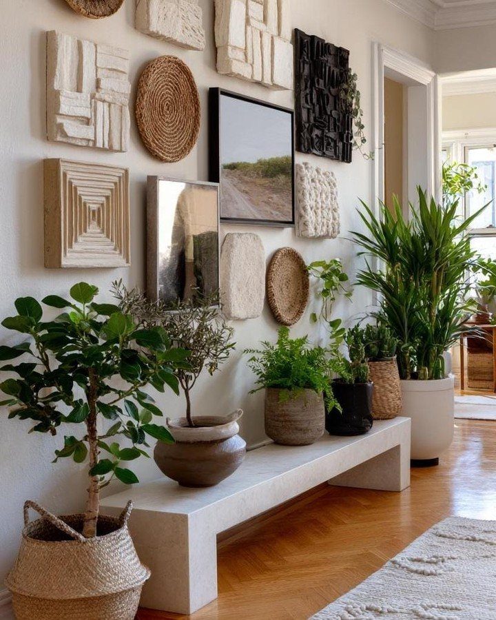
Baskets and carved panels bring shadow and surface variation that flat prints cannot match, which matters in a hallway where people pass close enough to notice.
I would keep the dimensional pieces in the upper two-thirds and let the lower edge stay simpler, where someone might brush against it.
Hanging woven material is its own skill: a loop of twine on a nail will sag and twist.
I use a plate hanger fitted to the back rim, or for shallow baskets, a single long finishing nail driven through the weave at a hidden point.
The carved panels need a cleat or a keyhole, not a wire that lets them tilt.
This idea trades the crisp edges of framed art for warmth and hand; I would not mix it with glossy metal or glass, which feel like they belong to a different room entirely.
Choosing the Right Wall
A wall crammed with furniture or existing decor will compete with whatever you hang there.
I would pick a wall I pass every day. The gallery wall only works if you live with it, not past it.
The dining room wall I face while I eat keeps me company through breakfast and late emails alike.
Enough room matters too. Massive walls dwarf small arrangements; a tight hallway gives a vertical stack its purpose.
Let the architecture suggest the shape before you choose the layout.
“Combine different genres, time periods, scales, and mediums to create depth and intrigue,” Robins and Bennett say. When hanging art, the designers recommend arranging pieces of art on the floor first to explore gallery wall layouts without commitment.
Planning Before Hanging
Spread everything on the floor or across a table and live with the arrangement before you touch a hammer. Move frames around, step back, try again.
A piece you planned for center might read better off to the side; a small print can hold its own beside something oversized once you see it in relation.
For renters especially, craft paper templates save security deposits. Trace each frame onto butcher paper, tape the shapes to the wall, and live with the ghost arrangement for a day.
Pull one down, shift another, until the balance holds.
No accidental holes, no spackle patches at move-out. The floor is your sketch; the wall is permanent.
Creating Visual Interest
Flat frames alone read as a single plane. I would break that up with a vintage mirror that catches window light, a tiny shelf with a trailing plant, or a woven textile that casts a shadow.
The eye travels to variation.
A carved panel or a small sculptural piece interrupts the rectangle repetition that otherwise turns invisible.
Travel finds help here. A textile from a trip, a print from a local market; these carry texture memory that a mass-produced canvas does not.
The layering draws you in twice, once for the composition and again for the surface.
Maintaining Balance
I place it just off-center, toward the middle but not dead in it, so the eye travels rather than slamming to one spot. The four outer corners work too for smaller collections.
Then fill with medium and smaller frames, alternating vertical and horizontal orientations. Crisp edges between pieces keep the grouping from looking like it happened by chance.
The big frame is the blazer; the rest are accessories that pull toward it.
Proportion matters more than symmetry. Every piece needs a logical place in relation to the anchor, not equal space on all sides.
Step back often. The wall should feel settled, not solved.
Frequently Asked Questions
What is the rule for gallery walls?
Keep the spacing tight and even, about a thumb’s width between frames, and lay everything on the floor before you touch a nail. I snap a phone picture of the arrangement so I have a map to follow.
The real rule is cohesion over perfection: matching intensity matters more than matching color, and a consistent finish or theme holds together frames that otherwise have nothing in common.
Are gallery walls still in style?
Yes, though they have shifted toward more color, texture, and mixed materials than the old monochromatic metal trends. I see fewer strict symmetry rules now and more mirrors, small shelves, and woven pieces layered in.
The look is more collected and less bought-in-a-day, which suits anyone building a wall over time.
What are common gallery wall mistakes?
Overcrowding and inconsistent spacing are the big ones; I keep about a thumb’s width between every edge so the eye reads intention, not clutter. Skipping the floor layout is another, since one misplaced nail can throw off a whole grid.
On dark walls, hanging too loose makes frames cast shadows that read as murk, so I pull those slightly closer than I would on white.