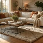
A living room wall can absorb $22 in framed prints or thousands in recessed shelving, and the difference comes down to whether you can drill into what’s behind it.
Renters with standard drywall will lean mirrors and float shelves; owners who know their studs from their pipes can anchor stone, slats, or a moon that glows blue after dark.
The charcoal fireplace wall I painted in 2019 taught me that half-commitment reads as a mistake, not a choice, and that rule holds whether you’re hanging one oil painting or a 48-by-60-inch student canvas above the sofa.
1. Mirrors
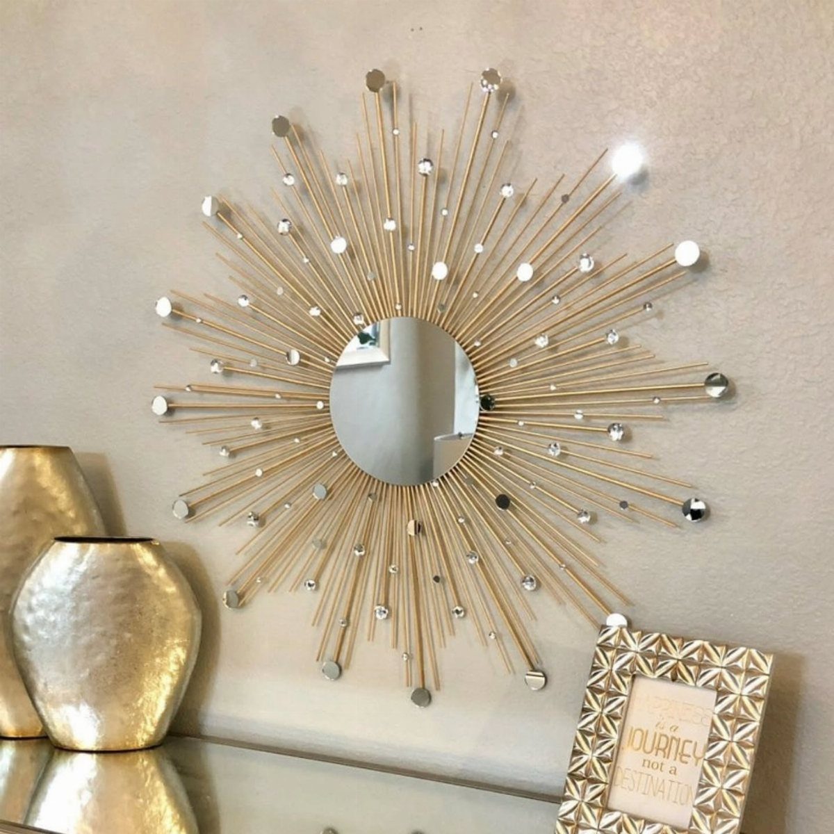
A mirror does more than fill empty wall space; it catches window light and pushes it deeper into the room.
A round mirror hung opposite my living room’s only window stopped the back wall from feeling like a cave by mid-afternoon.
For renters, leaning an oversized mirror against the wall skips the anchor holes entirely. A rectangular mirror leaned on the floor behind a sofa adds the same depth without commitment.
Grouping smaller mirrors in a loose cluster, spaced a hand’s width or more apart, works in tight spots where one large piece won’t fit.
The frame matters as much as the glass. Gold or black metal frames read modern; weathered wood suits anything cottage or farmhouse.
Match at least one metal finish already in your room, or the mirror floats instead of grounding.
Skip this if your wall faces a television or a messy entryway; you will not enjoy the double view.

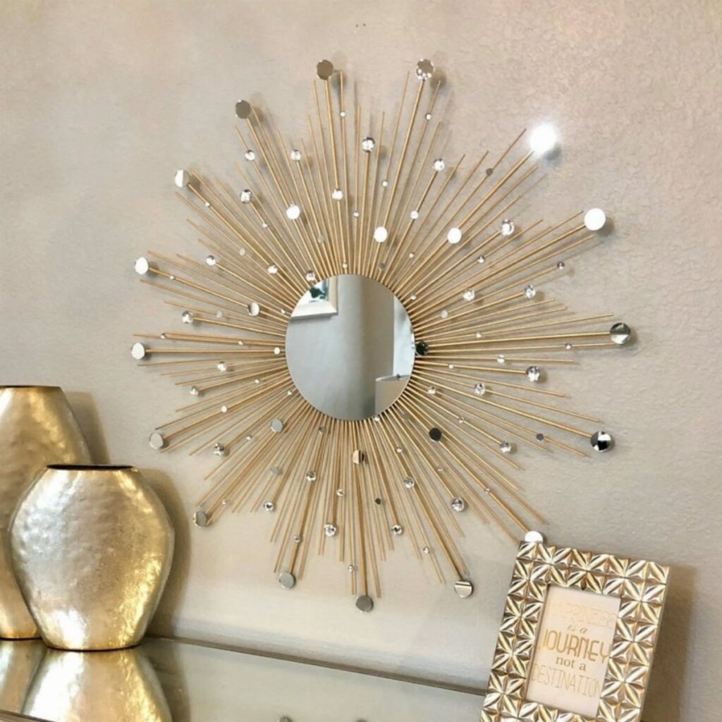
Metal construction and eye-catching metal sunburst frame for boho sunburst mirror set 3 set with 11.8 In round mirrors in Gold/Black providing sturdy vintage gold sunburst wall mirror flair

SIZE: 24'' metal gold sunburst mirror with a centered 6.7'' circular mirror, perfect as an accent mirror that will brighten any wall and is a perfect accessory to any room.
2. Floating Shelves
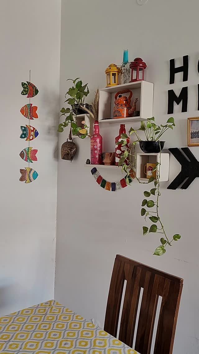
Floating shelves read as built-in storage at roughly 1/10 the cost. I installed a shelf ledge above my sofa in an afternoon using a stud finder and a level I already owned.
Load them so they look collected, not cluttered. I stick to a rough rule: mostly books turned spine-out in one color family, with objects that vary in height making up the rest.
A small trailing pothos in a ceramic pot, a ceramic teapot I found at a garage sale, and a short stack of hardcovers in warm tones sit on my middle shelf now.
The top shelf holds taller pieces; the bottom stays clear enough for my morning coffee.
For narrow walls, shorter shelves work; above a full sofa, run two or three longer ones spaced vertically so you can reach each without a ladder. Check weight limits before loading ceramics.
Renters can skip drilling by using heavy-duty floating shelf brackets designed for drywall anchors rated for solid weight.

91" x 46" OVERSIZED FULL LENGTH MIRROR: At 7 ft 7 in tall and 3 ft 10 in wide (91" x 46"), this extra-large rectangular floor mirror gives you a full body view in one glance, making it ideal for spacious bedrooms, dressing rooms, living rooms, and home gyms where a standard mirror is not enough.

Full Length - 71" length x 31" Width x 0.8" depth, the full length mirror can provide a full body view when leaned against the wall, to give you the perfect viewing angle before you head out the door. The full length floor mirror, which can be an accent piece for any room. The modern style mirror can match almost any type of room decoration, making your space more open and bright

Premium Shatterproof Tempered Glass: This 78" x 35" oversized full length mirror is crafted with tempered glass, delivering crystal-clear, distortion-free reflections. The shatterproof construction minimizes breakage risk and enhances exceptional sturdiness, making it ideal for everyday home use and stylish home decor
3. Gallery Wall
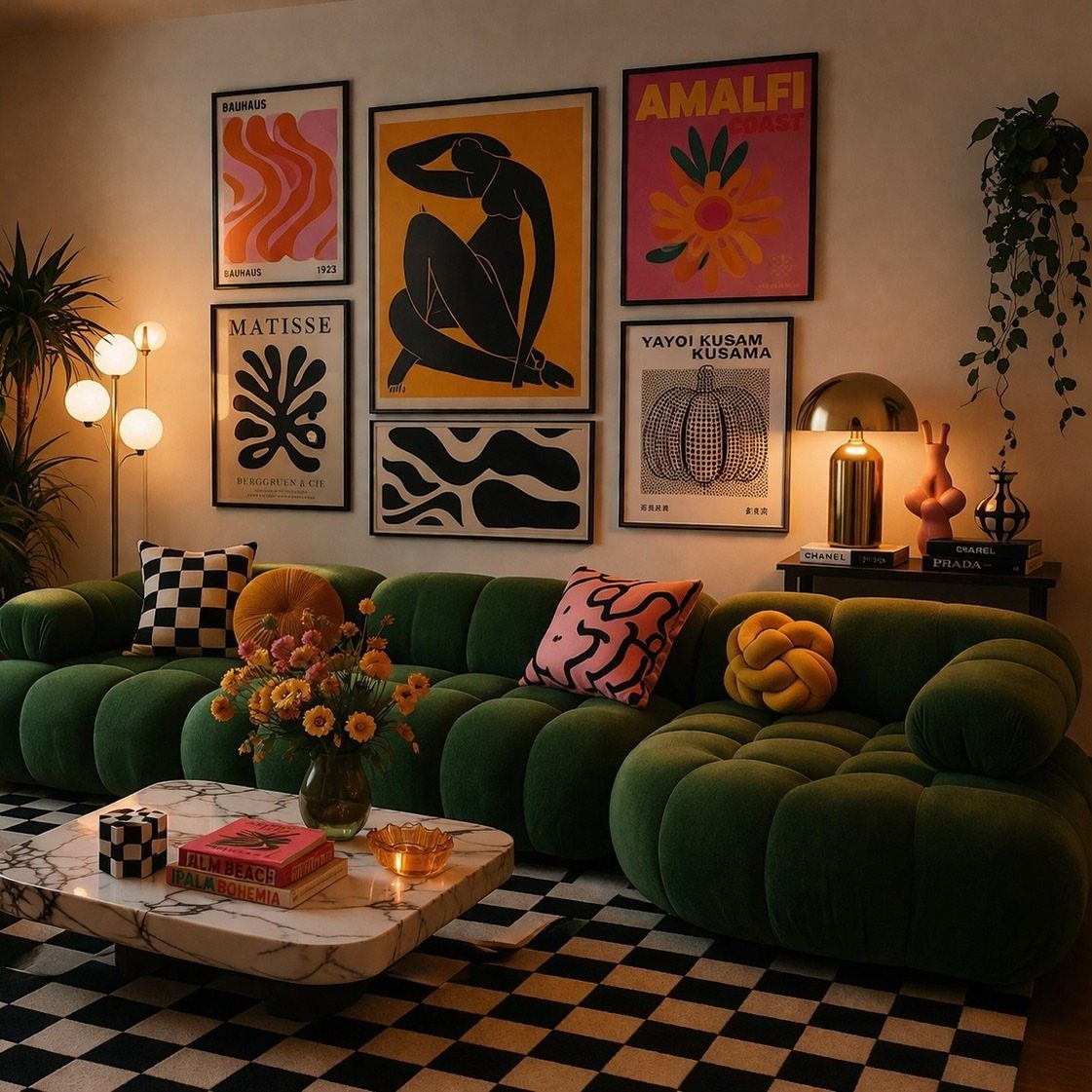
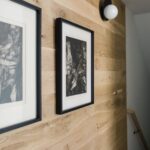
A gallery wall lets you use what you already own: concert tickets in cheap frames, a small mirror, a woven wall hanging from that trip to Oaxaca.
I built mine around a "BAUHAUS" print I bought for $22, then added 5 pieces I’d stored under my bed for 2 years.
Start with your largest piece above the sofa back, then build outward in a loose rectangle rather than a rigid grid. Mix frame finishes; matching them too closely looks like you bought a set.
Vary sizes so no 2 adjacent pieces share the same dimensions.
For commitment-phobes, floating ledges let you lean instead of hang, swapping pieces seasonally without new holes. I switch in botanical prints every March and darker photography every October.
The cohesive version: pick one theme, like black-and-white photography or blue-toned abstracts. The eclectic version: trust your eye and stop when the arrangement feels full, not when you’ve used everything.

Centerpiece of Room Decoration - These shelves boast a distinctive design and an elegant shape, making them a focal point that elevates the style of any room. Ideal for the living room, bedroom, study, bathroom, laundry room, children's room, or office, they reflect the owner's sophisticated taste and blend seamlessly with various decor themes.

𝐌𝐨𝐝𝐞𝐫𝐧 𝐚𝐧𝐝 𝐕𝐞𝐫𝐬𝐚𝐭𝐢𝐥𝐞 𝐒𝐭𝐲𝐥𝐞: The hidden bracket design gives a clean, floating look that works beautifully as home decor wall shelves in modern, farmhouse, rustic, or industrial decor styles. Adds warmth and style without overwhelming your space for bedroom decorations, farmhouse living room decor, office wall decor, nursery, entryway, kitchen, and more

𝐌𝐨𝐝𝐞𝐫𝐧 & 𝐌𝐢𝐧𝐢𝐦𝐚𝐥𝐢𝐬𝐭 𝐒𝐭𝐲𝐥𝐞 - Featuring clean lines and a rustic brown finish, these wall-mounted shelves bring warm farmhouse charm and modern style to any space. Perfect as shelves for room decoration, book shelves display, and rustic farmhouse wall decor — they elevate your bathroom wall art vibe, bedroom aesthetic, living room style, kitchen organization, office setup, and laundry room storage all in one versatile design
4. Accent Wall
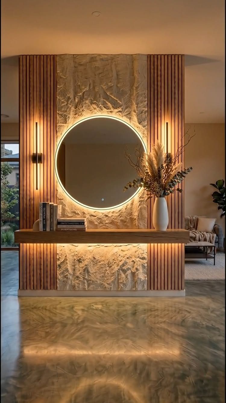
One bold wall does what fully decorated walls cannot: it gives the eye somewhere to land. I painted my fireplace wall charcoal in 2019 and never regretted it, though I did repaint the first attempt too purple.
Wood slats, textured panels, or even a single strong color all work. Treat the remaining walls as breathing room; keep them warm white or a tone lighter than your accent.
Vertical paneling draws the eye up in rooms with standard apartment ceilings.
For renters, peel-and-stick wallpaper in a bold geometric or grasscloth texture installs in a morning and removes with a hairdryer.
The risk is going halfway. A slightly darker beige reads as a mistake, not a choice.
Commit to the contrast or skip it entirely.

Versatile Sizes for Display: Vittanly 15-Pack Multi-Size Picture Frame Set includes 3x 8x10", 6x 5x7", and 6x 4x6" frames. Ideal for showcasing family photos, artwork in living rooms, bedrooms, and offices

Capture Your Memories: From the faces of your loved ones to great times with friends and family get-togethers, this collage photo frame lets you display an array of wonderful moments. It features 12 frames, each perfectly sized for 4x6 photos

Modern Minimalist Style: Our Picture frames are carefully packaged with minimalist art in mind, featuring natural colors such as black, white, and brown. Whether used as wall hangings or desk decorations,the gallery wall frame set is suitable for all seasons. We prioritize the perfect balance of aesthetics and functionality, ensuring a comfortable and natural experience for our customers.
5. Oversized Artwork
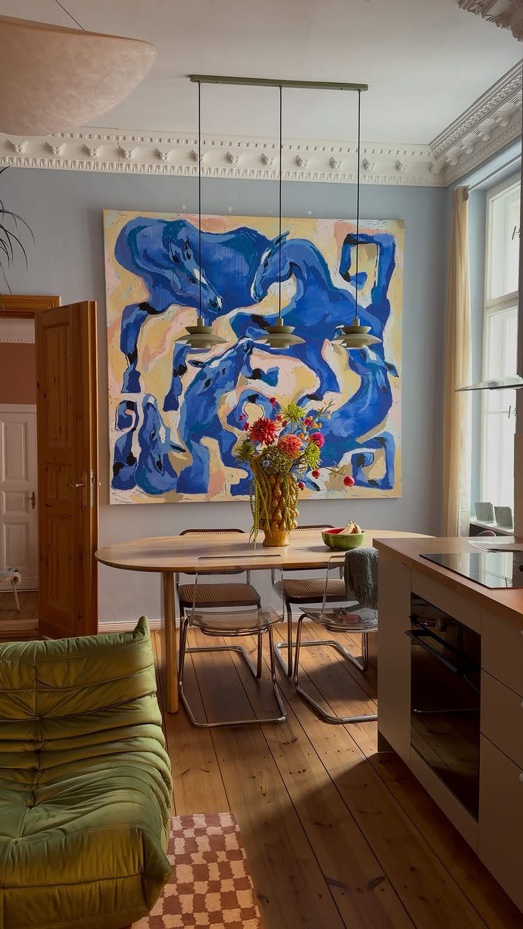
A single massive piece turns a blank wall into architecture. I bought a 48-by-60-inch canvas at a student art sale for $180, hung it above my sofa with 2 picture hooks, and stopped buying smaller art for that wall entirely.
The scale rule: your artwork should be 2/3 to 3/4 the width of the furniture below it. Above a standard sofa, that means a piece wide enough to anchor the wall without looking lost.
Anything smaller gets swallowed.
For tight budgets, engineer prints from photo labs run large for cheap and look sharp in a simple frame. Black-and-white photography or high-contrast abstracts hold up at that scale; detailed scenes go muddy.
Two large pieces paired side by side work in open-concept spaces where one piece would feel lonely. Keep a small gap between them, and treat the pair as one unit for width calculations.
The downside: you need a vehicle that can carry it. For oversized pieces, borrow a vehicle with cargo space or rent a truck by the hour.

TIPS: 1. Calibration is necessary before using the stud finder function. 2. Laser level is manual-leveling, not self-leveling, please use the two bubble vials for accurate horizontal, vertical and cross lines. 3. Two bubble vials only work and light up when the Laser Mode is active, not in the detection mode. 4. Self-adhesive strips are not suitable for dusty, coarse surfaces, wallpaper, or drywalls, etc. Replace the strips if they are dirty or not sticky. 5. Class II laser safety product, output < 1mW. 6. Note: NOT designed for use on LATH and PLASTER WALLS. Works best on DRYWALL and WOOD WALLS

Accurate and Rapid: The wall stud finder adopts an intelligent micro-sensor chip with the highest sensitivity which can accurately and quickly find edges and center of metal, studs, joists, pipes, and live AC wire behind walls, floors, and ceilings. Fast detection saves users time and effort, making task completion easier. It must be ultimate gifts for professionals, homeowner,s and DIY enthusiasts

ACCURATE: More sensors = More accuracy. Conventional electronic stud finders have 1 or 2 sensors. The ProSensor M210 has 13, making it the best stud finder on the market
6. Wall Sconces
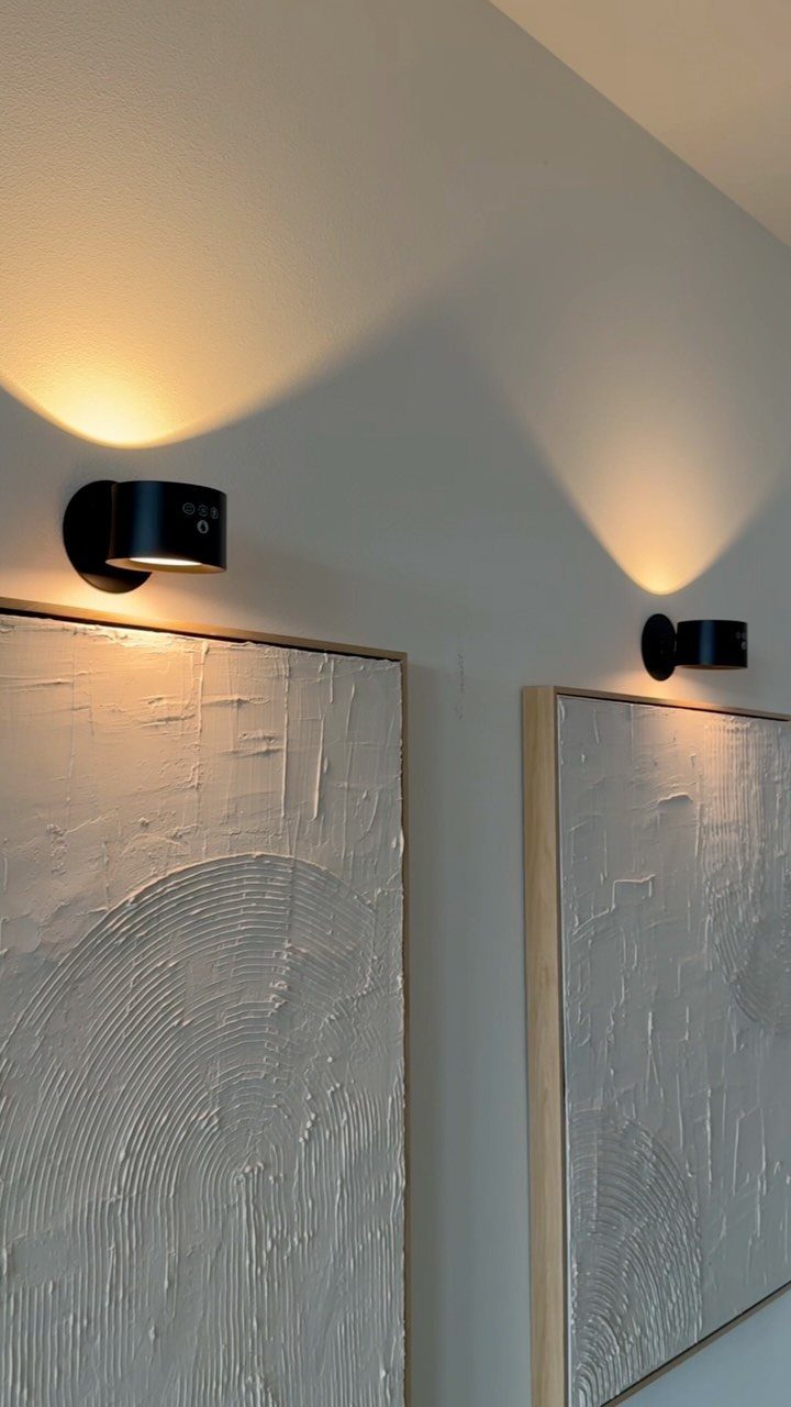
Wall sconces solve the lighting problem that floor lamps create: they free up floor space and actually illuminate your art instead of your ceiling.
Plug-in brass sconces on either side of an abstract painting work well, with cords run behind the frame in a channel painted to match the wall.
Picture lights mount directly above a frame; sconces flank it. Both put light where your eye goes, not where your feet are.
Dimmers matter here: full brightness in the evening feels aggressive later on, and a plug-in dimmer saves you rewiring.
For renters, battery-operated LED sconces with remote dimmers now last months on a charge and cost far less than hardwired options. The light quality improved dramatically in recent years.
Position sconces at roughly eye level from the floor, and close enough to the artwork edge that the light falls across it evenly. Too close and the light pools; too far and it misses the canvas entirely.
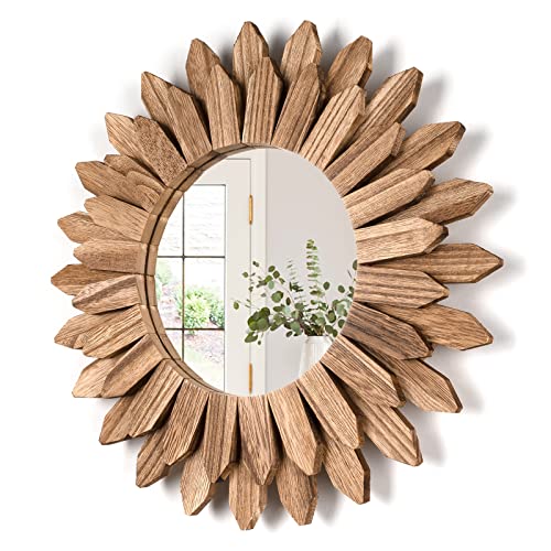
Handmade Shabby Chic Decorative Mirror: This country rustic mirror made of solid wood, torched finished features carbonized black color, and the beautiful wood texture makes it an antique accent. Two-layer wood pieces make it a stylish and eye-catching wall art on your wall

MOON PHASE MIRROR WALL DECOR: This unique moon phase mirror set with birds creates a striking gothic and witchy focal point, instantly elevating bedrooms, living rooms, or spiritual spaces.

1. PREMIUM BOHO DECOR - Authentic Sunburst Design for Modern Homes Elevate your space with this stunning 3-piece boho sunburst wall mirror set. Each 12-inch round mirror features intricate metal rays in elegant gold finish, creating perfect wall art for living room, bedroom, and bathroom decor. The bohemian style complements farmhouse, modern, and eclectic interiors. Transform blank walls into focal points with these eye-catching decorative mirrors that blend functionality with artistic beauty.
7. Architectural Details
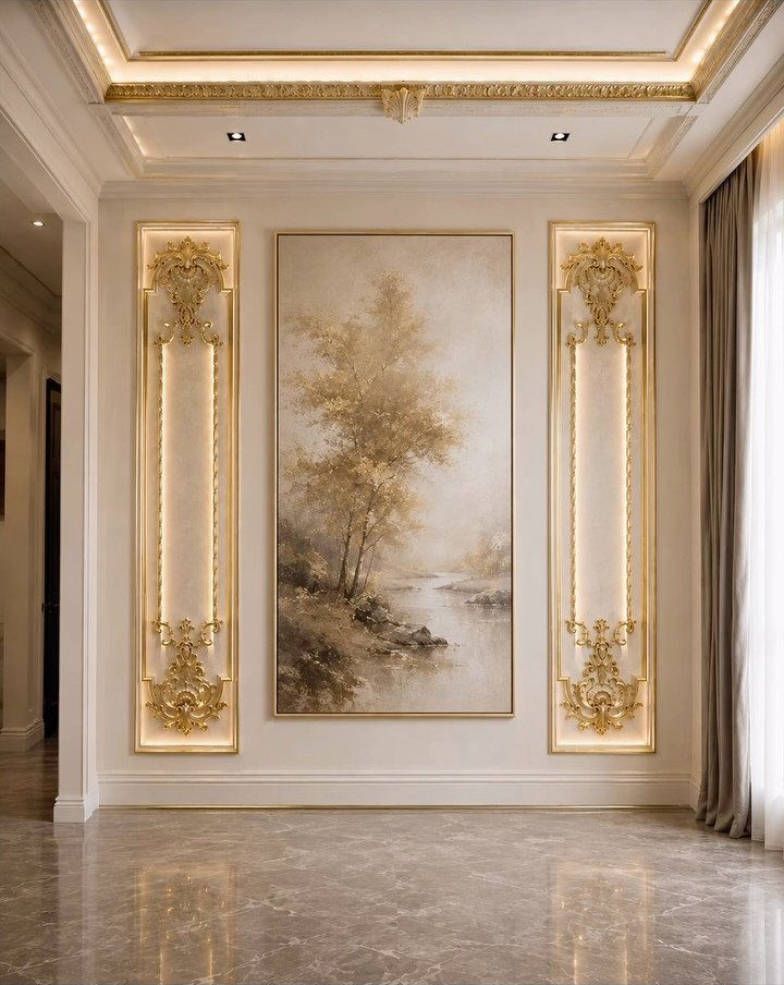
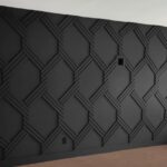
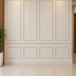
Crown molding and wainscoting turn a flat wall into something that looks built in over decades.
I like board-and-batten for renters who want character without the commitment of a full gut job; it nails up over drywall and comes back down when the lease ends.
Paint the trim to match your wall color if you want quiet depth, or go two shades darker if you want the eye to find it from across the room.
Vertical details draw the ceiling up, which matters more than you’d think in apartments with standard builder heights.
Check your wall first: old plaster needs different fasteners than drywall, and that changes both your tool list and your Saturday timeline.

Premium Shatterproof Tempered Glass: This 78" x 35" oversized full length mirror is crafted with tempered glass, delivering crystal-clear, distortion-free reflections. The shatterproof construction minimizes breakage risk and enhances exceptional sturdiness, making it ideal for everyday home use and stylish home decor

Large Size Full Length Mirror: The solid wood frame full length mirror measures 71"x32", providing a full-body view while enhancing your space. Made of pure natural wood material, each mirror features unique characteristics

Rectangular Mirror: Our 76" x 34" rectangular full-length mirror enhances space by reflecting light and providing a clear, full-body view. What sets this mirror apart is its rounded corner frame design, which not only adds a touch of elegance but also features anti-collision functionality. The smooth, curved edges eliminate sharp corners, reducing potential risks and ensuring a safer user experience
8. Accent Furniture
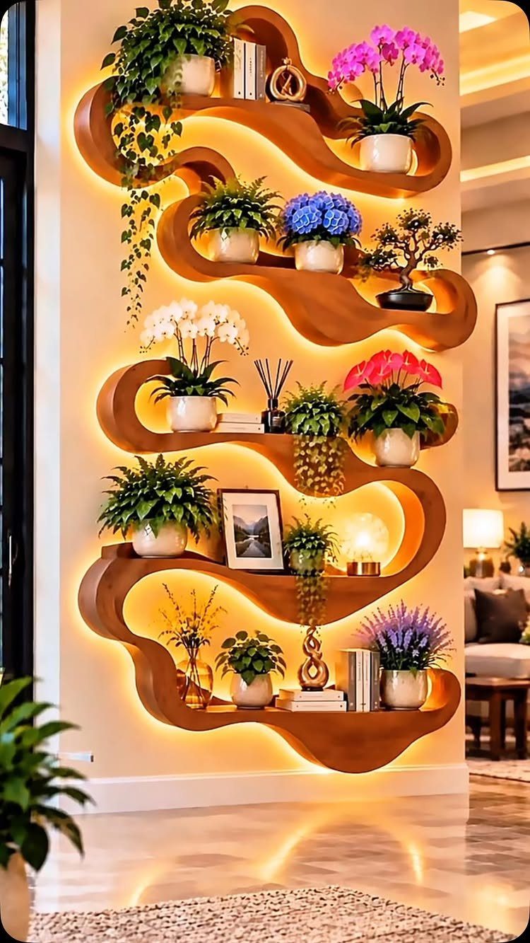
One piece of furniture can carry a whole wall if it has enough presence. A curved shelving unit, lit from behind, lets plants cast soft shadows upward and turns storage into something that moves.
I’d look for something with its own light source if your living room lacks overhead wiring for sconces. Backlighting on shelves replaces the need for extra lamps, and the piece reads as architecture rather than storage.
Walnut brings warmth, but oak or ash would read cooler if your room already leans warm.
This trades away hidden storage; every shelf is display, so it suits people who edit their objects down to what they actually like looking at.

Centerpiece of Room Decoration - These shelves boast a distinctive design and an elegant shape, making them a focal point that elevates the style of any room. Ideal for the living room, bedroom, study, bathroom, laundry room, children's room, or office, they reflect the owner's sophisticated taste and blend seamlessly with various decor themes.

Well-designed Floating Shelves: Our white floating shelves for wall are made of MDF Laminate. These wall shelves can organize daily sundries to tidy your space, display your art pieces on the wall to decorate your home, and make it full of aesthetic flare.
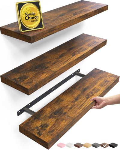
𝐌𝐨𝐝𝐞𝐫𝐧 & 𝐌𝐢𝐧𝐢𝐦𝐚𝐥𝐢𝐬𝐭 𝐒𝐭𝐲𝐥𝐞 - Featuring clean lines and a rustic brown finish, these wall-mounted shelves bring warm farmhouse charm and modern style to any space. Perfect as shelves for room decoration, book shelves display, and rustic farmhouse wall decor — they elevate your bathroom wall art vibe, bedroom aesthetic, living room style, kitchen organization, office setup, and laundry room storage all in one versatile design
9. Statement Art Above the Fireplace
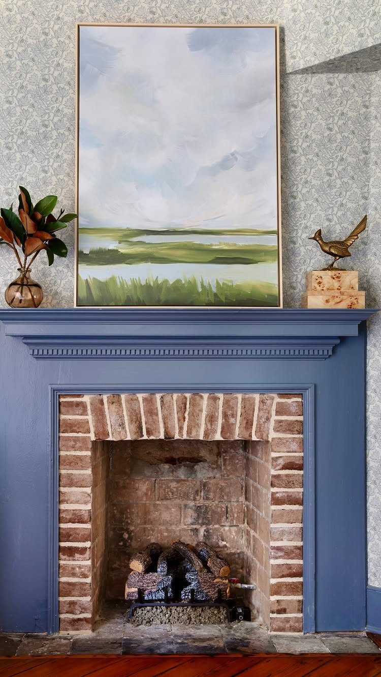
The fireplace is where a living room’s eye lands first, so what sits above it carries more weight than the same piece would on any other wall.
Green and blue tones soften the geometry of brick and mantel without fighting the natural materials.
I tend toward a single large piece rather than a cluster; the mantel itself gives you a ledge for smaller objects, and layering too many sizes above it turns busy fast.
A vase and one sculptural item on the mantel is enough.
No fireplace? A console table against the wall with a framed piece above it borrows the same logic: low furniture, vertical art, breathing room between.
As designer Gabriela Eisenhart of Silo Studios in Atlanta says, “The living room is the perfect place to make a statement.” Next to possibly only the kitchen, it’s your most frequented room, and a space all your guests are likely to enjoy.

Durable Material: YESKAY 11x14 picture frames made of MDF wood, stable structure, premium texture, and well-made quality. The HD plexiglass front also protects your treasured photos from damage and keeps them in good shape for years.


Elevate Your Decor with Customizable Lighting: Our picture lights instantly make your artwork and living space look more elegant and stylish. Choose from 3 color temperatures (3000K/4200K/6500K), 12 RGB colors, and 2 dynamic modes (Flash & Fade) to complement your decor. Give your paintings a gallery-inspired glow with soft white light, or create a vibrant atmosphere with RGB colors for everyday decor and holiday celebrations.
10. Wall Decor with Paintings: a Classic Choice
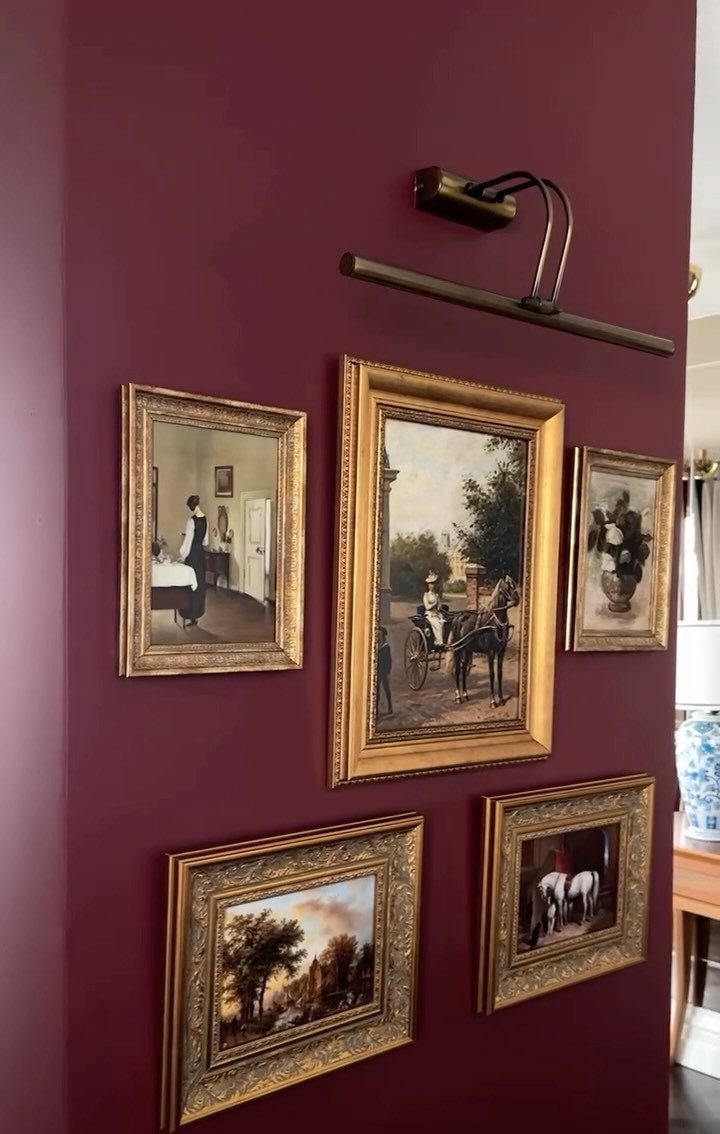
Burgundy walls with gold frames read formal, but the formula scales down. A single oil painting under a brass picture light gives a white apartment wall the same intentionality without the clubroom feel.
The mistake is covering the wall because bareness makes you nervous. One piece, hung at eye level when you’re standing, beats a cluster crowded together.
If you collect smaller works, rotate them; leave the wall half empty.
Check your light source before you buy the fixture. Battery-powered picture lights exist now, so a rental with no wiring near the art isn’t the obstacle it used to be.
The light matters more than the frame.
11. Integrated TV Media Wall Unit
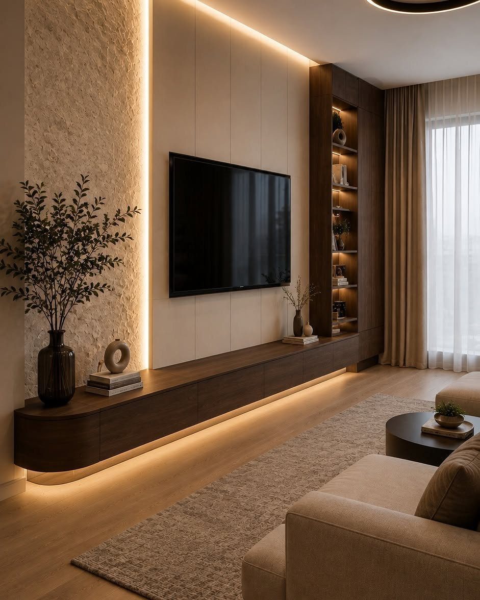
A TV wall usually looks like an afterthought; this one treats the screen as part of a single panel system.
The wood slats behind the television and the floating console below it read as one built-in piece, even though nothing here is actually built in.
LED strips behind the panel eliminate the black hole effect when the screen is off. I’d route the power during mounting so no cords drop to the console; that clean line is what sells the look.
This trades away flexibility. Your TV size is locked to the panel opening, and the console height is fixed.
Measure your components before you drill; soundbars and game consoles have gotten taller than most people expect.
12. Illuminated Moon Wall Art
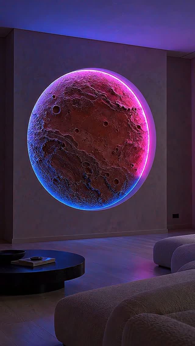
Neon backlighting on a moon relief turns a wall into something that works after dark, not just during the day.
A blue and purple glow reads as ambient light, not decoration; you could watch television with this on and it would not compete.
I would not hang this above eye level. Floating it high turns it into a planetarium effect, which is its own mood but not a living room I’d want to sit in.
The piece is large enough to carry a wall alone. If your room is small, this is your one move for that surface; anything else nearby would read as competing.
13. Textured 3D Stone Wall Sculpture
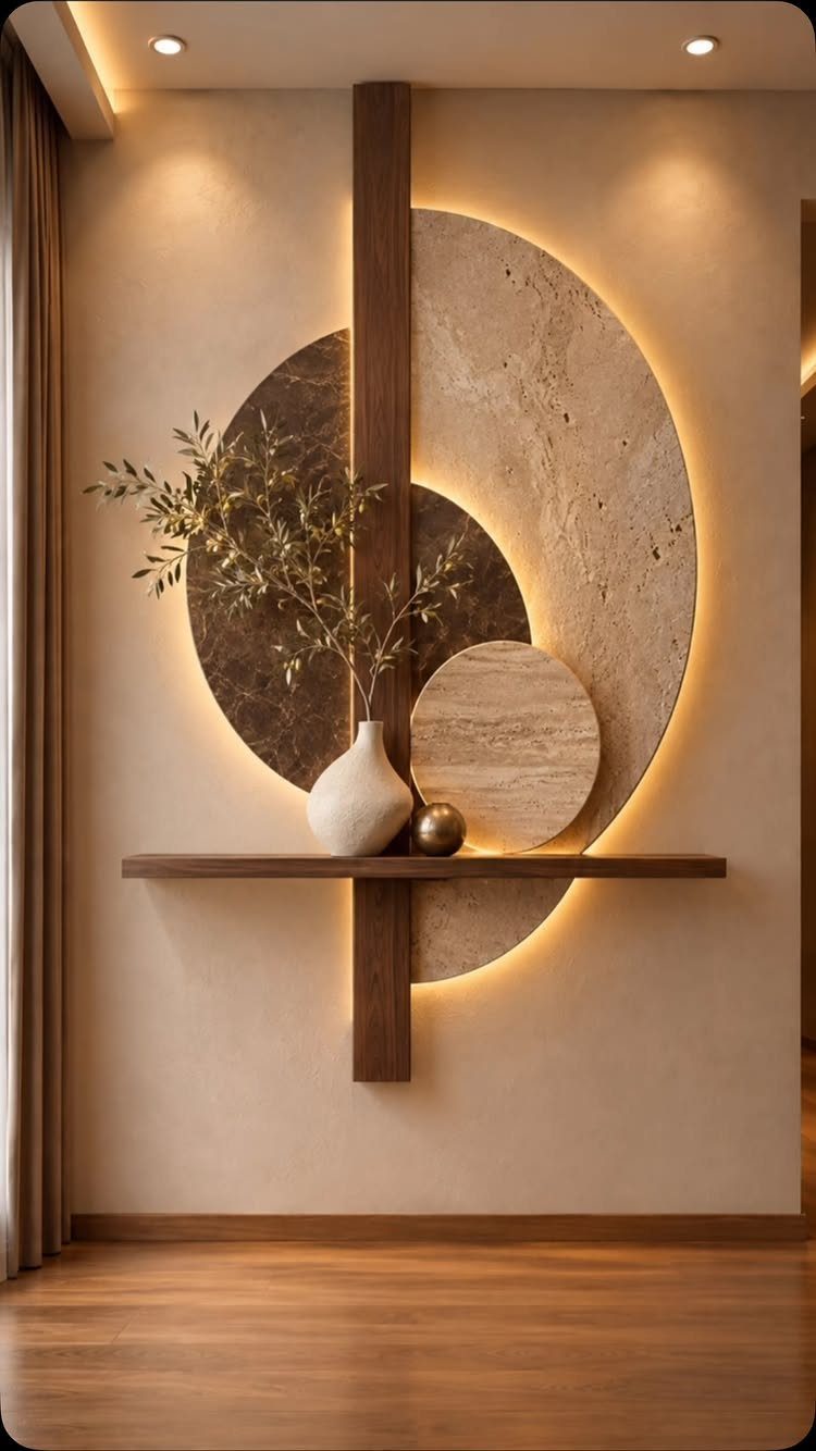
A textured stone installation turns the wall itself into the artwork, no frame required.
Layered discs in varying sizes and shifting warm-to-cool tones read as modern sculpture; a single flat slab would look like a backsplash that wandered into the wrong room.
Real stone veneer overlays run more per square foot than lightweight composite panels in a 3D pattern, which ship to your door for less.
Either way, the wall needs prep: a clean, flat surface and construction adhesive rated for the weight. I would not attempt this on plaster over brick without checking what’s behind it first.
A vertical timber beam does practical work; it breaks the pattern before it becomes monotonous and gives the eye a place to rest. Adding a narrow shelf at one height, not several, keeps the look intentional rather than storage-heavy.
Once the adhesive cures, the commitment is permanent, and the room’s color story is locked to stone.
Best for someone who has one strong wall and a minimalist temperament: the rest of the room can stay nearly empty.
14. Built-in Recessed Shelving Display
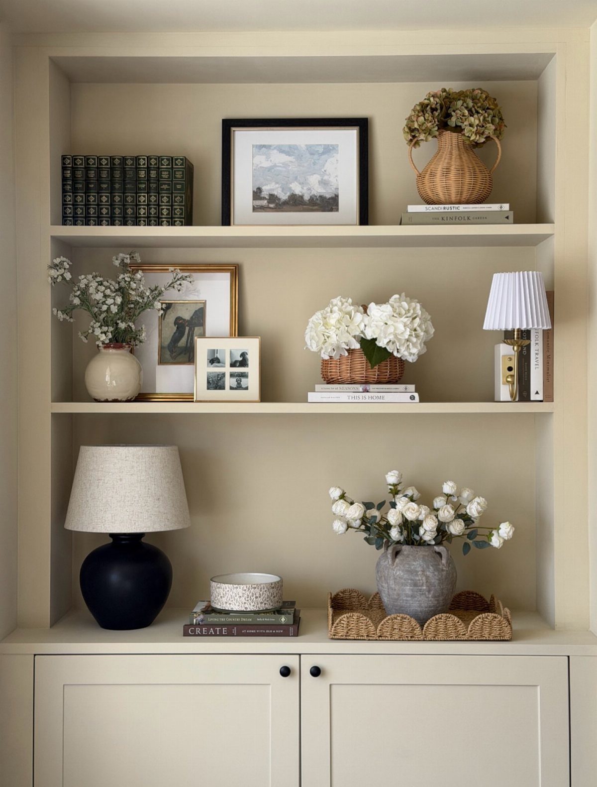
Recessed shelving borrows depth from the wall cavity, so the storage reads as architecture rather than furniture. A unit that sits flush with the surrounding wall, painted the same color, makes the objects on display feel intentional rather than piled.
New construction or a full gut renovation lets you frame the niche during build-out.
In an existing drywall wall, a shallow recess is usually safe if you check for plumbing or HVAC first; anything deeper needs an engineer’s eye on the structure.
Hiring out the cutting, then painting and installing the shelves yourself, keeps the project to a weekend and a manageable budget.
Tall item, low item, stack of books, repeated: that rhythm is simple to copy and keeps a display from feeling random. Softening hardback spines with organic shapes, like flowers or a woven basket, keeps built-in shelves from feeling too rigid.
A small lamp on the middle shelf is the detail most people skip; it turns the display into actual room lighting after dark.
Cabinets below hide what recessed shelves cannot: the router, the remotes, the living room’s necessary clutter. Without base storage, open shelves above collect everyday mess faster than you can style them.
This idea demands either luck or budget. Finding a recessable wall with no mechanical inside it is chance; building one runs into thousands in most markets.
A flat wall with shallow ledge shelves costs a tenth as much and reads nearly as built-in if you paint shelves and wall identical.
Combining Decor Ideas
Pair an accent wall with floating shelves and the shelves read as intentional architecture rather than afterthought storage.
Mixing art styles works if you hold them together with something real: a common color that shows up in every piece, or frames in the same finish even when the art inside them disagrees.
Distribute mixed pieces across the whole room instead of crowding them on one wall; balance needs space to register.
Maintaining Wall Decor
Dust wall panels, shelves, and frames with a soft microfiber cloth or a vacuum brush attachment before the buildup becomes grime. Manufacturer-recommended cleaners for wood panels and shelves; WPC just needs a damp cloth.
Direct sunlight fades color over time. UV-protective window film or curtains earns its keep when art faces south or west.
A picture ledge lets you swap pieces seasonally without new holes.
Choosing Colors
Wall art can pull a whole color scheme into one place. Two large indigo paintings echoing a rug’s line pattern turned one living room into a coherent space instead of a collection of separate choices.
Find prints that pull from colors already in your room: the sofa, the rug, even a throw pillow. The art does not need to match exactly; it needs to belong to the same family.
This works at every budget.
Lighting Considerations
Picture lights give artwork its due; sconces do the same for architecture or fill in where ambient light falls short. Put either on a dimmer and the same fixture serves evening conversation and late-night reading without rewiring.
Adjustable sconces let you swing from task light to accent without swapping fixtures.
Some wall panels come with built-in lighting that traces texture after dark.
Frequently Asked Questions
How do I design my living room wall?
Start with one focal wall and build around it. Leave breathing room on the remaining walls; fully decorated walls exhaust the eye.
What is the 2/3 rule for living rooms?
Artwork above furniture should run about two-thirds to three-fourths the width of what sits below it. A piece about two-thirds as wide as the sofa below it holds its own without overwhelming the wall.
What shouldn’t go on living room walls?
A mirror facing the television or a cluttered entry just doubles what you do not want to stare at.
Avoid artwork so small it floats alone above a sofa, and resist covering a wall completely out of nervousness about bare space. A single piece at standing eye level wins over a tight cluster that only looks nervous.